Data Visualisation
Future Sports Fans
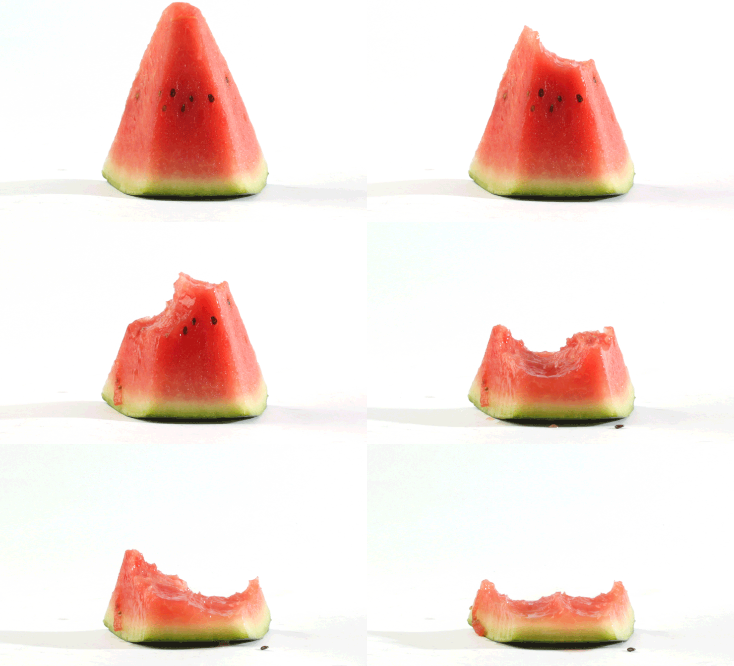
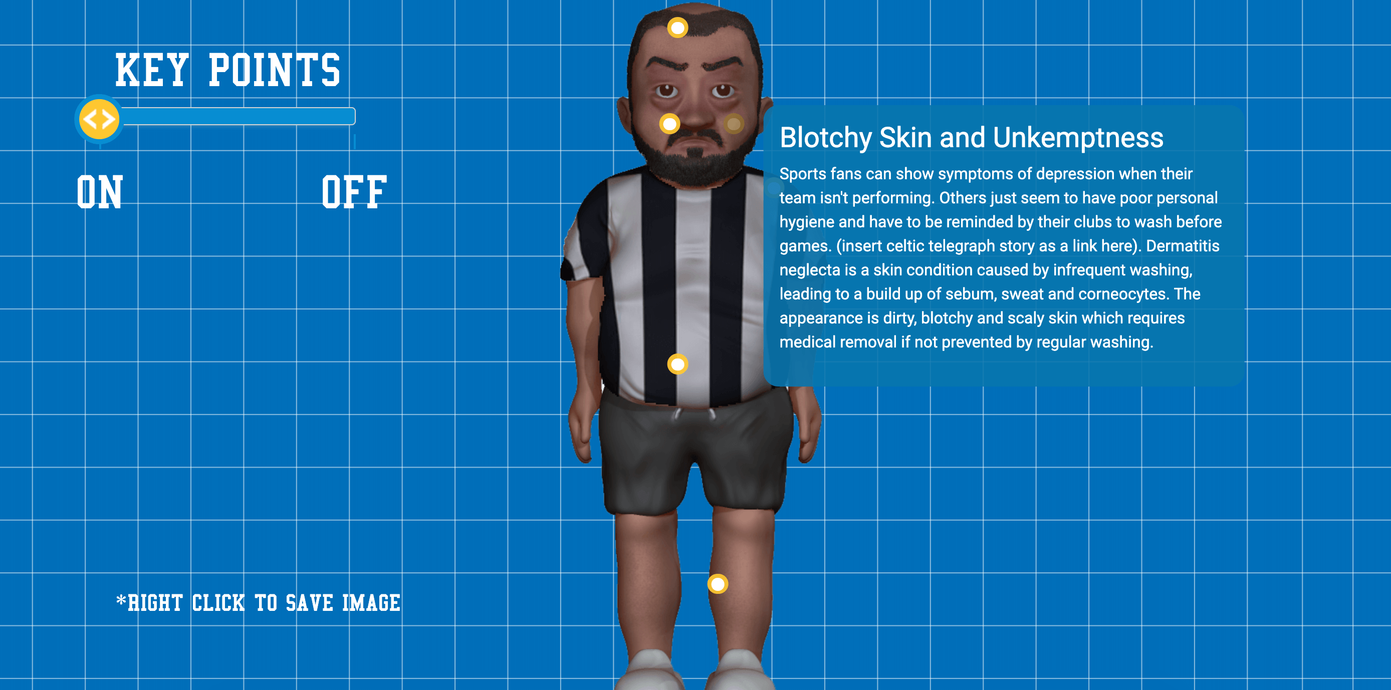
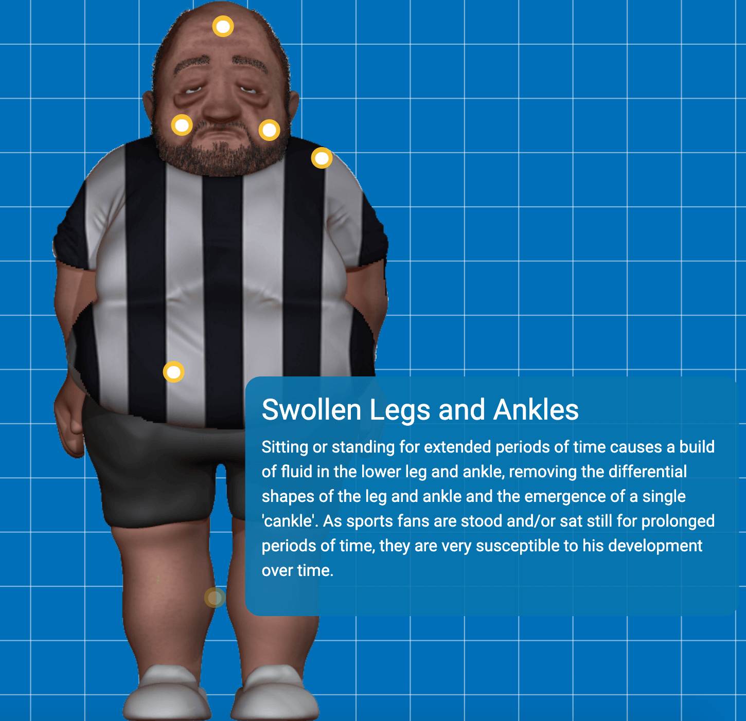
Future sports fans was a recent health-related project based on visualising the apparent health impacts on sports spectators if they continued the lifestyle of the average fan on match days.
The campaign had phenomenal shares and was featured on many pages such as LADBIBLE and UNILAD
Reality Celebs
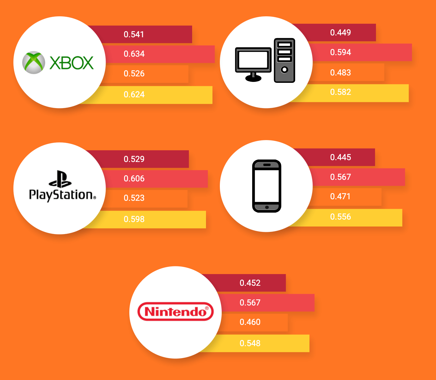
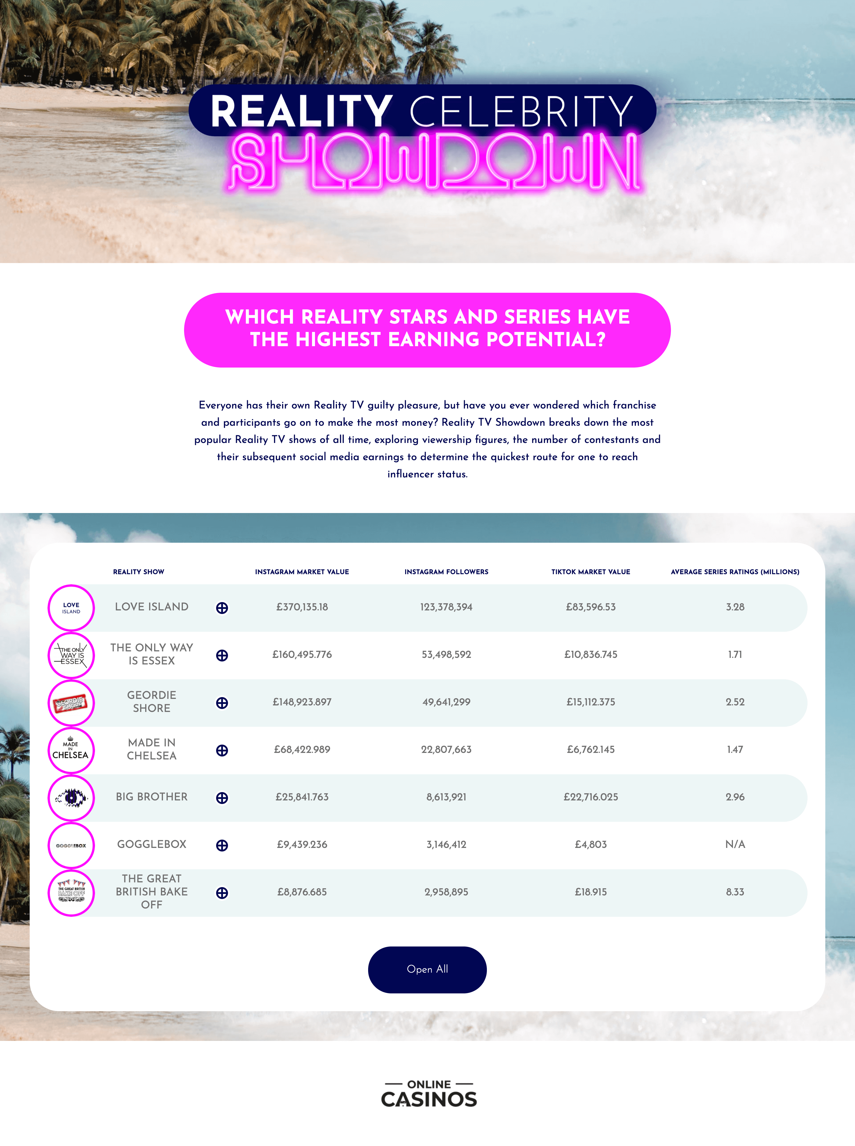
Reality Celebrity showdown was an interactive table project which displayed the total revenue that was made by each reality tv show through social media platforms such as Instagram and tiktok.
INFOGRAPHICS
Why are they important?
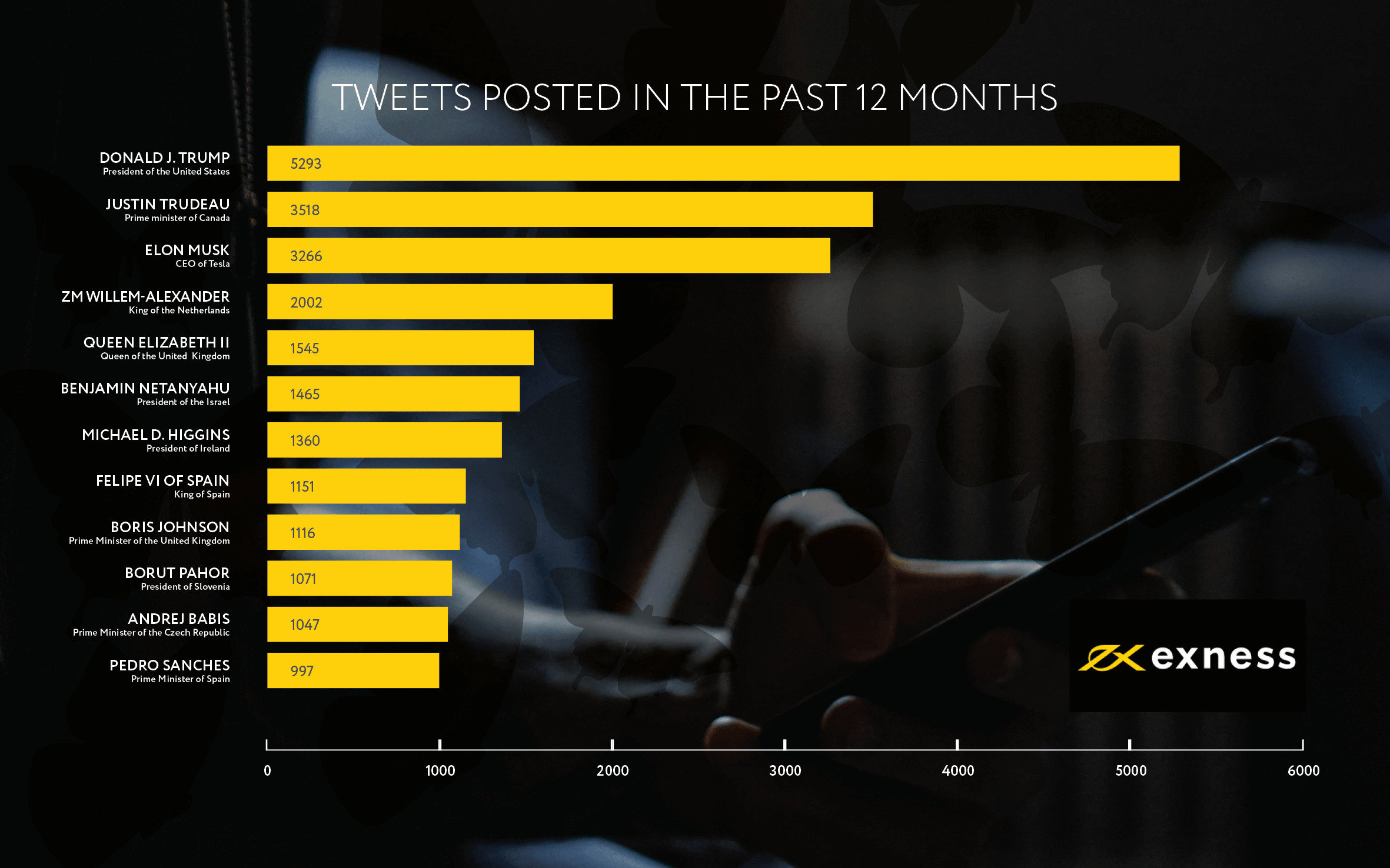
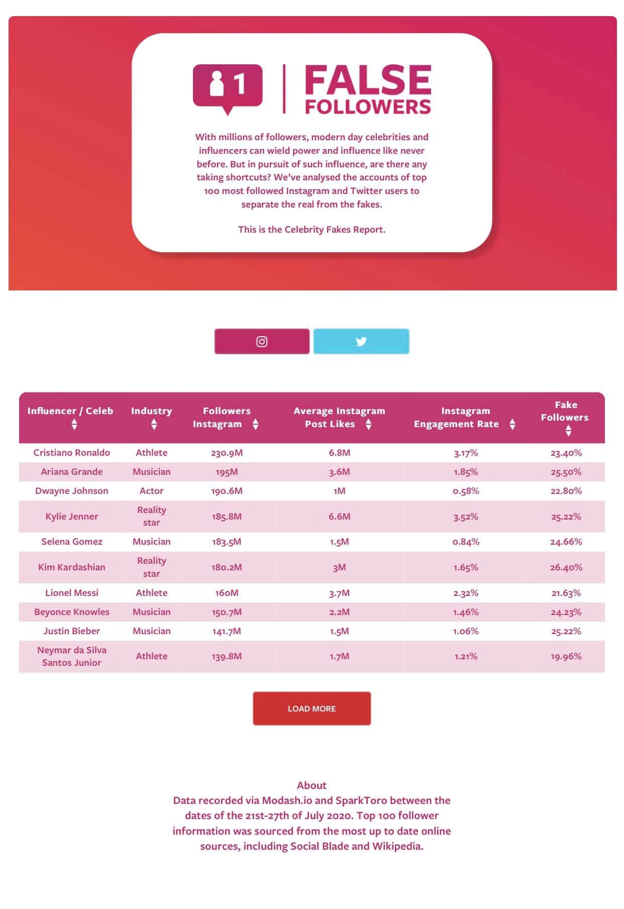
Graphical tables and information design is essential to convey facts and figures, they aide information retention and give interesting focal points to a body of text that captivates your audience and encourages them to read.
These could be designed in numerous different ways, Graphs, charts tables or simply icons and instructional pieces that instruct or inform the reader.
Below are just a few examples of infographics produced by Nathaniel brown.


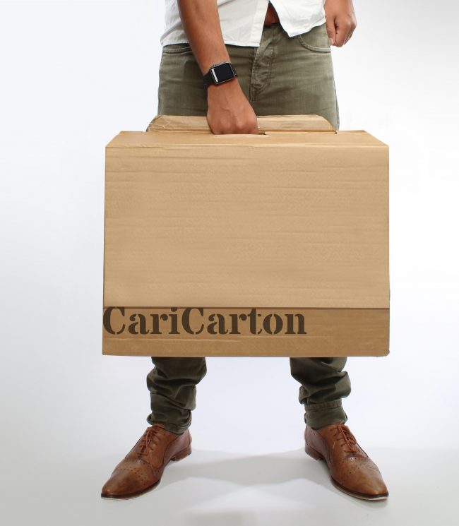
CARICARTON
An academic design project
After working as a designer for about 10 years, I finally decided to go back to school. I enrolled onto the MA design course at the University of Leeds.
Caricarton is the final project for this 2 year MA that earned me a distinction at one of the top 100 Universities in the world.
A crescendo of creative research into a subject that i knew nothing about. A project to tackle the problem of packaging in an eCommerce environment.
This project exercised several usability research oportunities focussing on user centred design and finished with a 20,000 word thesis on carrying out this design research and final summarised portfolio.
It’s long, It’s in depth,
Enjoy.
The Project
Abstract
In recent years internet shopping has rapidly grown to become the preferred method of commerce, it is estimated that 77% of internet users now shop online (Twenga 2016). Offering the widest variety of goods, internet shopping brings accessibility to almost every product in the market without ever requiring the shopper to leave the comfort of their armchair. This does not mean shopping has eliminated problems for the customer, with unpredictable delivery times requiring the shopper to be present, a more convenient way of shopping has been born. Many brands have turned to click & collect shopping, cutting down the queues at the store by completing transactions online and allowing customers to pick up goods safely and securely at a time that is convenient to them. Pioneered by brands such as Amazon and Argos in the UK, the time to adapt to a click and collect marketplace is now, with numbers currently suggesting almost a quarter of online purchase are now using click and collect as a method of receiving goods (IMRG 2016) Convenience is becoming the key motivator for shoppers to collect their online purchases (Chaliel 2016).
Cut out the need to wait at home all day for that obscure purchase to be delivered, instead have it waiting for you when you pick up your shopping or get off the train after your commute home. Click & collect shopping opens doors to what items you can buy from your local convenience store making the fulfilment possibilities endless and offering the broadest product range possible for supermarkets, without requiring them to physically stock the goods. (Chaleil 2016)
The only problem now is helping the shopper carry their goods from the click & collect point to their home.
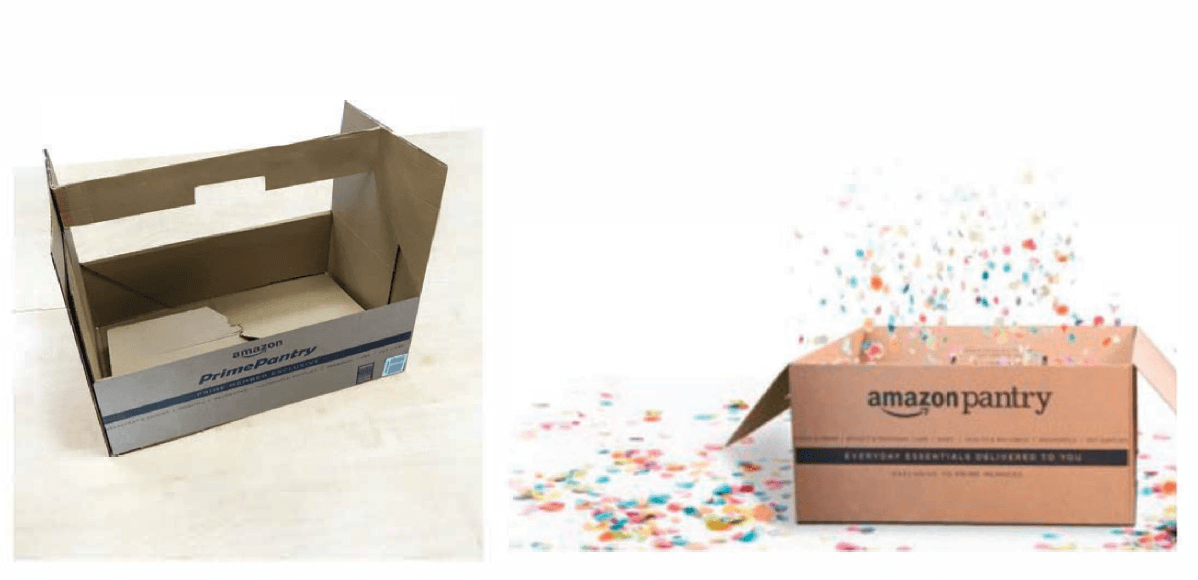
In this ever changing market place, can we develop a packaging that will benefit shoppers in the year 2018? Even as of conducting this research innovations have been made in this new and emerging field re-defining the way we shop. New shopping concepts such as Amazon pantry pave the way for the needs of this new type of packaging system, aiding the consumer in safely ferrying their purchases to their home.
Overview
Aim
The project aim is to design and develop a new and unique type of packaging to benefit the current trend in e-commerce online shopping of click & collect.
Research focus
Research will focus on user centred design to develop a product that meets the varied needs of stakeholders within e-commerce. Design research will be lead by needs of the user but will also incorporate all needs of the industry, from multi-channel retailer to warehouse packer. The researcher hopes to identify any stimuli that would need to be incorporated into a successful packaging design for use within the online shopping market place. Research will outline what has already been accomplished in the industry, but also what is missing from and identify any problems associated with current packaging. Solutions will be developed taking into account any found user problems, any existing industry standards will also be taken into consideration.
Contribution to the field
Research will be conducted into online shopping trends. This research will identify not only how many people shop online and receive their items by click and collect shopping methods, but also find the users preference in how they receive their delivery, what their packaging preference looks like and how to achieve user satisfaction through e-commerce packaging.
Research will be conducted into the best materials, techniques and user understandings of instructions used in this type of packaging.
Originality
Although there has already been research conducted into the desirability of packaging and what stimuli satisfy a consumer in regards to packaging design, this is usually carried out on product packaging and little in the field of actual delivery packaging. E-commerce and internet shopping is an emerging field and new marketplace, little research has been conducted on user preferences for such a packaging type.
Objectives
- Research Packaging design techniques and user preference
- Research Packaging material types and user preference
- Analyse e-commerce delivery process from clicking buy to customer receiving order
- Understand what instructions are needed by the user to promote ease of packaging use
- Understand what aspects of packaging are important to the user
- Develop an easy to use packaging system to transport multiple purchases easily & securely
Research Structure
Literature Review
- Online shopping preferences
- Design research
- Trend Forecasting
- Packaging design
- Usability testing methods
- Environmental impact
- Branding Design
Primary Research
- Online Questionnaire 1
- Visual research
- Sample collection
- Low-fi Prototyping
- Location observations
- Interviews
- Online Questionnaire 2
- Usability testing 1
- Usability testing 1
Analysis & Findings
- Online shopping process
- Online shopping problems
- Order & collection process
- Locker size / box size
- Target audience observations
- Preference of materials
- Quick erection box types
- Structural strength
- Box locking techniques
- Preference of branding
- Order & collection process
- Instructional understanding
- Usage preference
- Desirability factors
Prototype / Outcome
- Initial lowfi prototypes Selected
- prototype scalable size Crash
- lock opening Cardboard types
- Fold flat easy construction
- Design Locking handle
- Stackable design
- Branding opportunities
- Logo design / Bran design
- Instructional design Easily
- Loadable
- Separate lid
Research Methods
Literature review
Research from reading literature found in books, journals, online and other sources was conducted to fulfil this project. The main fields of study are Online shopping, Brand design, Instructional design, Design research, and Packaging design.
Online Questionnaires
2 x online questionnaires are carried out by the researcher each with 100 participants. The results are used to determine user preferences to gain a greater understanding of the users need when developing a packaging type.
Interviews of industry professionals
Semi structured interviews of industry professionals were carried out on professionals in the delivery sector (royal mail employee) & the packaging industry.
Lowfi prototypes
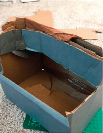
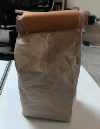
Multiple iterations of lowfi prototypes are created to develop the best approach to a packaging system that satisfied all requirements of the project outcome.
Location Observations
Observations are conducted at multiple points of interest including Royal mail collection offices, Click & Collect points & lockers and an Amazon fulfilment centre to ascertain the entire process of e-commerce shopping and observe the Subjects that may use Amazon click and collect lockers to develop a profile of our target audience.
Market Research
Market research of existing packaging and materials is carried out to determine positive aspects and failures currently existing so improvements on current systems can be developed.
Usability Testing
2 Rounds of usability testing are carried out on prototypes. Firstly to determine the ease of use of proposed packaging types to identify any initial failings and undesirable traits. After refinement the second round of usability testing is carried out on proposed target audience to identify ease of use and general desirability of finished prototype.
Questionnaire 1
The first questionnaire survey determined how popular the proposed method of shopping (Click & collect) was and to forecast on how popular it may become. It measured the e-commerce shopping climate and identified any problems shoppers currently experienced with online shopping.
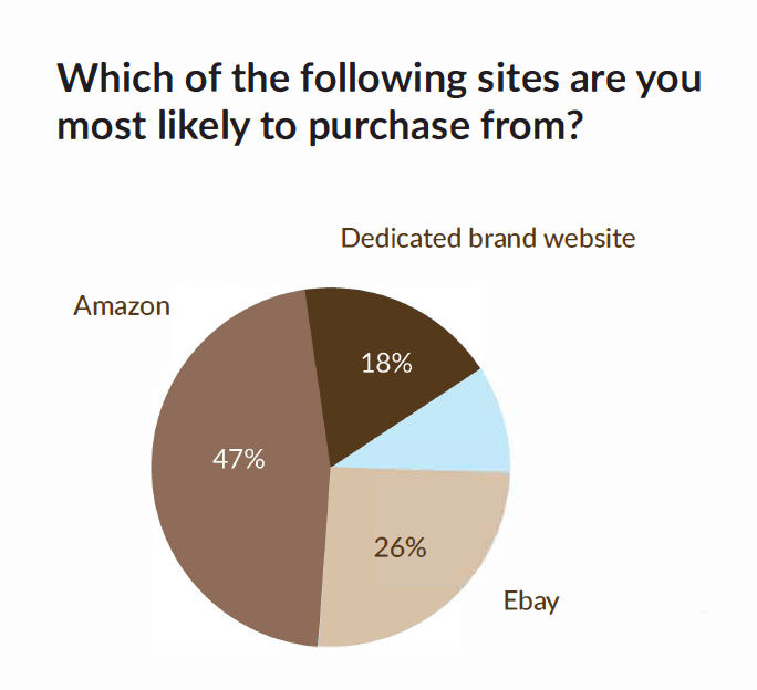
This question in particular was interesting as we compared it to 2014 questionnaire results (Guruswami 2014) we found that preferences have been reversed and Amazon has taken over as the most popular place to buy online.
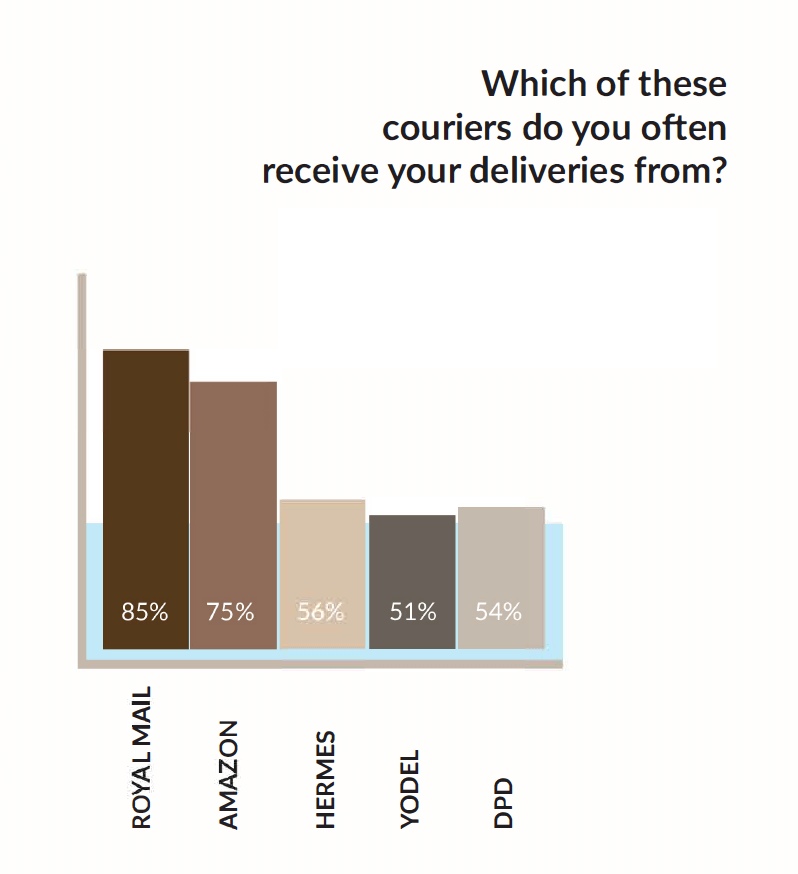
This question shows the rising popularity of Amazon’s own courier service. Amazon now rival Britain’s national postal service Royal mail for frequency of parcel deliveries.

This question shows the potential interest to the consumer in collecting their on line shopping from a click & collect locker.
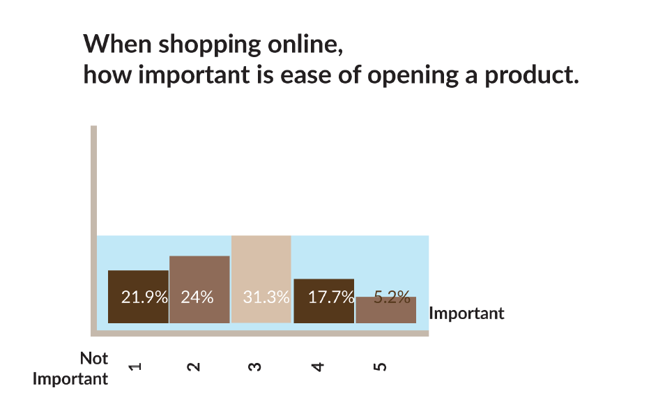
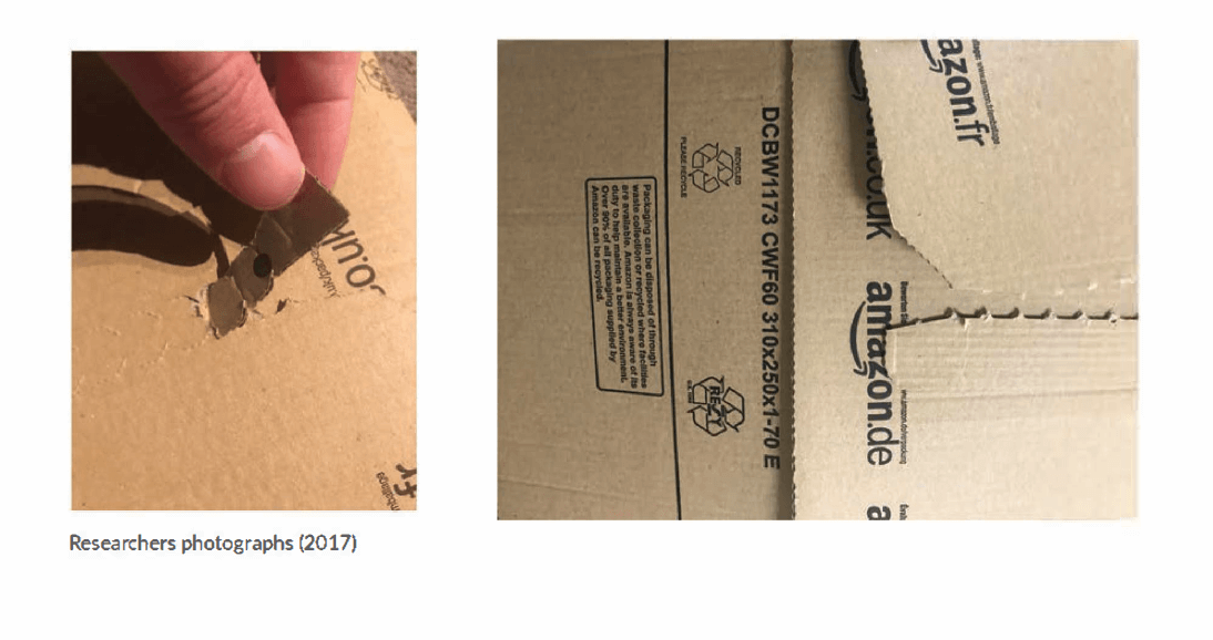
Recently it was found in primary research by collecting packaging samples that most are easy open packaging. The importance to consumers of easy open packaging was analysed and found not to be entirely important to everyone. A mixed review across the board as to the importance of the matter, with as many as 5 participants even claiming that it showed no importance to them at all. The results of this question left the researcher undecided whether to include this feature in further usability tests or even in the final design.
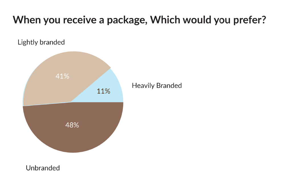
Participants showed that they do not like heavily branded boxes and much preferred plain and lightly branded packaging design to receive their on line purchases. Through literature review it was suggested that people prefer this for 2 reasons, firstly the current trend in sustainable packaging suggests that consumers are becoming more environmentally aware. (Arora 2013 pp 116) A heavily printed package suggests to the user that the packaging has greater environmental consequences and should be avoided. Another reason consumers would prefer an unbranded packaging is for security and anonymity reasons. A package with no indication of the sender can hide the value or nature of its contents, preventing theft (Fryer, J. and Medina, D. 2015) and or embarrassment.
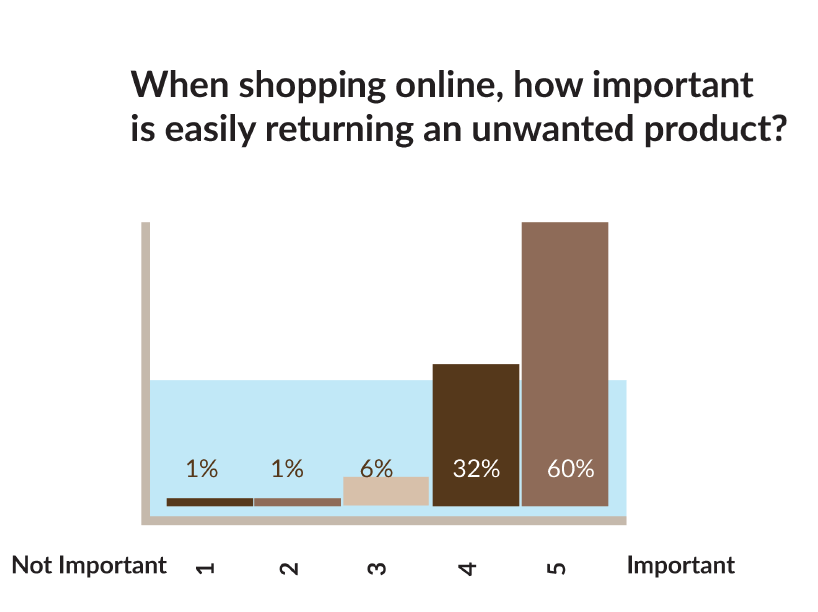
The majority of participants showed that returning a product easily was important, with 60% of those placing this with the most importance on a semantic scale of options. When shopping on line it is important for the consumer to return something as it isn’t possible to view or try on the actual product at point of sale. Within E.U legislation is a requirement that a product can be returned for a full refund without any reason within 14 days if bought online. (Europa.eu 2017, Which 2017)
It is concluded from this that designing a product that can be used multiple times, being resealed and returned would aid the user in returning an unwanted product.
This would also have the added plus of being more ethically viable than simply throwing away the box or sending for recycle.
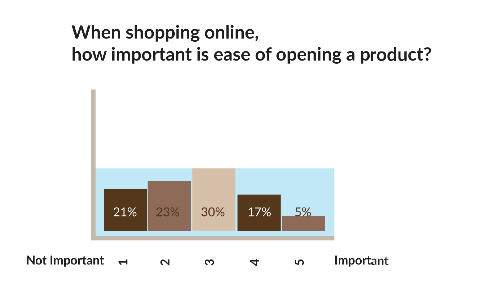
This question was asked to participants to determine the importance of frustration free easy open packaging and the trend for using cardboard zips on e-commerce packaging found when the researcher collected samples. The response was highly varied and not very conclusive with mixed preference cross the board, in fact only 5% of participants considered this a very important factor. Aesthetically on the other hand it can be used to instruct the user how to safely open the packaging preventing damage to products inside. It was concluded that Including a cardboard zip will not harm the overall design of the packaging.
Interviews
Interview 1 was with a long term employee of Royal Mail who has worked with for the UK’s National mail company for over 9 Years.
The interview used to develop an insight in to desirable traits for a user who handles packaging on a daily basis.
This is a semi-structured interview with a royal mail employee conducted for a MA Design Module for the School of design, University of Leeds.
By participating in this interview the subject is agreeing to data being used for research purposes of aforementioned module. Your research will be used to potentially design an improved online shopping experience.
Your help is greatly appreciated.
- How long have you worked for royal mail and what jobs have you done there?
- What do you like best about working at Royal mail?
- How many parcels would you say that you personally handle in one day?
- Are packages sometimes difficult to lift or carry? And why is this?
- How many parcels are returned to the depot after they have gone out for delivery each day?
- At the collection office, what is the busiest period?
- After a failed delivery, how long do people usually wait to collect from the depot?
- What type of person usually collects from the depot?
- What problems do you see with packaging?
- At the collection office, what time is busiest period?
- Has the collection depot got busier in recent years? If so, why do you think this is.
Thank you for completing this short interview.
Ok so I’ve typed up some answers .they might not make sense and be perfect grammar coz I’m really tired also if the answers are too short or if you want something going into further detail or explaining just say ..
I have worked for Royal Mail for 9 years and 9 months . In that time I have mainly been in delivery with some over the counter service. I also do evening collections and sorting on overtime. The thing I enjoy most about work is talking to & meeting new people every day on my deliveries . I also enjoy being outside all day. The amount of parcels I handle per day depends on the day. Tuesday’s tend to be fairly quiet days with less mail , Thursday’s are usually the busiest days with double the amount of Tuesday’s work load . On a busy day I will have about 40 packets and parcels however on a Tuesday it might be as little as 15 . This isn’t a true across the board reflection as my current duties are rural deliveries (mostly farms , so I have less delivery points because it takes longer to get to each delivery point ) . An ‘urban’ walk can easily get 60+ parcels on any given day . Parcels are difficult to carry when they’re packaged in large/ heavy boxes that are too wide to be able to get your arms around . Amazon packages are difficult to carry as they’re not sealed up and tend to fall apart in your bag . The busiest period in the collections office is lunch times and roughly 4pm to closing time. Opening up the office at 7am there is often a queue outside waiting for the office to open presumably collecting parcels before work . Currently with my rural duties I don’t bring any parcels back , as it’s mostly farms and nice areas customers are happy for parcels to be left in a safe place or with neighbours . On a normal ‘urban’ delivery around 50% of parcels are brought back . As it is officially ‘not Royal Mail policy’ to leave parcels , we are not protected if we were to decide to leave a parcel in a safe place or with a neighbour that unbeknown to us the customer didn’t get along with and the customer complained . Most people decide the risk is not worth their jobs . I think customers lying about not receiving items puts a dampener on things . Unfortunately time restrictions and increased workloads mean most of the time we just phsyically do not have time to try with different neighbours. People usually collect their parcels as soon as possible . Usually the next day. The people that collect parcels from the depot are usually in some form of work uniform . Smartly dressed. There are many different problems with packaging – all resulting in complaints towards our delivery staff even though clearly not our fault . Biggest issue is rain. Most Packages & letters aren’t designed to be waterproof . I guess people think it doesn’t rain on a postie ! Jiffy bags pretty much disintegrate and you have to try and hold it all together with elastic bands and an embarrassing apology . Also wet things don’t go through letterboxes very well , so even if they have made it to the door in almost one piece , trying to put it through a letterbox is a different story. Amazon don’t seal their packages so those packages fall apart even without the rain. Usually seems to be when sending books , they just have a little folding flap that isn’t fit for purpose . Often on an evening when we’re sorting the mail we have to put some packets In our own bags because companies have posted heavy items like keys/ padlocks in a flimsy envelope that is already breaking after the journey from collection to office . A lot of complaints off people are “well it’s only a cd why have I got to sign for it !!!” (Or an other item of equal value) , we haven’t sent it signed for so don’t complain at us , we are just doing our job , take it up the sender . Another is small things in big packages . A dvd that’s been put in a big a4 cardboard package that isn’t flexible enough to go through a smaller letterbox . The customer is expecting it to be dvd sized and to go through the door, and thinks it’s unacceptable to have to pick it up and that is obviously our fault again. yes the Collections office has got busier . I think this is down to job insecurity and increased workloads . It is a sackable offence to leave a parcel somewhere (shed , garden box , behind a bush etc) and with today’s complaint culture it isn’t worth the risk. Also the fact that our deliveries are getting bigger and parcels numbers are growing we literally don’t have time in our duties to knock and wait , then knock and wait again at the customers door , realise they’re not in, go next door , knock and wait , realise that neighbour isn’t in, go to the other next door . And then go back to original customer and leave the note saying where it is . It’s just not realistic .
Also I know I contradict myself when I say it’s a sackable offence to leave parcels in a safe place, but then I say I leave mine in safe places . It’s only coz the houses I deliver to aren’t exactly on the road side, and i 100% know the customers aren’t gonna try and pull a fast one by saying they haven’t got it
This was an electronic Interview with a Professional within the packaging industry. The interview was used for information into materials and production limitations for the final product. The researcher also drew conclusions on trend forecasting within the packaging industry.
This is a semi structured interview conducted on a professional who works within the packaging industry specialising in corrugated cardboard. The answers to this interview will be used for research into packaging design for a MA Design module at the university of Leeds School of Design. By continuing to answer this short interview, you are agreeing for this data to be used in this module.
Thank you for your help, it is much appreciated.
- How long have you worked in packaging? And what is your current position?
14 years. Sales – Business Account Manager
- What type of cardboard would you say is the strongest and best suited to ecommerce packaging?
Its not that simple. It depends on the product, is the product going to support any of the weight if stacked, is it getting exported, value of product, does it need to be reusable for returns. There isn’t a one style or board grade that fits all.
- How many boxes are produced by your company every day?
Approx. 50 million
- Please explain briefly how cardboard is manufactured.
Either 3 or 5 liners of paper are stuck together using steam and starch through a machine called a corrugator.
- What is the largest size a single sheet of corrugated board that can be produced by your company?
1625 x 3200mm – single wall
1620 x 3200mm – double wall
- What is the most elaborate packaging you have seen made?
I saw a truck at coke a cola HQ. I’ve also seen a F1 car at an exhibition
- What is the most common type of packaging requested by your customers?
0201 style boxes – flaps meet in the middle.
- For the boxes you manufactured for Daniel footwear, what sort of cardboard is used?
It is B flute – 125gsm White kraft (virgin paper) / 150 waste based fluting/ 150gsm Kraft liner
- What kind of problems do you see with packaging today?
Packaging technology is moving very quickly and customers are demanding it to do more and more. I think the biggest problem with packaging in general is waste and recycling. Cardboard is very good in this respect as it is a very “green” product, whereas plastics are very poor. I am constantly seeing the damage plastic packaging is having on the environment, particularly the seas and oceans.
- Can you give me any examples of where you see the future of packaging is heading?
I think packaging will eventually be 100% recyclable and the recycling will be the norm. Print will continue to improve and the applications of corrugated and/or paper based packaging will be more wide spread.
Thank you for completing this short interview
LOW-FI PROTOTYPES
The researcher designed a plethora of Lowfi prototype models before settling on the model that fulfilled most desired criteria. Initially it was thought the most important factor was to make an adaptable packaging type that adapted to the contents size. Later it was decided that the packaging size was actually determined by the maximum dimensions of the click & collect locker. One of the most important factors discovered was the placement of a handle to aid carrying of the parcel.
Brand Development
Branding was developed for the product and the name Caricarton was chosen. The name represents and easy carry package, developed on alliteration for a strong sounding easy to remember name.
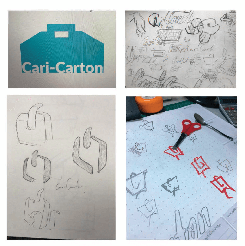
Typeface
A stencil typeface ‘Stardos Stencil’ was chosen. Similar to stencil type found on shipping crates but with a softer edge, it gives the feel of strength and stability associated with shipping, whilst still maintaining a softer friendlier feel.

Logo design
to accompany the typeface chosen a brand logo was developed.
This was taken from the look of someone holding a box with one handand simplifying the form to a simple shape. It also emerged from the first 2 letters of the brand name and is a partial C and an A from the stencil typeface used.
Observations
Observations are conducted at key locations that would aid research in all stakeholders to the project, this includes warehouse pickers, packers and eventually the public themselves. It was important to observe the shopping journey, from the moment a purchase is made right up to receiving the product.
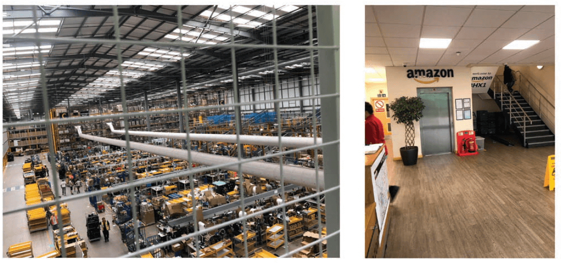
Amazon distribution centre.
Amazon, true to its brand values of being a “customer focused friendly company” (A Wheeler 2013 pp. 220) Invites members of the public to come and observe the process of how an item arrives at destination.
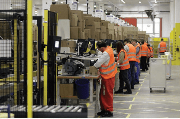
The 45 minute tour around the huge warehouse, 3 times the size of Wembley stadium with activity spread over 3 floors of processing power, promised to show anyone interested in the subject their machine like accuracy and automation in their picking and packing process.
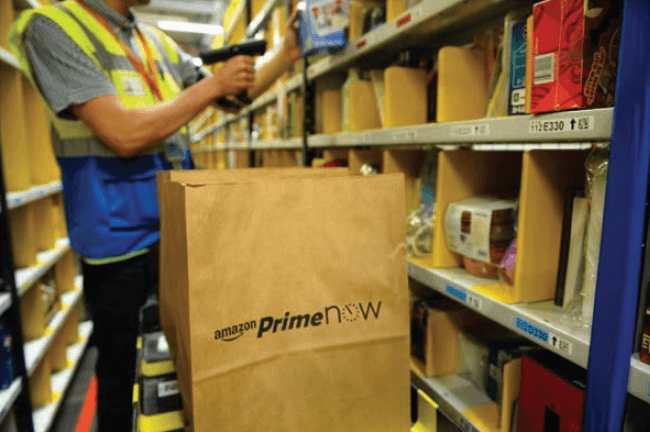
Amazon’s fulfilment centre drew conclusions that the overall design should contain elements of quick construction as workers struggle to erect packages at busy times of year to meet the high demand of peak trading season. structural stability and stack-ability of the design are also requirements observed through visiting this site. The sheer diversity of product time suggested that packages dimensions should not be defined by the product that can fit inside it. It was found that Amazon holds over 14 different box types at each packaging station.
Amazon ‘PRIME’ deliveries receive priority treatment in both picking and packing areas. It was found that services such as ‘PRIME NOW’ have their own distribution centres which explains their limited range of product. It was also found that ‘PRIME NOW’ product is packaged much earlier in the picking process.
Royal Mail Collection
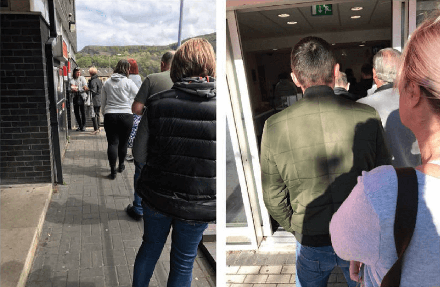
The researcher visited multiple Royal Mail collection offices and observed a high volume of footfall at each location. There was always a constant stream of people collecting missed deliveries.
The researcher observed a good mix of people from all different demographics in the queues at the collection offices. Not all people were alone and had a friend present which contributed to the queue lengths. The researcher observed the average weight time to be around 15 minutes per person that joined the queue.
Technology integration
The researcher observed that Royal mail had adopted computer technology in a few locations. This machine was to pay customs charges, but looked easy to use and self explanatory.
The researcher found it somewhat strange that the rest of the collection process was manual and took a person to read a collection card then collect the package from presumably a warehouse type storage area in the back. The process could be improved by adopting a more technological lead approach to collecting packages.
Collection lockers
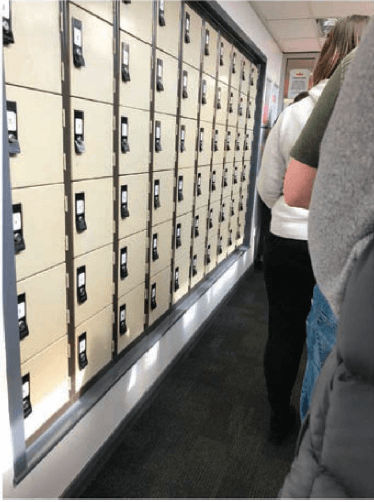
The researcher observed the presence of collection lockers, these were numbered and presumably belonged to individuals that frequently had to collect from the Royal mail depot. The researcher did not observe anyone using these while attending the location.
This seemed like a waste of space which could be easily replaced with a similar service to click and collect lockers and could reduce queueing time experienced at busy periods.
Click & Collect lockers
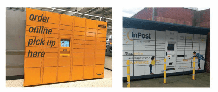
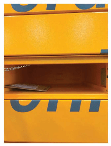
The researcher visited and observed click & collect lockers of various varieties. It was found that fundamentally these lockers are of the same design and the same modular dimensions across various brands. Click & collect lockers are often found in supermarkets, petrol stations, tube station and convenience shopping locations where the user would normally visit for other purposes.
Locker Sizes
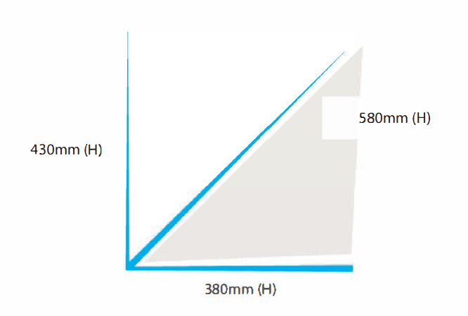
The researcher took measurements of the largest locker and designed packaging that fit this compartment exactly. 430mm(H) x 380mm(W) x 580mm(D) The researcher found that Amazons prescribed locker dimensions are not the maximum that could potentially fit this space. Amazon (2017)
Multiple Purchases
The researcher observed that when buying multiple products online and opting for delivery to one of these lockers, their purchases are delivered to multiple small lockers at the same time. This means the customer has to take time opening several lockers to collect their purchases, which increases the time taken to collect and is also difficult if carrying multiple items.
The researcher collected 3 small items, each from different lockers compartments, this would have been far less time consuming if it was already all in one locker.
Small visitor count
The number of people using the lockers at any given time was very low compared to those observed using Royal mail collection points, presumably this could be down to the times each location was visited. The speed and ease of using the lockers could also account for this as a queue would be less likely to build up with a more efficient service than that experienced at a Royal Mail collection office.
Amazons Recent investment in locker technology shows an increased need for lockers. With systems such as Amazon hub, Lunden, I. (2017) to bringing the lockers closer to the user.
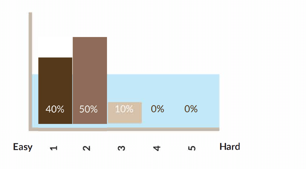
How well did the participant construct the box from flat?
Participants were asked to erect Version 6 from flat to full construction, Version 6 contained simple arrows to guide participants where to push for easiest construction method. The results showed 40% of participants found it really easy to assemble the box, with a further 50% and 10% finding it easy and simple respectively. None of the participants were found to have trouble constructing the package.
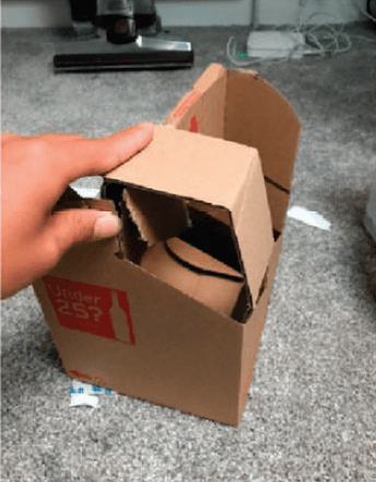
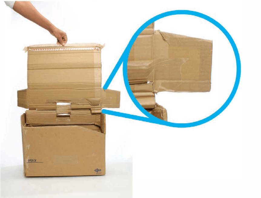
These results showed that a suitable box construction design was chosen, This featured a crash locking system that features a 1 motion erection type. found in many types of packaging the crash lock enables users to construct the box trouble free, it is even possible to with a single hand.
Observations to participants reactions were recorded and 90% of participants were found to show delight at the ease of constructing the package. Comments such as’ That was easy.’ being recorded from at least 2 of the participants.

How did the participant use the lid?
It was found that without instruction participants struggled to realise that the lid potentially had 2 separate uses (To constrain package on shield contents from outside) Naturally, the majority of participants used the lid for the box externally, it is to be assumed this is the preferred position of the lid.
Participants seemed to have some trouble with the lid, this was found to be a weak designed aspect of version 6, Specifically it was found that participants had problems with flaps on the lid. the flaps aided in confusion and created a confusing experience. Because of this the question was raised whether to include the flaps in the next iteration at all. The flaps on the lid were initially included to hide a hole in the side of the package, another design solution needed to be found because of this problem.
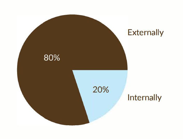
Observation of Participant using adhesive tape
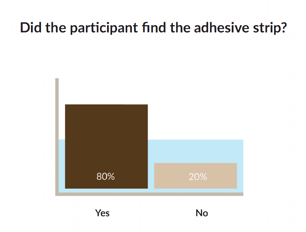
Participants were observed as to whether they easily discovered an adhesive strip on the underside of the packaging lid. Participants were fed no instructions as to the location of the strip.
Although 80% did find the adhesive strip this was observed to be to a dis-satisfactory level of ease, 100% participants that were observed to find it showed an emotion of surprise showing that they did not expect it to be there. 20% of participants did not find the strip at all until shown its location.
If an adhesive strip was to be used in the final design it needed to be more obvious. When the adhesive strip was found by participants, 100% instantly knew how to use it, double sided adhesive strips have become so common place all participants can use them easily.
Observation of participants using the handle
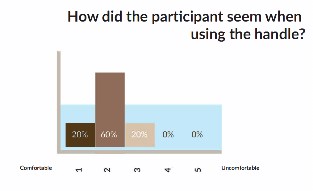
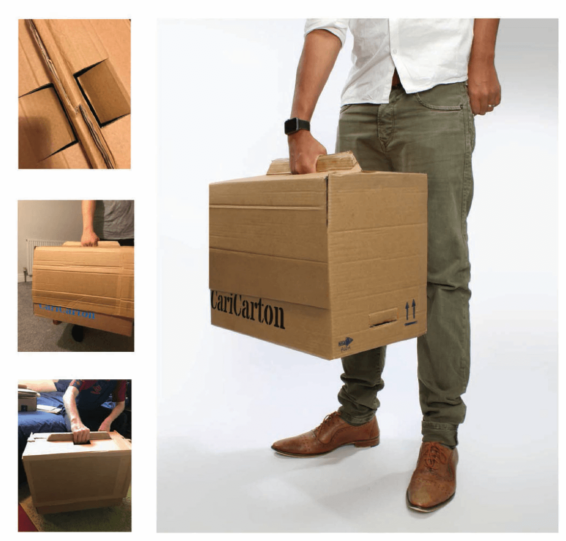
After sealing the package, participants were asked to use
the handle, lift the box and were observed to carry the central handle.
Participants are asked their general opinion of the handle,
most appeared fine and didn’t have any suggestions for improvement. The cardboard felt thick and comfortable to use was the overall opinion of those surveyed.
Questionnaire 2
Questionnaire 2 was used to outline certain uses for the packaging to be created, it determined how it would be used and outlined any common problems users might experience with current packaging available. It was also used to help develop aspects of the branding for the packaging and determine graphical elements that could be used in the final design.
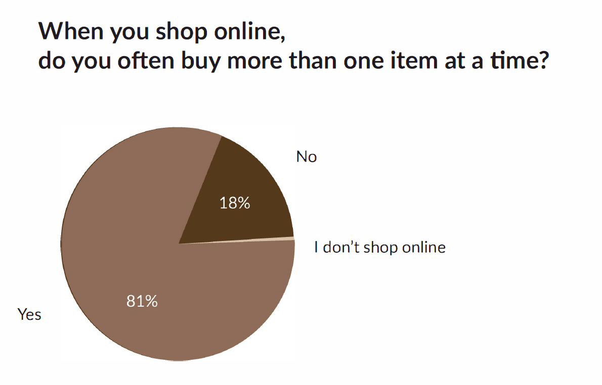
This question showed that when a customers made a purchase online 81% said they would buy more than one product from the same place. This showed the need in the market for a packaging to hold multiple different items to be received at a singular destination.
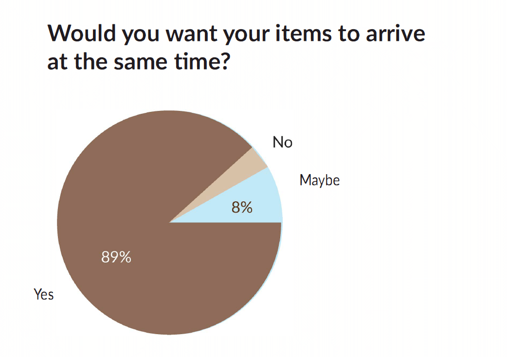
This question showed that it is a viable option to develop a packaging that would contain multiple items that arrive at the same time. This was proven at a later point in the study with Amazon developments in ‘Amazon pantry’ offering a standard fee for delivery of a single box of a set size. (Amazon 2017)
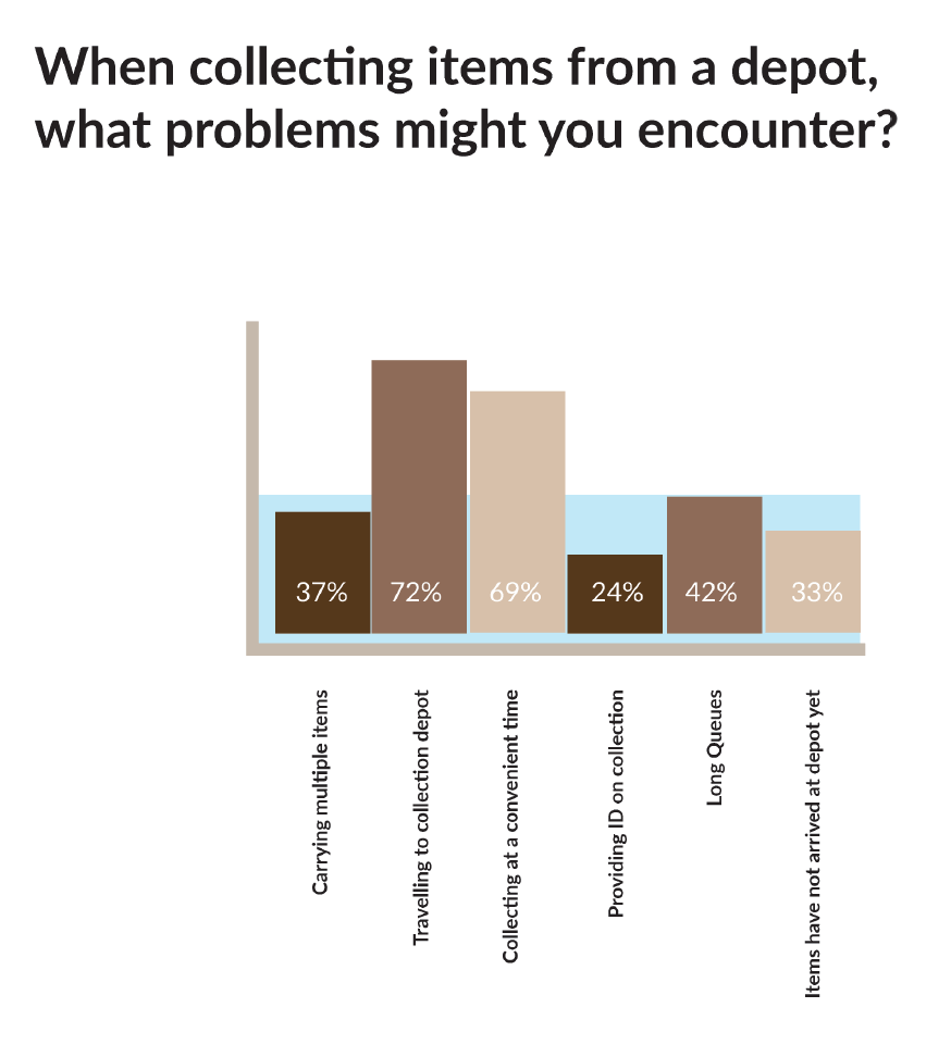
When participants were asked what problems they may encounter when collecting their packages, convenient times and travelling to a depot are perceived as the most commonly experienced. while other problems such as carrying items, Long queues and arriving at the depot before your items are also experienced. Some of the problems such as collecting at a convenient time and long queues can be solved by the solution of a click and collect locker. A solution for carrying multiple items and tackling the problem of travel would need to be combated in the design of the proposed packaging.
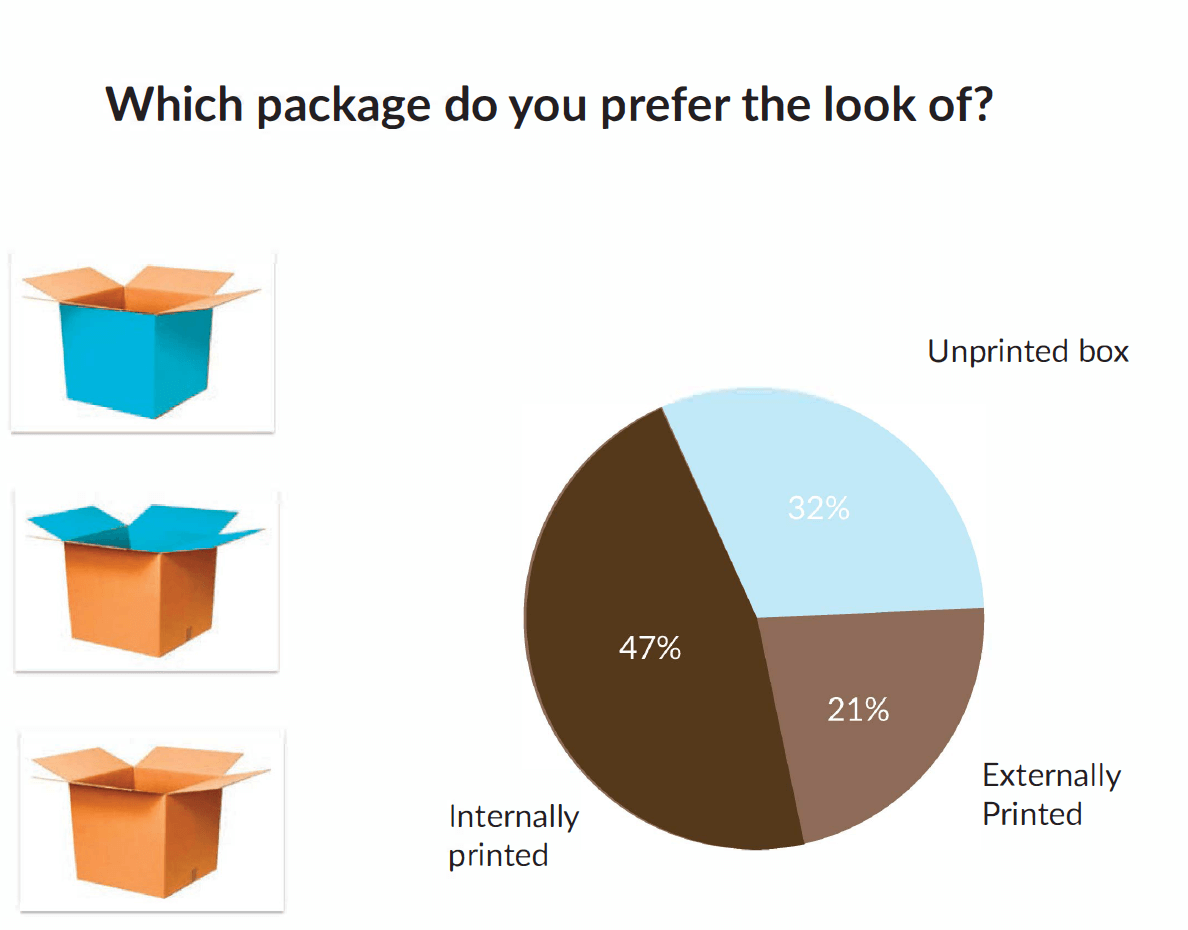
A visual stimuli was used in this question to determine the preference of how the packaging was branded. similar to a question in the 1st questionnaire it reflected on how heavily branded the participant preferred their packaging.
An internally printed package was preferred overall perhaps because it still added discretion to the contents of the box, but immediately told the recipient who the package was from upon opening . This helped determine that the package should not be heavily printed externally, but an equal amount of print cold be provided internally to great effect.
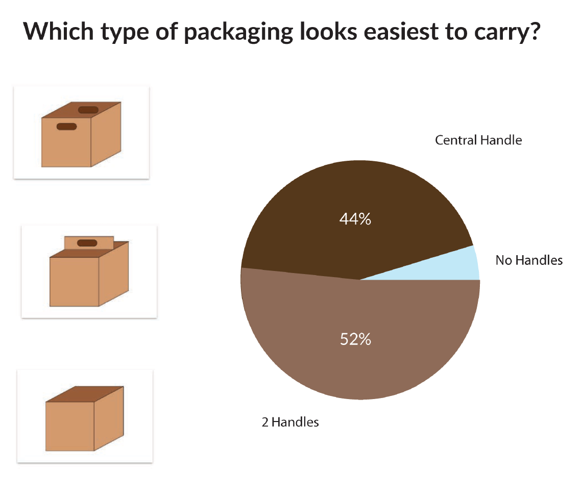
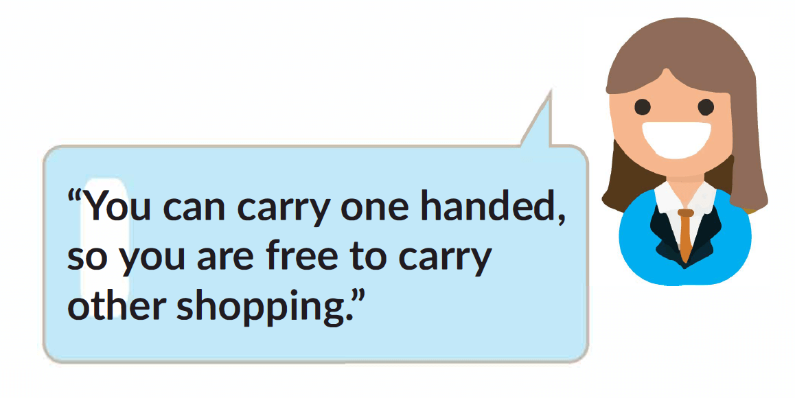
Although the majority of participants suggested that the box with 2 handles looked easier to carry, this wasn’t by a overwhelming majority, and almost an equal split of both handle designs was preferred. After the question was asked as to why the participant thought this, many participant correctly identified the benefit of a singular handle in that it frees the other hand to perform tasks such as “Easier to carry it with one hand so I have my other hand free to push a pram or hold a child’s hand.” & “You can carry one handed so you are free to carry other shopping.”
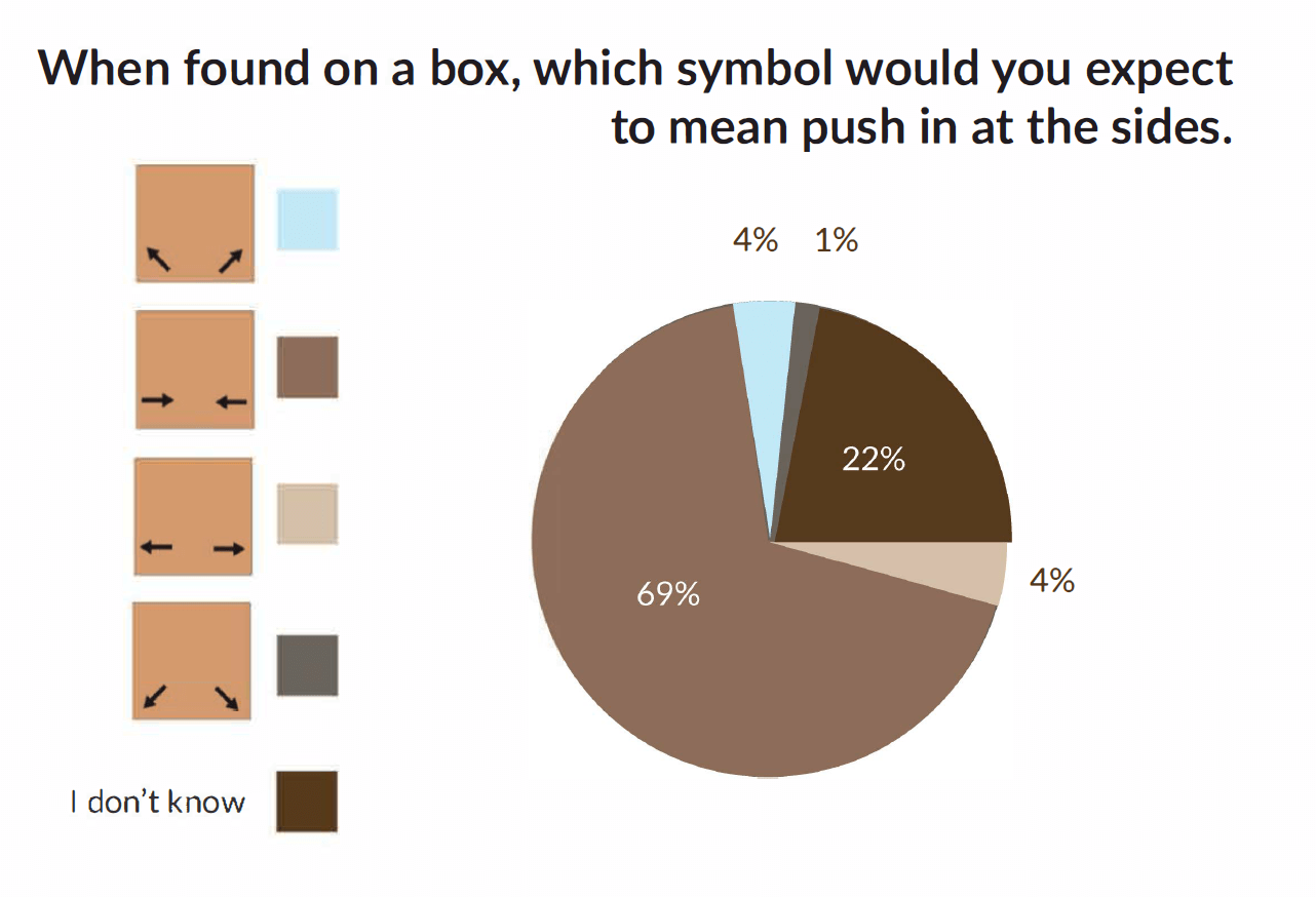
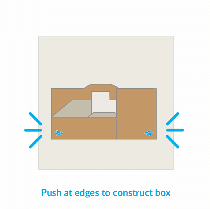
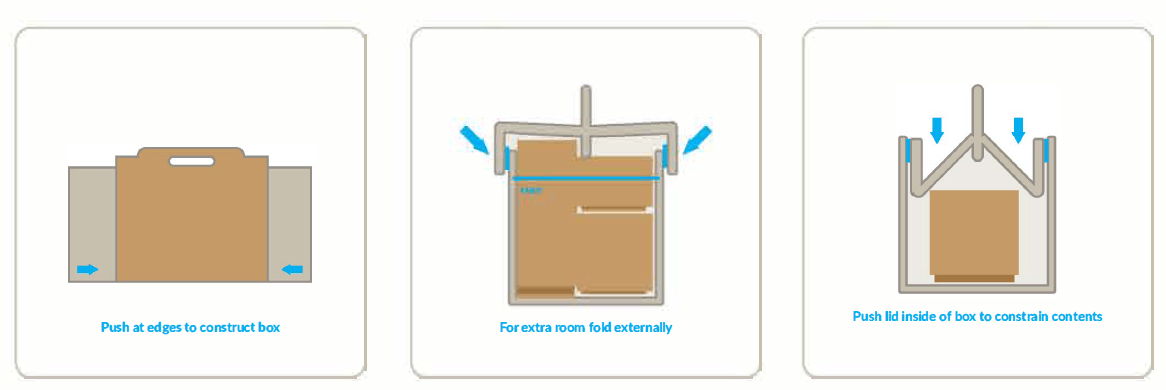
This question showed that participants identified the second instruction from the top as the one that meant they had to push at the sides with 69% off all participants choosing this option. The second chosen option at 22% shows that participant didn’t know and are unsure. Perhaps their surety would be clarified when the instructions were found in situ. This basis would be used as instruction on how to construct the packaging.
Visual research and sample collection
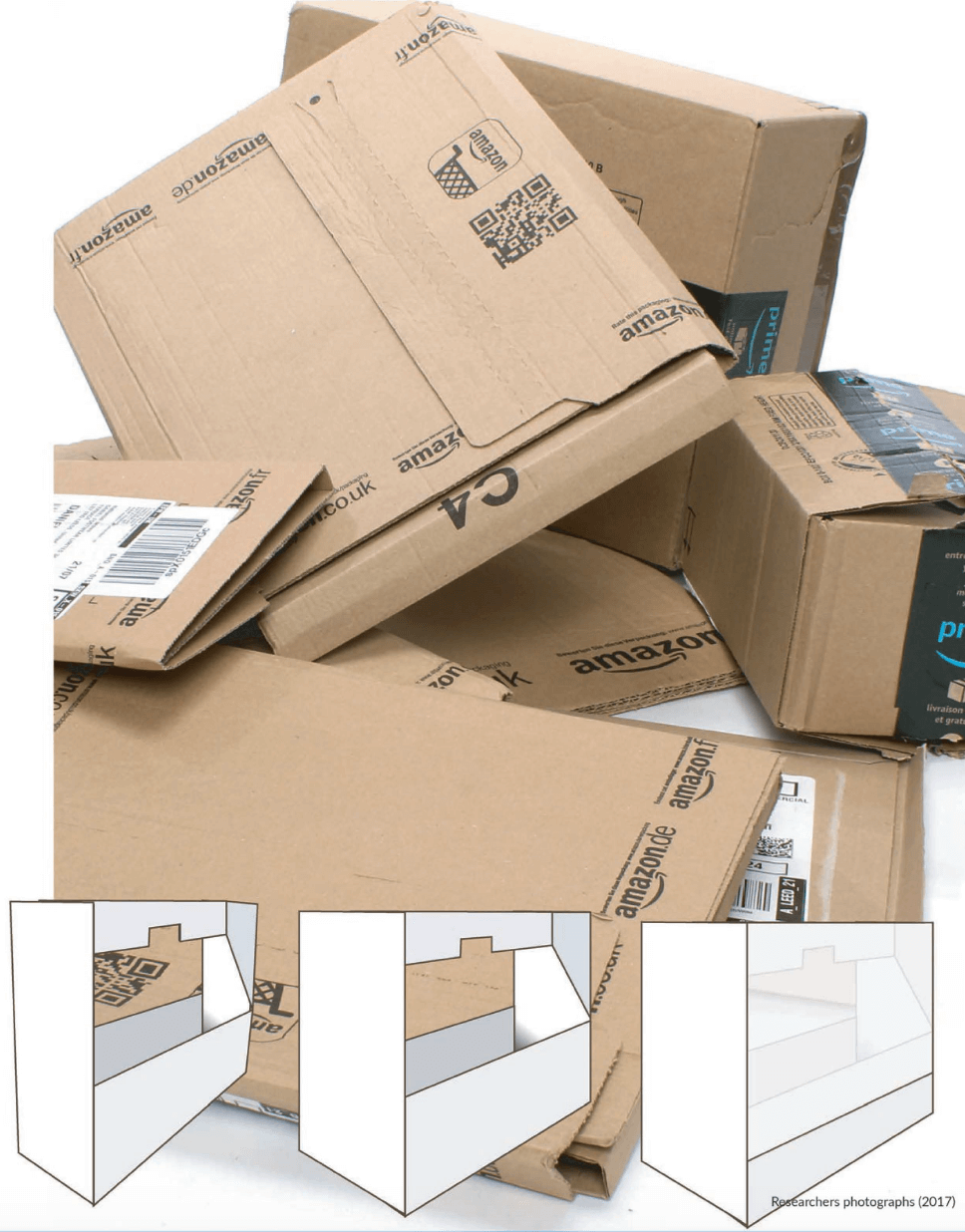
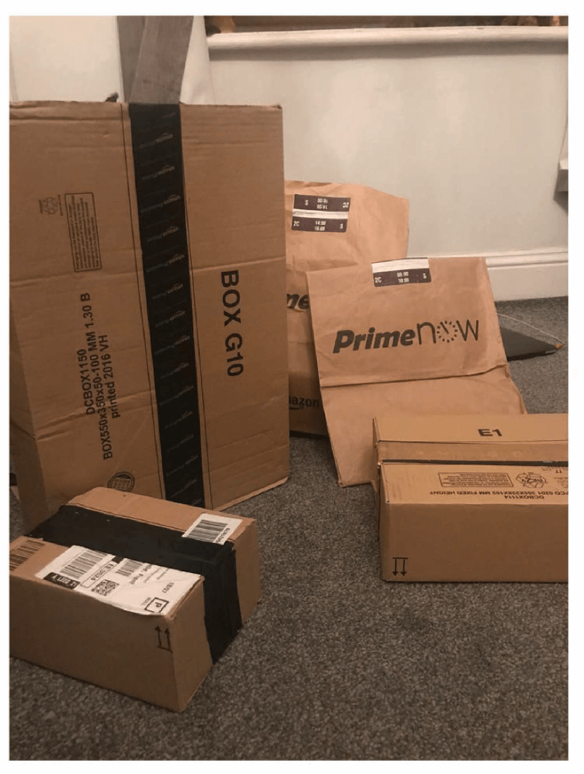
A collection of delivery packaging was completed during the project, the researcher determined through this collection and questions asked at the Amazon delivery centre that there are over 14 standard boxes used in Amazon fulfilment centres.
A website was found which had catalogued Amazon packaging used and documented at least 83 different types, this shows that there was no standardisation of Amazon packaging until recently.( Inc, I. 2014) This was reinforced by the more recent BBC documentary War on waste on which it was highlighted that Amazons packaging use was nonsensical and ill packaged items among Amazon is rife (BBC 2016)

Materials
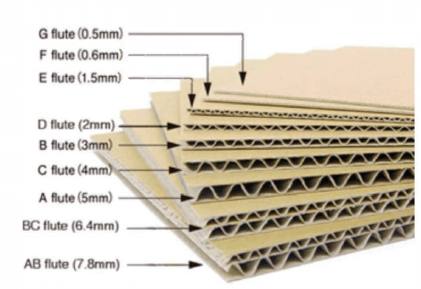
Literature review was used by the researcher to determine the best material to use for the designed packaging. It was found in interview with Daniel Graham (2017) that there is no specific material that could be recommended for any one type of packaging and each packaging was made from a materials which met the need of that specific packaging type. It was found using questionnaires what important factors we’re to the user and a material that best suited the need was found. Flute types The researcher found through literature review that cardboard was manufactured in different flute types which determined the thickness, strength and rigidity of the material. It was ascertained that the best material for the project would be an EE type fluted cardboard. EE Flute gave a thickness of 3mm and the strength needed to carry the recommended weight of 10kg.
Cardboard Coatings
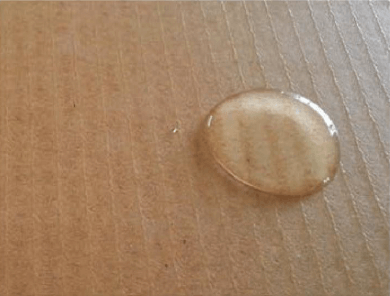
The researcher found to add strength to cardboard it is possible to coat the cardboard which increases protection to contents and adds strength to the packaging. It was determined that an oil or wax coated cardboard would offer shower protection to the packaging and contents and increase the strength of the overall design.
Recycling Compatible Adhesives
It was found through literature review that an adhesive that is easily recycled was needed, these are known as Recycling compatible adhesives or RCA’s.
The idea behind RCA’s is that when recycling the cardboard to pulp, the adhesive clumps in a way that ensures its stays big enough to collect and separate from the cardboard. This ensures that our final product is easily and readily recyclable, which is a positive for environmentally friendly consumers. Hot melt glue is the best adhesive to use when recycling is concerned. (Bennet 2015)
Reinforced paper tapes
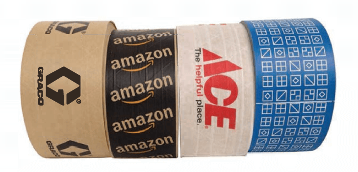
It was found through literature review and observation that the industry standard paper packaging tape with gum adhesive which is 100% recyclable and the best to use for design and branding purposes.
Instructional Design
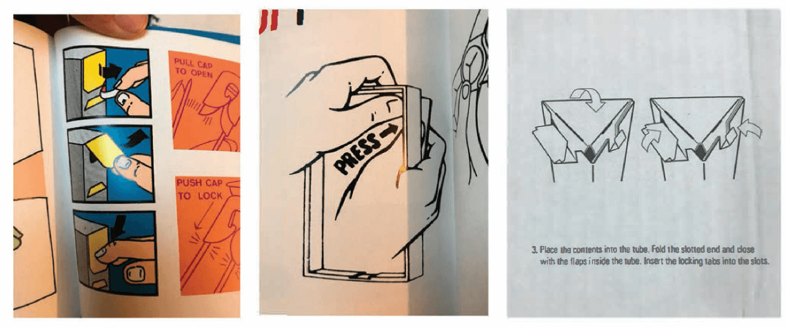
The researcher developed instructional design for the project which was re-iterated alongside developments in the packaging. Literature review and collection of found examples was used to understand techniques for packaging instructions. The instructions are designed within brand guidelines using the approved typefaces and symbols which will reinforce desirability for the brand and product.
The researcher developed instructions for aspects which were found to be less than easy for the user during usability testing. This would aid the ease and fluidity of use for the product and help to improve understanding of how to construct the package for the user.
Usability Testing
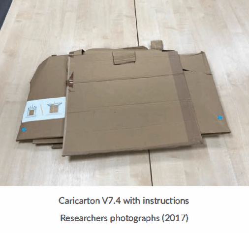
Further usability testing was conducted on prototype V7.04. The results are used to see if any problems with the final design still occurred and whether instructions to be used helped the end user with aspects of the box. 10 participants of mixed ability carried out the tests.
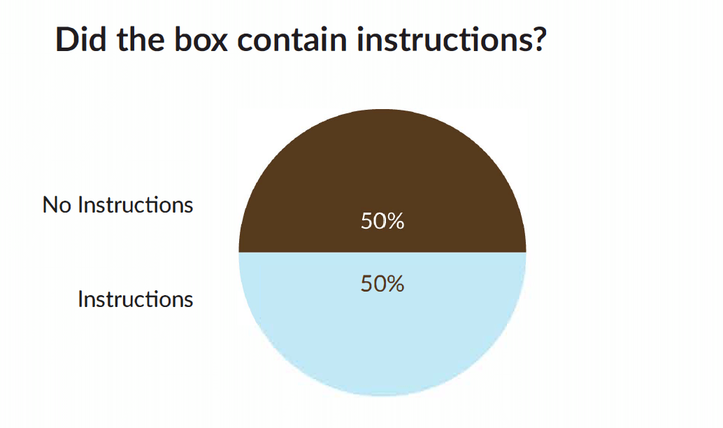
Because this usability test had elements of testing the successfulness of instructions, participants were split into 2 equal groups. One group contained instructional elements to the packaging, the other group did not.
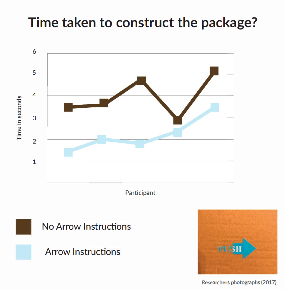
The above test was conducted with the 2 groups of participants, although both groups or participants constructed the package in a reasonable time, its clear from the results that those which benefited from the arrow instructions had a clear advantage over knowing exactly how to erect the package.
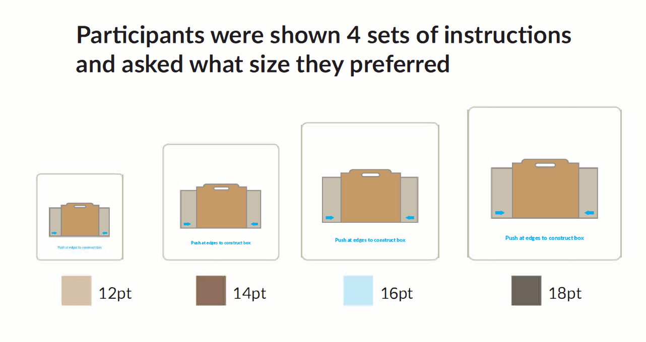
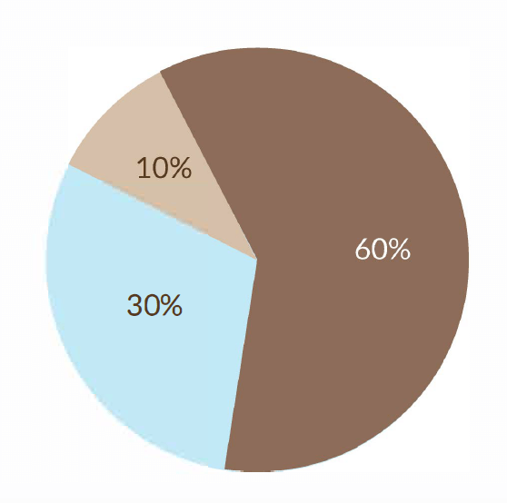
Participants are shown 4 sets of instructions and asked which size they can most easily read and find most appropriate for use, the pt size is relative to the instruction size so was used as a guideline to correspond with that which was chosen.
60% of participants picked 14pt as the best size of instructions to use.
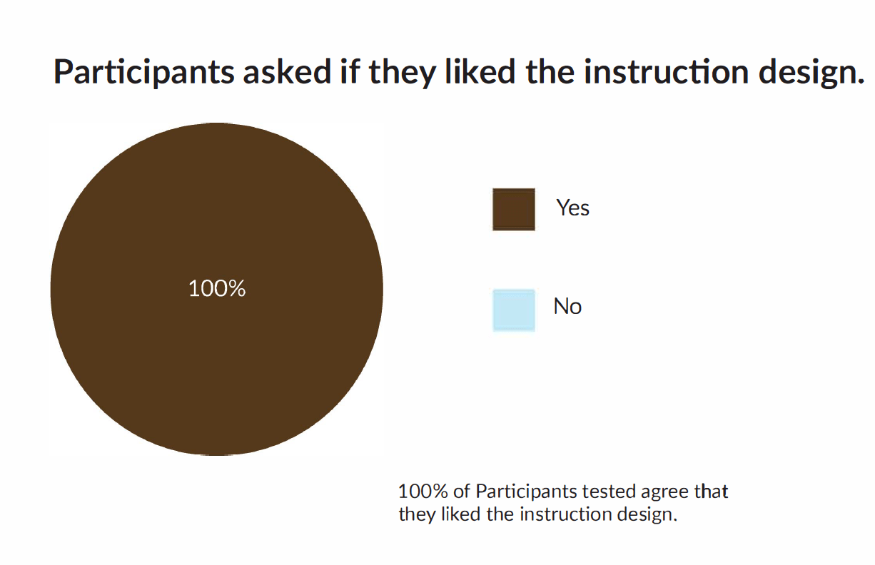
Comments by participants regarding the instruction design.
- Simple instructive colours and design style, very easy to understand.
- Easy to follow design with nice colour scheme
- Nice colour scheme and easy to understand.
- Nice colours and easy to understand.
- Easy to understand, looks like the box.
- Easy to understand, relates to the package.
- Easy to follow and good colour scheme.
- Looks nice and clean, easy to follow.
- Nice design easy to understand
- Easy to understand and looks like the box.
Usability Testing 2
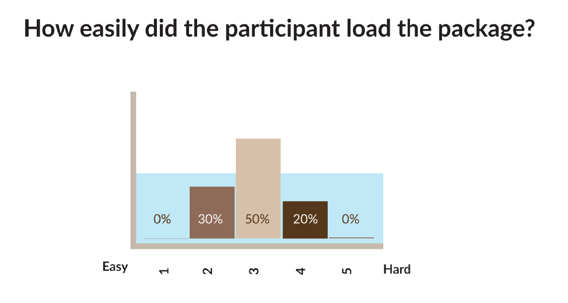
Participants are asked to load a package with 6 Amazon boxes. The researcher ensured that the boxes fit prior and observed participants loading the boxes into. The observer marked the participants on how easily they managed to get the boxes inside the package. The researcher found that all participants had some difficulty in loading the boxes into the package and marked them accordingly.
The researcher made notes on the progress of the participants and found that difficulties came about for 2 reasons. The high sides on the side of the box and the lid getting in the way of the person loading the package.
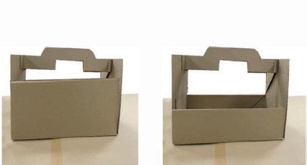
What do you like about this design?
Participants are asked what they like about the design. 60% of participants commented on the easy construction of the package, whilst 40% made comment on the strength of the design, both of which are desirable traits for this design.
- Construction is quick and easy.
- The construction of the package is very easy to work and is very simple to use.
- Easy construction, nice feeling handle and strong
- Strong and nice central handle.
- Simple design that erects easily.
- Sturdy and simple to construct, doesn’t take up much room when flat.
- Assembles easily
- looks recyclable and strong.
- Looks recyclable and holds a lot.
- Strong and assembles really easily.
What don’t you like about this design?
Participants are asked what they didn’t like about the design. 70% of participants said they disliked the lid of the box and 20% of participants said the sides are too high.
- The lid is a bit cumbersome and doesn’t appear strong enough.
- The high sides made the package hard to load.
- Hard to fit things into the box
- The lid is a bit inconvenient.
- Hard to find things like the tape on the underside of the lid.
- The lid gets in the way.
- lid gets in the way a little bit.
- A little confusing on how to use properly.
- The lid isn’t seamless and you can see inside the package
- The lid is a little flimsy
Participants are observed when asked to seal the package.
The 2 groups of participants, those with instructions (50%) and those without (50%) are asked to seal the package, they are then observed to see how easily they can locate the double sided sticky tape on the under side of the lid.
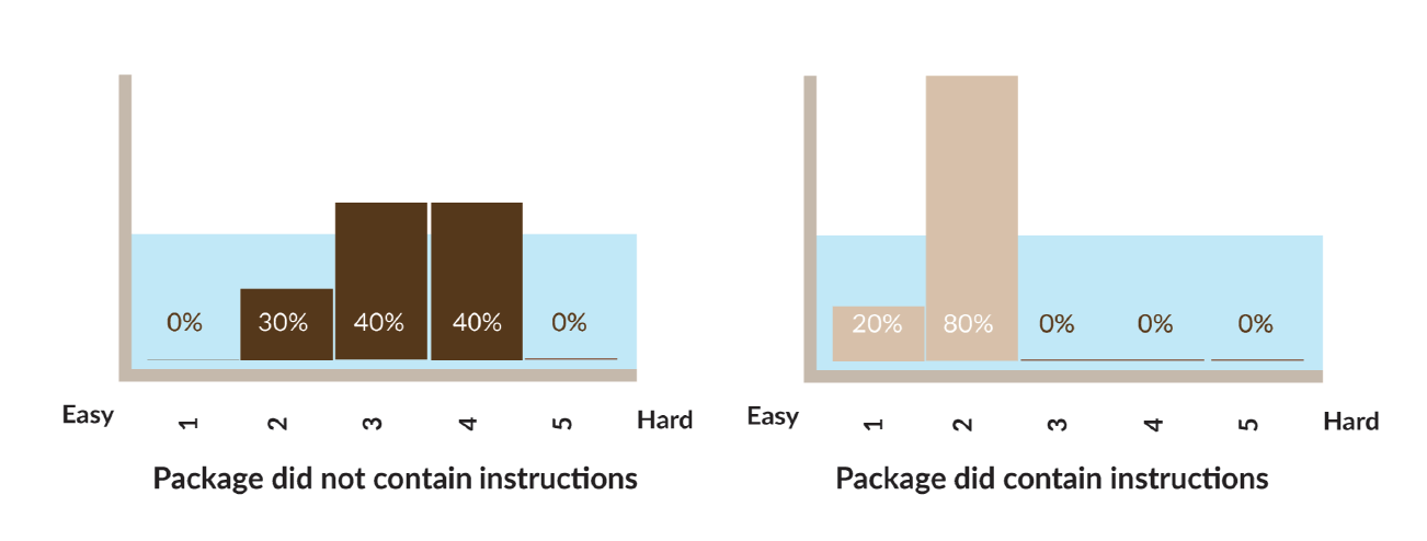
We can see that the participants who are provided with instructions found it easier to locate the double sided tape, they are observed to take less time and look in the right place than those who did not have instructions.
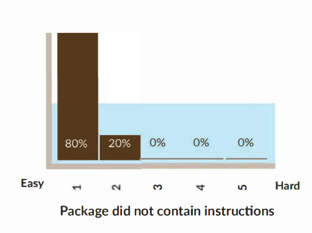
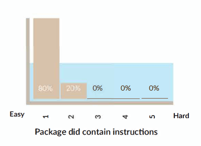
How easy was it for the participant to use double sided tape on the package?
After finding the position of the tape, the participant was observed to use the tape, it was found that none of the participant had trouble performing this task and that all participants tested knew exactly how to use the double sided tape.
Conclusion
The aim of the project was to design and develop a packaging for online shopping needs. The researcher developed a packaging for e-commerce in 2018. Branded the Caricarton, it is designed to meet the needs of a click & collect shopping service specifically for multiple purchase delivery. The Caricarton features the following elements which meet the criteria required of such delivery system.
Stackable design
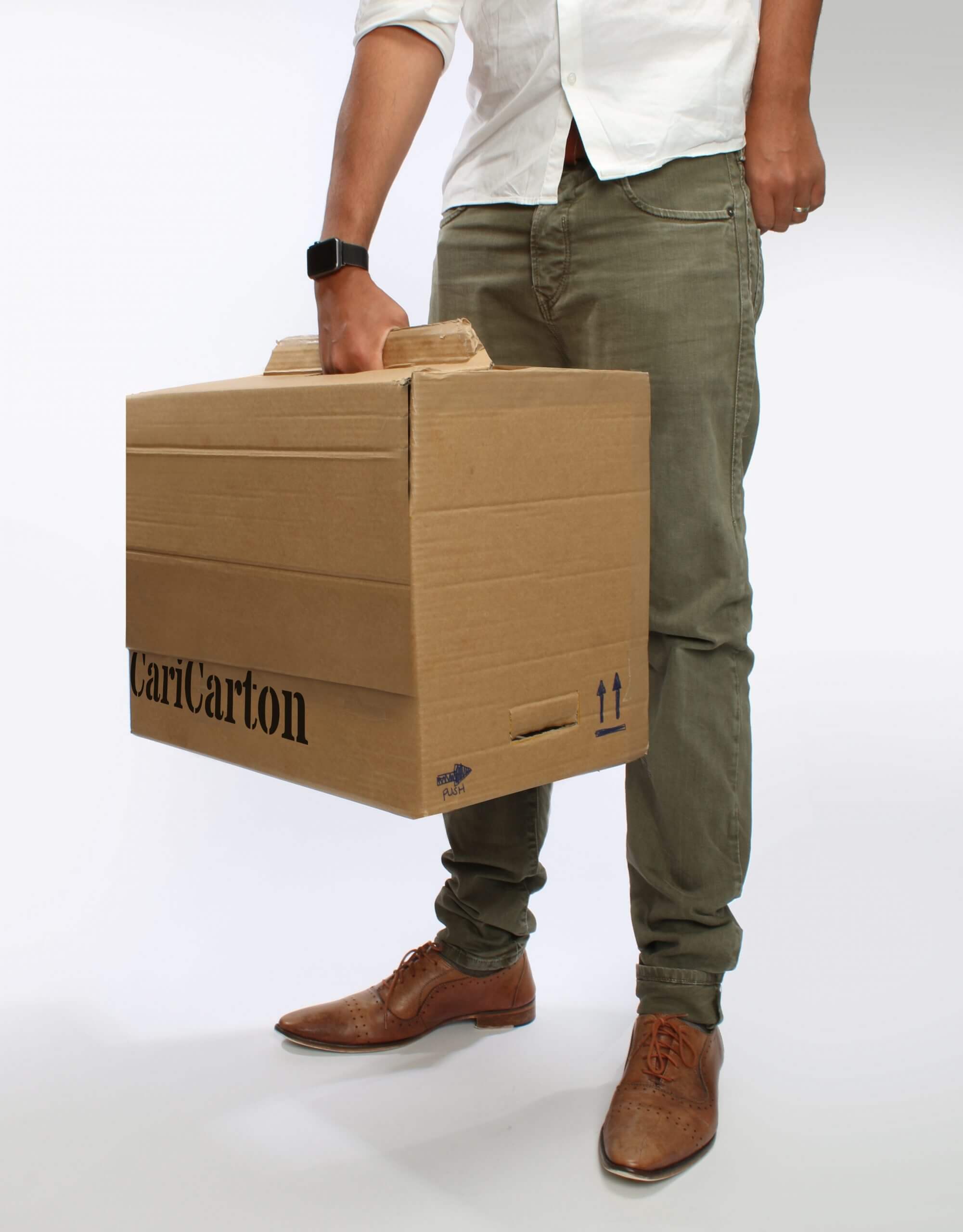
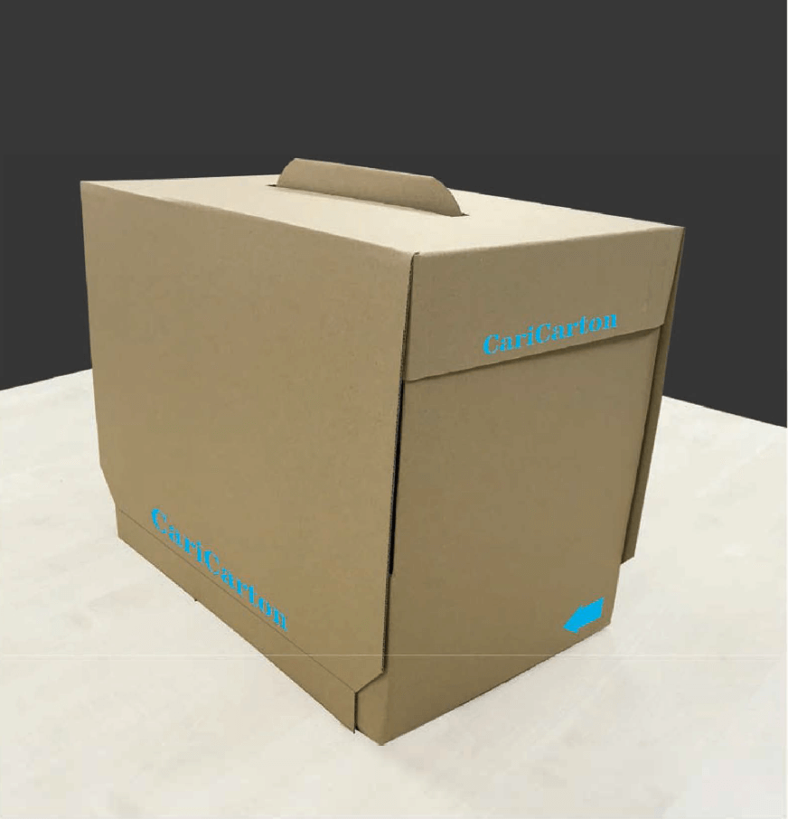
The Caricarton can stack on top of each other, the protruding handle fits into the recess in the crash lock and makes it stable to stack when fully erected.
Keeps contents secure
The Caricarton is fully seal-able keeping the contents both secure and private. Once opened with the zip lock, the Caricarton is evident when tampered with adding hat final element of security which was a major factor of importance when asked in online questionnaire 2.
Discreet external design
The exterior of the packaging is discreet giving an element of privacy to the end user. users showed that they preferred either plain packaging to minimal branding for this reason. This both cuts down on packaging theft and can potentially save embarrassment with online shopping.
Folds flat
Both the lid and the body of the package fold flat for easy storage. it is possible to fit at least 10 of the boxes into the footprint of 1 constructed box taking up minimal space.
Quick Construction
The Caricarton is developed to be as easy to construct as possible for all users. This is achieved with easy to understand instructions and intuitive design. Improving time to construct aids ease of use and allows packing workers in e-commerce fulfil their job role a lot faster and more efficiently.
Fits Click & Collect Locker
The primary usage are for the Caricarton is Click & Collect lockers, an ever growing popular way of shopping. The Caricarton fits these lockers exactly allowing the maximum purchases possible to be delivered and collected from these locations.
Self seal-able
Caricarton comes equipped with self seal tape that is already applied and strong enough to keep the package secure. The self seal tape is understood by all users tested and doesn’t require further instruction on how to use.
EE Flute Cardboard
EE Flute cardboard was chosen to feature in the final design, this wasn’t achievable in the prototype due to manufacturing limitations.
EE Flute cardboard provides Caricarton with the strength required whilst still being thin enough to not feel so robust to the user.
Easy to understand instructions
The caricarton’s instructions are designed to be as simple as possible, designed using usability testing and questionnaire techniques, they are both on brand and easy to follow.
Single handed carry design
The Caricarton features a single central handle. This is to aid the user in carrying other items, opening doors or completing other tasks with their free hand. This was a positive for the target audience as the location of click and collect lockers are usually supermarkets where the user is more than likely to be carrying other items already.
Strong
The design of the Caricarton has been made as strong as possible with the material, this is to protect the users purchases and increase longevity of the package cutting down on waste and helping the user reuse as much as possible.
Reusable
adding to the trend of reducing environmental impact, the Caricarton features a reusable design that can be folded flat when the user gets home and re-used, either to return an unwanted product or for any other purpose you see fit.
Recyclable design
The Caricarton is widely recyclable. Using kraft cardboard that can be made from already recycled material and recycling compatible adhesives it has a very good environmental impact as opposed to using plastic bags to carry your purchase.
Branded internally
Questionnaire results showed that participants didn’t like advertising or branding on the outside of the packaging. An internally branded package was preferred just as much as a plain package, but significantly more than an external branded design.
Easy Open
An easy open design was used for the Caricarton. Although questionnaire results suggested this was not a necessary requirement, it only aided the final design in elements of security and ease of use.
Holds 10kg
Caricarton was tested with weight of 10kg and carried over 1 mile in distance. Although an Amazon pantry box is twice this weight, it was deemed impossible for the user to lift at this weight and suggested that 10kg alone was already a heavy weight for the average user.
Separate lid design
After extensive usability testing, it was finally decided that the initially designed caricarton made from a single piece of cardboard made loading too hard for the user and didn’t look as good aesthetically. A separate lid design was chosen.
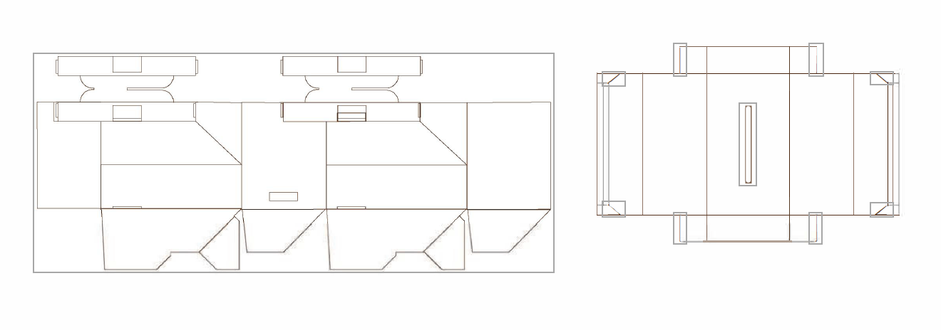
Net design
The net for both the Lid and the base fit on a single sheet of cardboard 1.2m X 2m in size. This is a standard size, available from most board mills and creates minimal waste with most of the board being used and the rest being recycled at point of manufacture.
Caricarton is a project that created an e-commerce packaging for shopping habbits in 2018. The project develops a packaging type beneficial to all stakeholders involved with e-commerce shopping. From the warehouse packers and private shoppers in a supermarket to the end user that actually collects their shopping from the locker itself. Every users journey has been considered in an effort to develop the most suitable packaging to this type of shopping.
Caricarton is developed formostly for multiple item shopping online. Research has shown that this is a viable near future concept with implementation just around the corner.
The design has taken into account ease of usability, environmental impact and aesthetical priorities. The researcher feels that a viable product has been concluded, that is easy to understand and operate, whilst giving environmentally ethical impressions to the user. The researcher believes the design of a product shouldn’t make the user think, but become second nature. This is why Caricarton has been created to be as intuitive as possible, easy to use for each and every person. Iterations have been design and improved at every stage taking every users feedback into consideration. Every change made has directly been influenced by the user and made to their preference.
Arora, D.N. 2013. THE BUZZ OF THE WORD GREEN IN HACKING COMPETITION. international journal of marketing, financial services & management research . 2 (1), article no: 2277-3622, p.121. [Accessed 13 January 2017]. Available from:
http://www.indianresearchjournals.com/pdf /IJ M FSM R/2013/ January /13.pdf . Amazon.co.uk. (2017). About Amazon Pantry. [online] Available at: https://www.amazon.co.uk/gp/pantry/info/ref=pntry_wayfind_7 _1 [Accessed 20 Nov. 2017] Amazon.co.uk. (2017). Amazon Locker – a self-service kiosk to collect your parcels. [online] Available at: https://www.amazon.co.uk/Click-and-Collect-with-Amazon-Lockers/b?ie=UTF8&node=2594544031 [Accessed 14 oct. 2017]. BBC. 2016. Hugh’s war on waste . [Accessed 14 January 2017]. Available from:
https://store.bbc.com/hughs-war-on-waste/hughs-war-on-waste . Bennett, S. (2015). How to Recycle Glue and Adhesives . [online] RecycleNation. Available at: https://recyclenation.com/2015/09 /how-to-recycle-glue-and-adhesives/ [Accessed 14 nov. 2017]. Chaleil, J. 2016. The Strategy behind Click and Collect by lockers! I Techingrocery.
[Accessed 12 February 2017]. Available from:
https://www.techingrocery.com/i nd ustry /click-and-collect/ . Guruswamy, M. 2014. Online Shopping Habits and Consumer Behaviour: A Study on Consumer Behaviour … – Murali Guruswamy – Google Books . [GRIN Verlag. [Accessed 12 February 2017]. Available from:
https://books.google.co.uk/books/about/Online_Shopping_Habits_and_Consumer _Beha. html?id=ey _iAgAAQBAJ&redir _esc=y&hl=en IMRG. 2016. Click & collect update (april 2016) . [Accessed 16 January 2017]. Available from:
https://www.imrg.org/imrg-insight/click-collect-update-april-2016/ . lncompetech.com. (2018). Amazon Boxes. [online] Available at: https://incompetech.com/gallimaufry/amazonboxes.html [Accessed 14 feb. 2017]. Lunden, I. (2013). EBay debuts its answer to Amazon lockers: Click & collect at retail stores, while eBay now goes abroad . [online] Available at:
https ://techcru nch .com/ 2013 I 09 I 2 4 I ebay-bridges-on Ii ne-a nd-h i gh-street-wi th-c Ii c ka ndcollect-servi ce-i n-the-u k-a rgos-fi rst-pa rtner / [Accessed 16 Feb. 2017]. twenga solutions (2016). E-commerce in the United Kingdom: Facts & figures 2016.
[online] Available at: https://www.twenga-solutions.com/en/insights/ecommerce-unitedkingdom-
facts-figures-2016/ [Accessed 8 Jan. 2017]. Wheeler, A. (2012). Designing brand identity: An essential guide for the whole branding team . 4th ed. United States: John Wiley & Sons Canada.
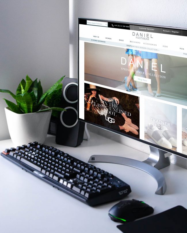
Danielfootwear.com
One of my main clients, I have designed pretty much everything for Daniel, from shop POS, Packaging to their website and even their App. I was their senior designer for 5 years. When designing for Daniel, i tried to use good clean eCommerce design principals that showcased the products effectively and gave a high end look to their web stores and shops. High quality materials were used in print work and creating a sense of luxury was achieved throughout.
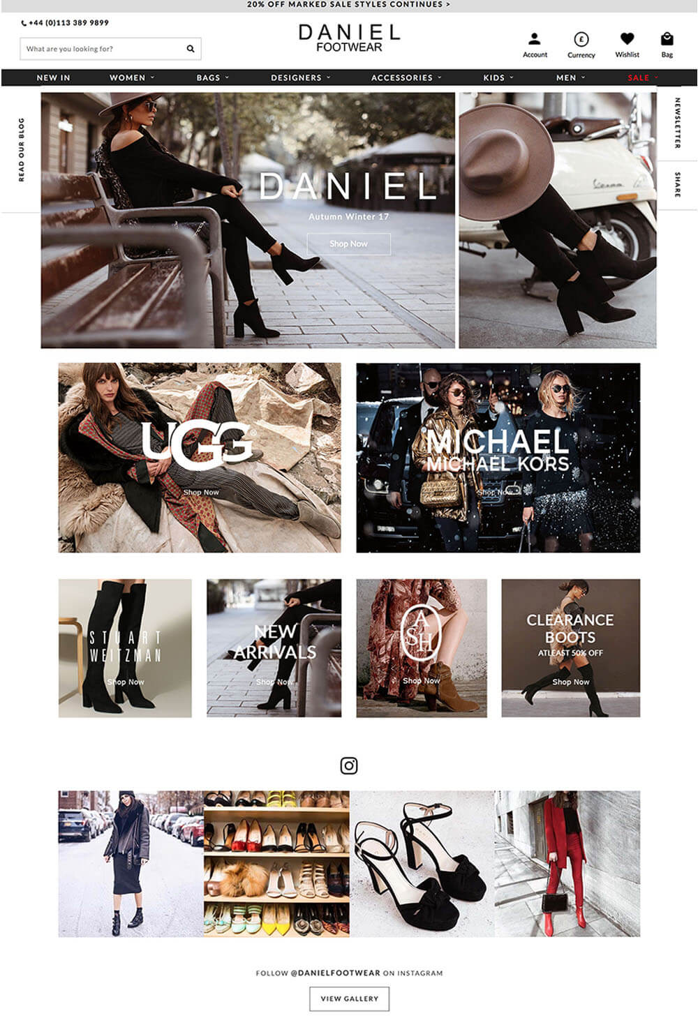
Design Everything
At Daniel I was the senior designer. In fact, honestly, I was the only real designer and thus did pretty much everything to do with design. I had to update the website on a regular basis whilst keeping consistency across the brand and delivering fresh content and promoting new stock daily.
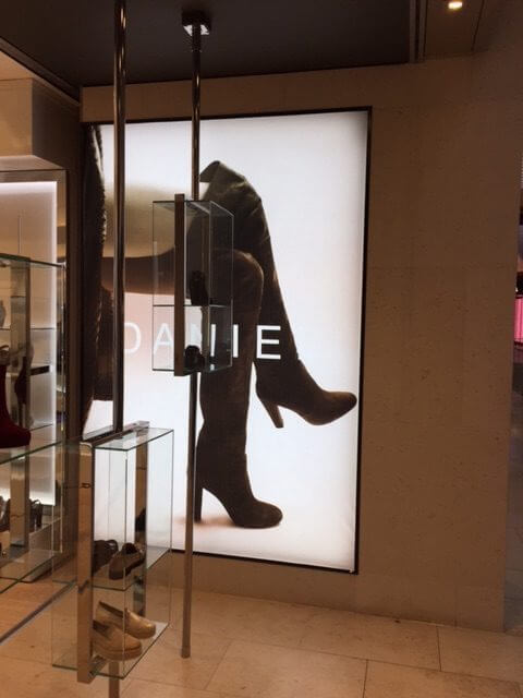
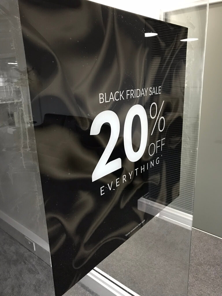
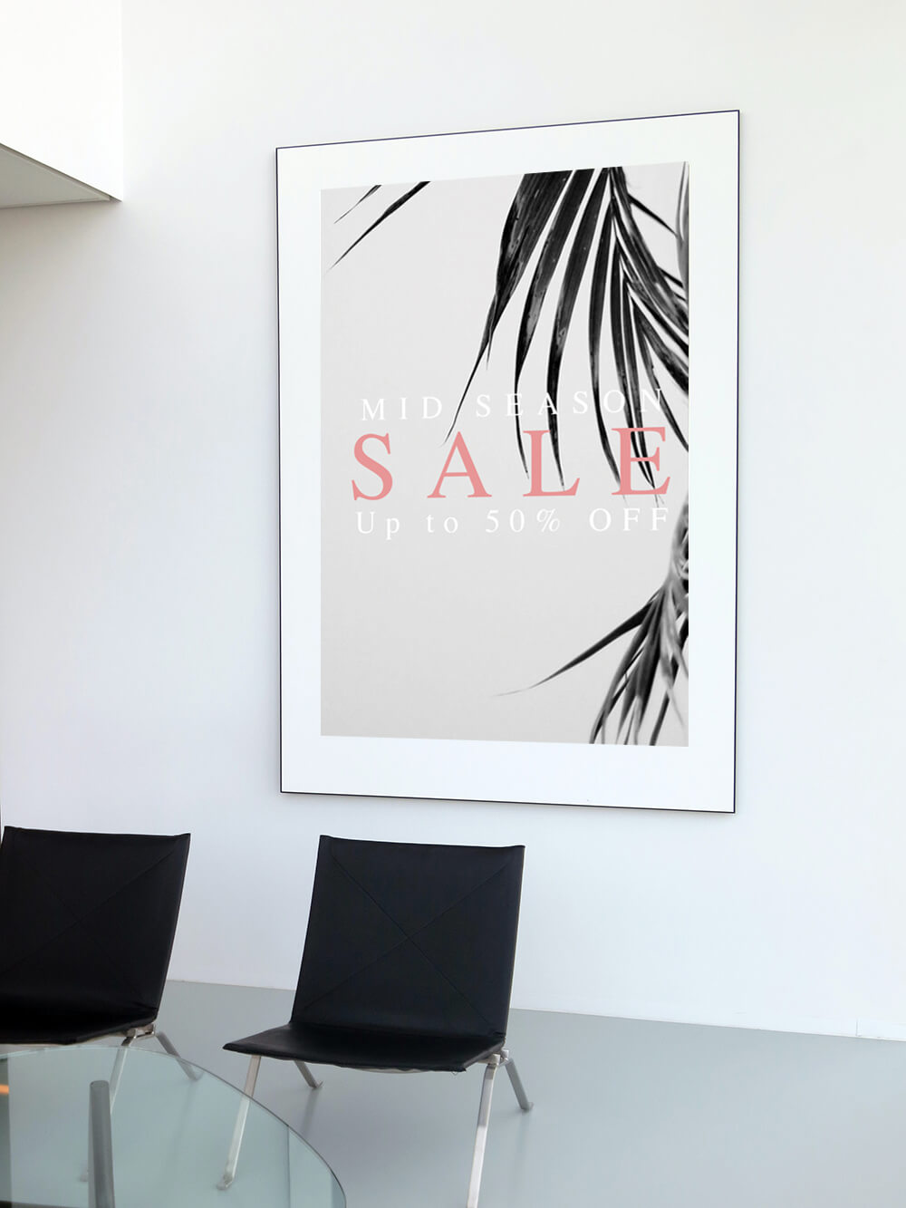
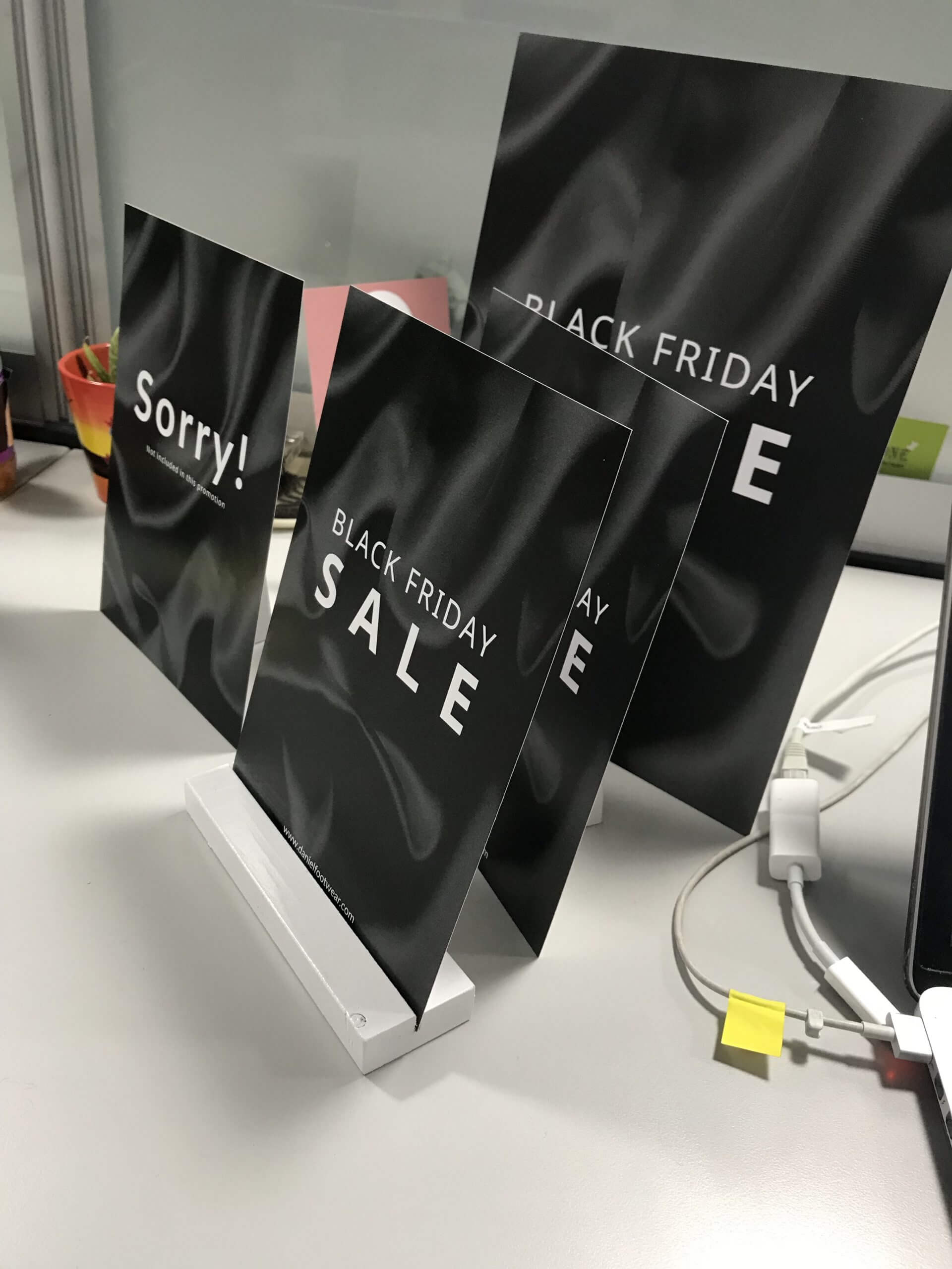
POS Design
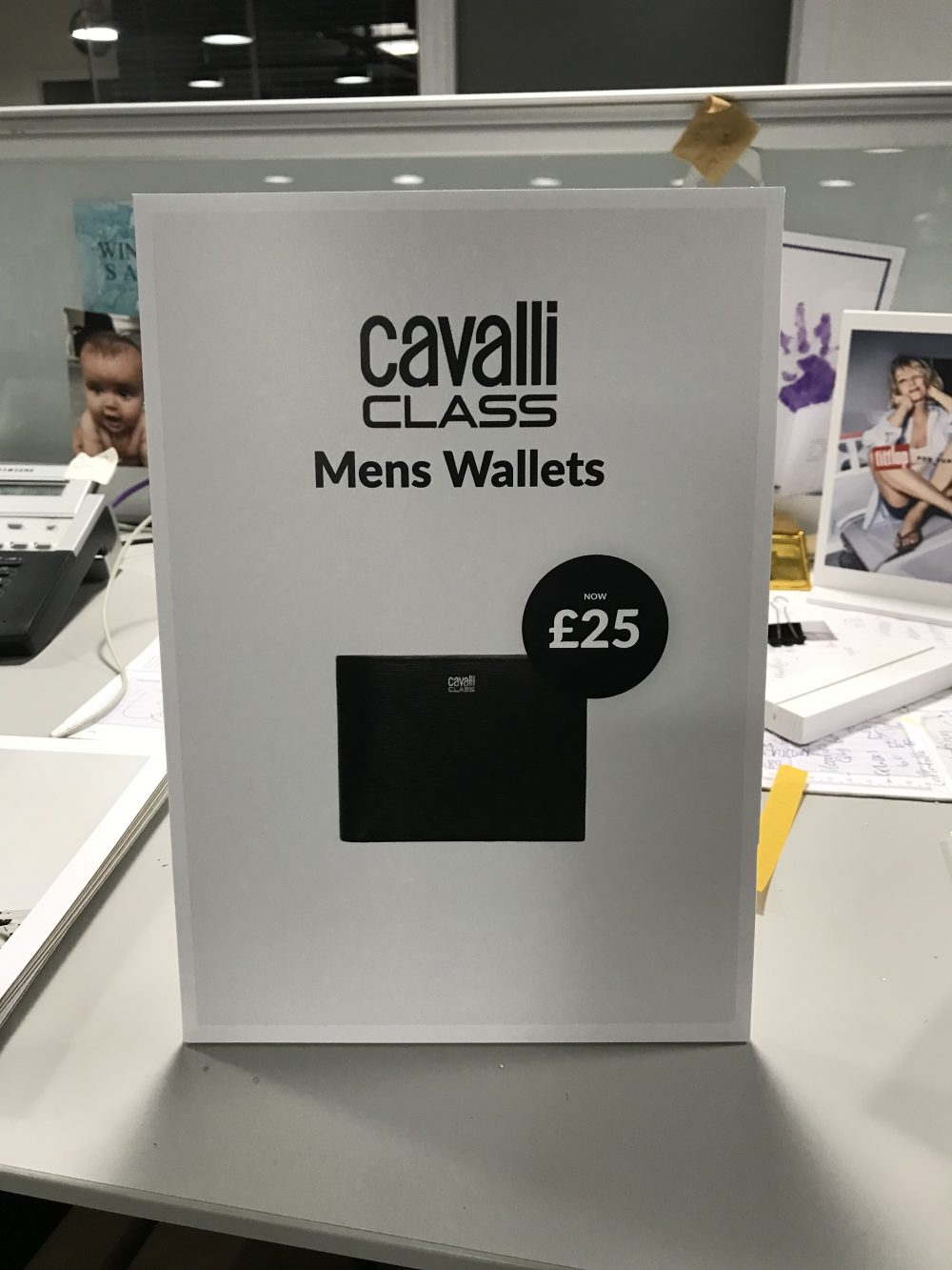
New designs for POS had to synchronise with the marketing calendar. Sale in retail is frequent, and it was a requirement to keep up with new, fresh, creative concepts .
Email Design
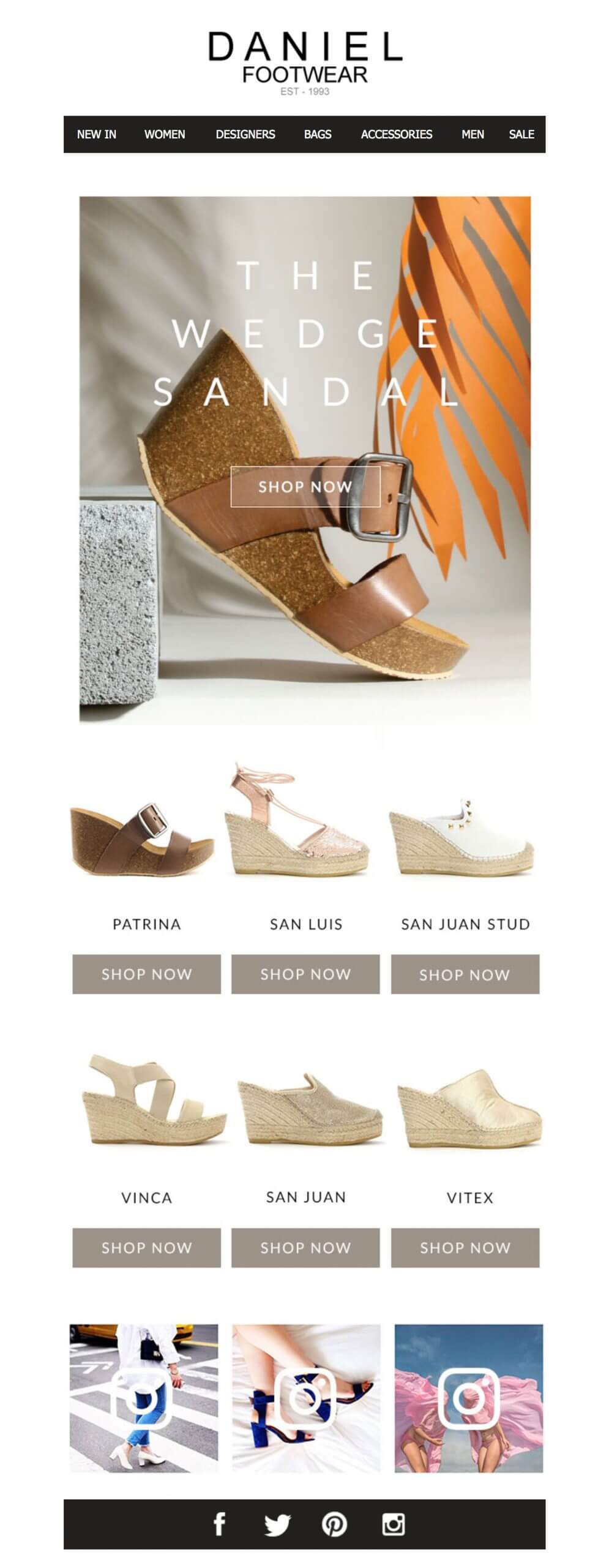
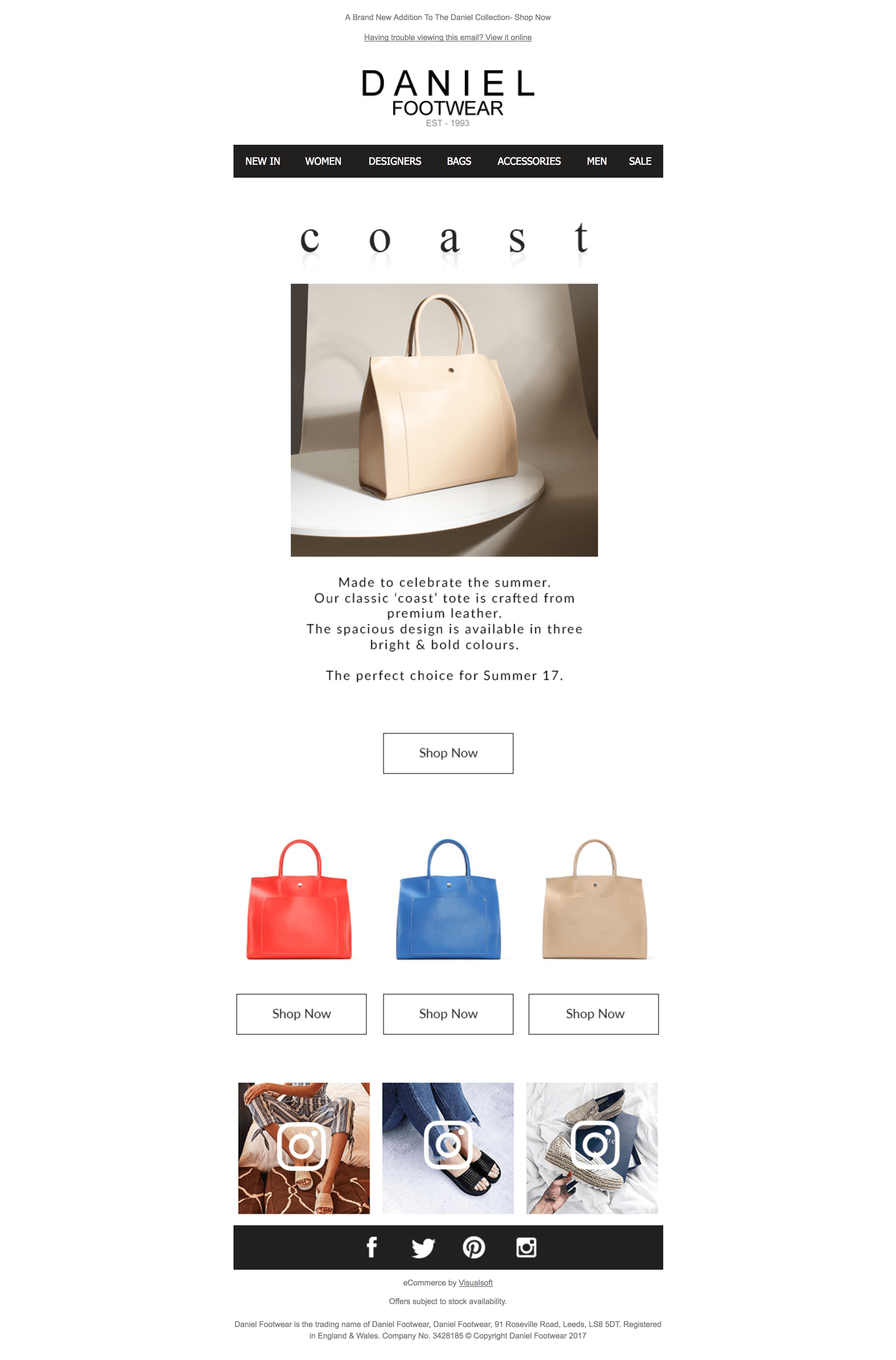
A minimum of 5 emails a week were designed by myself for Daniel footwear, these would promote the new stock using fresh product photography and studio shots which were sometimes directed by myself.
Shop Signage


The Creative Spirit of John Curry
This project was a print design project do design and layout a creative journey of dance and ice for Balbir Singh Dance Company. The purpose of the document was to present in a diary format a curation between dance and ice, a pastiche of the ice skating legend, John Curry.
ONLINE RSVP
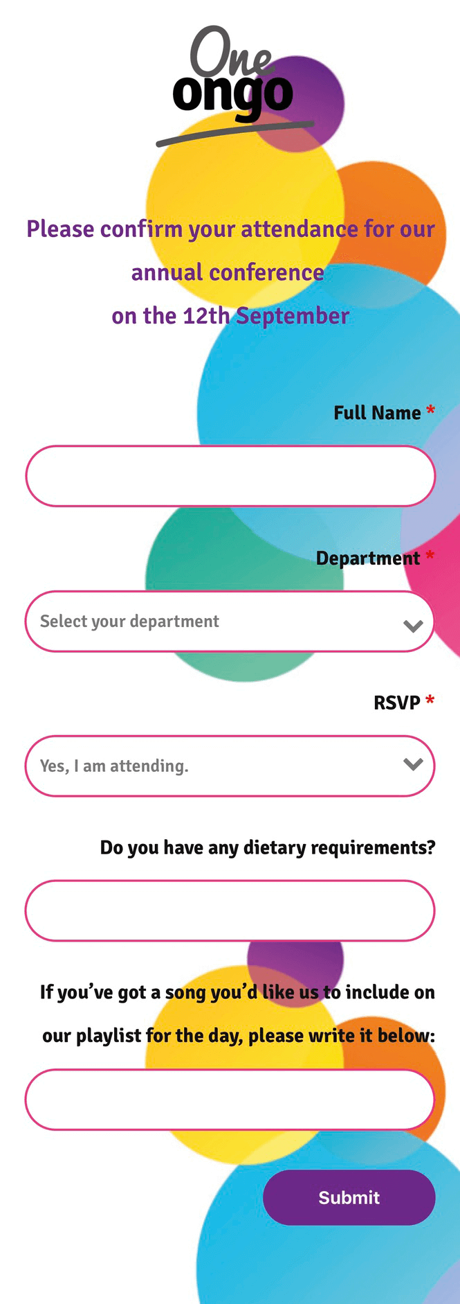
This annual conference event held by Ongo Housing had an online registration form which was emailed to delegates with the relevant fields to fill out. It had follow up emails and gathered important data for the live event.
Ongo had stringent brand guidelines that had to be adhered to at all times, when creating this RSVP portal these had to be added using custom fonts, colours and HTML, CSS.
Micro transactions per minute
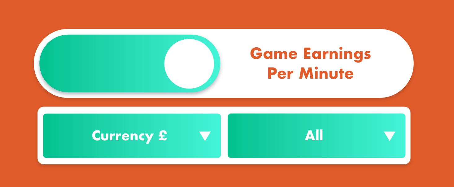
This UX/UI Design project was to develop a promotional micro site for online casino based client. It was developed as a social media share to encourage users to play their online games by demonstrating the profitability of online gaming.
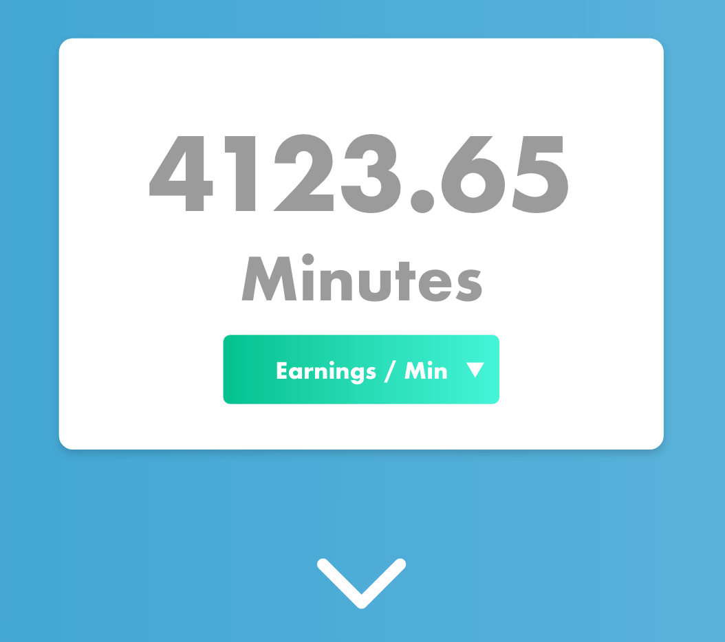
By using a visual display of top gossing games and a salary comparison generator that showed how much an e-sports player could earn the micro site would encourage gamers to spend via the online casino.
Adobe XD
Micro transactions per minute was designed using Adobe XD.
The link was shared with developers to collaborate on the project so they could get a better feeling of how the page was formed and how interactions should happen.
Logo Development
A logo was developed for the campaign which was stylised similar to the main branding for the client.

Navigation Design
familiar user friendly controls were developed for the project which used UI controls that the user would instantly recognise making the site controls easy to navigate.

Project N
A repeat client, Project N is a barber who started working at another salon and eventually opened his own.
I had developed a traditional barber logo for him previously which he loved and returned wanting something more modern for his new salon.
The client also required print work and commissioned some luxury quality business cards and flyers.

The Hairfarm
An interesting future prediction brief, this was a student project from when I was studying my MA Design circa 2016. Set by world renowned branding agency Elmwood, the task was to design and develop the concept for a barbershop in the year 2026. Complete with UX app development using Proto.IO and concepts for a future proof idea. A service where hair was recycled to produce food by processing Dermestadae beetles into beef flavoured patties (I know crazy right.) and an online booking for a barbershop concept was conceived (Booksy wasn’t even on the radar yet.) the hairfarm earnt the user credit every time they got their barnet refreshed.

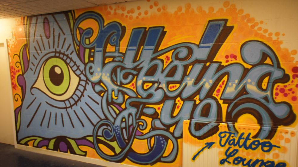
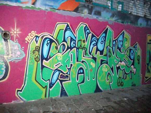
Graffiti Art
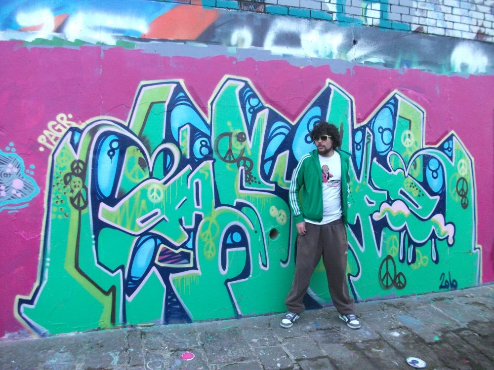
I started my graphics career around the age of 11 or 12 drawing on walls. It was a pure form of graphics and sparked my love of typography and colour. I don’t often pursue this media anymore, maybe once or twice a year if I’m lucky. But something about it still rings true.
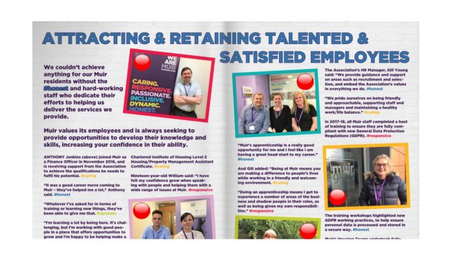
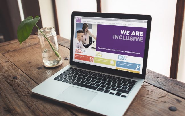
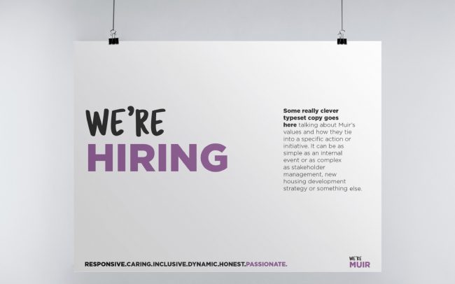
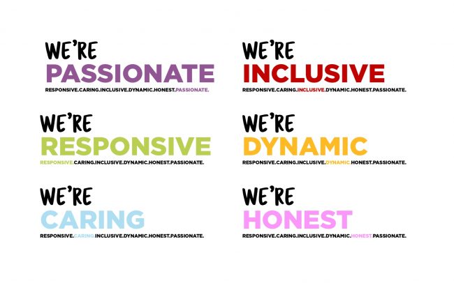
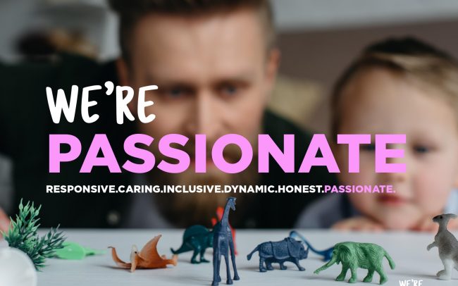
WE’RE MUIR
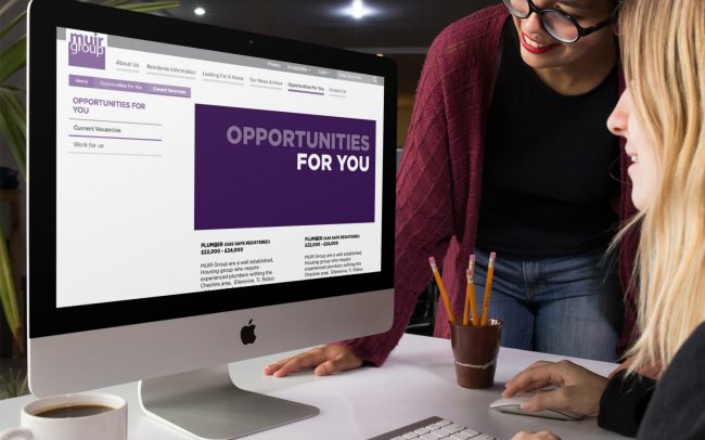
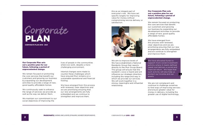
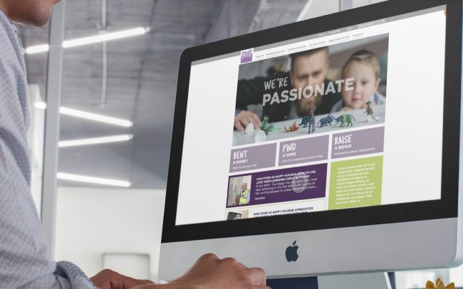
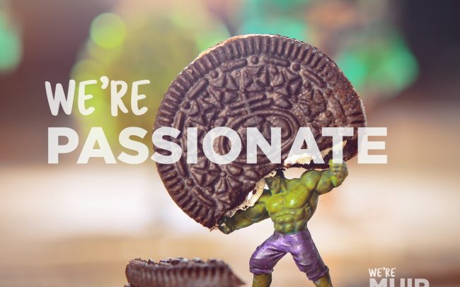
Muir are a UK housing association that although have brand guidelines, they aren’t using this properly. This branding presenter was made to illustrate what they are currently doing incorrectly and where they could take their branding for a brand refresh.
Creative Print
I do a lot of invitations, wedding stationary and other event printing. I specialise in high quality print techniques and finishes whilst bringing unique ideas using unconventional print techniques. This allows me to explore capabilities within print and gives me a good understanding of technical terms.
Please find below a small selection of these works.
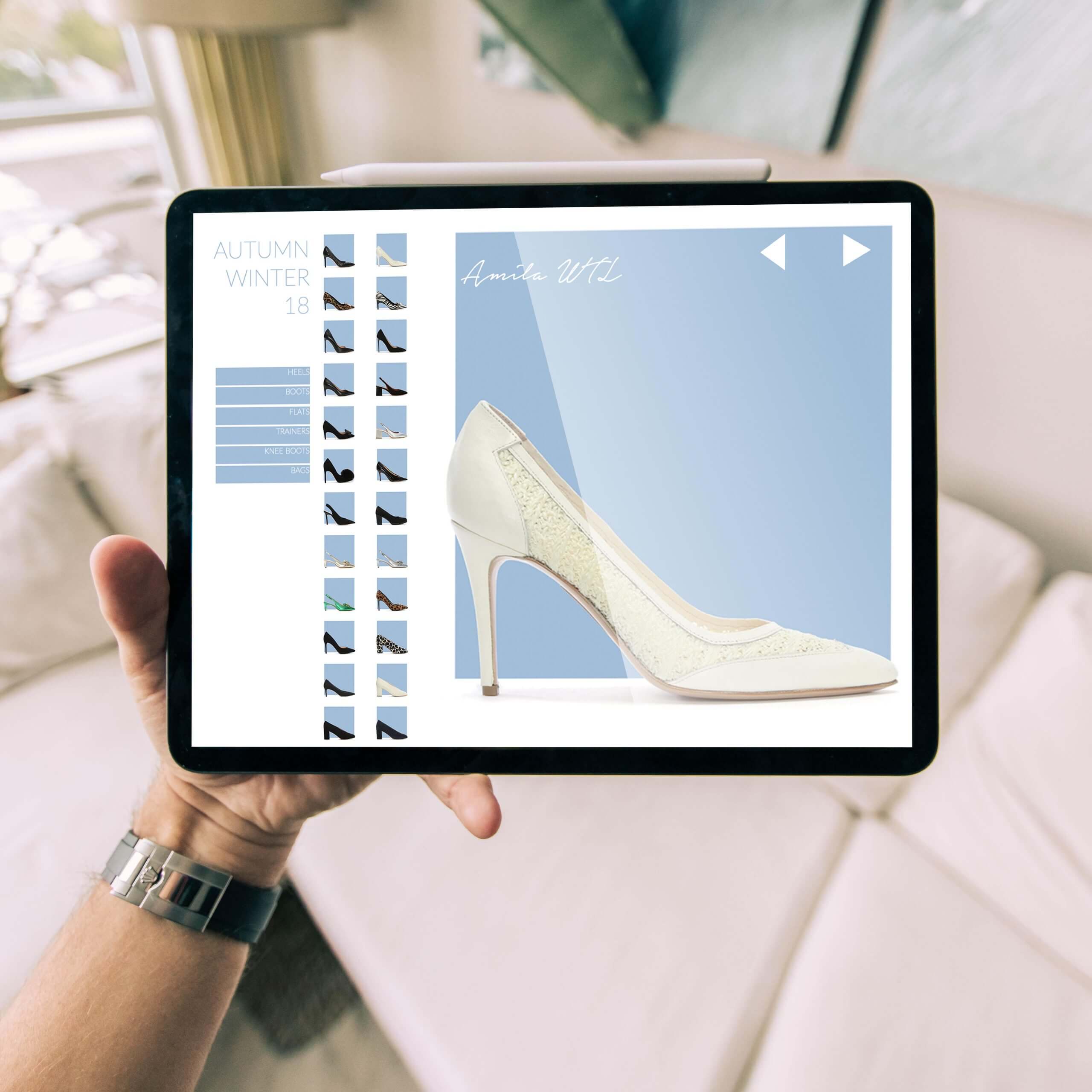
DANIEL FOOTWEAR LOOKBOOK
Having an interest in brutalist web design I wanted to create something new and functional whilst still being clean and usable.
For the Daniel footwear lookbook, the aim was to show off the seasons range in a visual way which was easy for the user to navigate whilst still being minimal, barebones and self explanatory.
INTERNAL BRANDING FOR A CREATIVE AGENCY
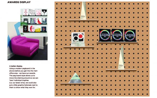
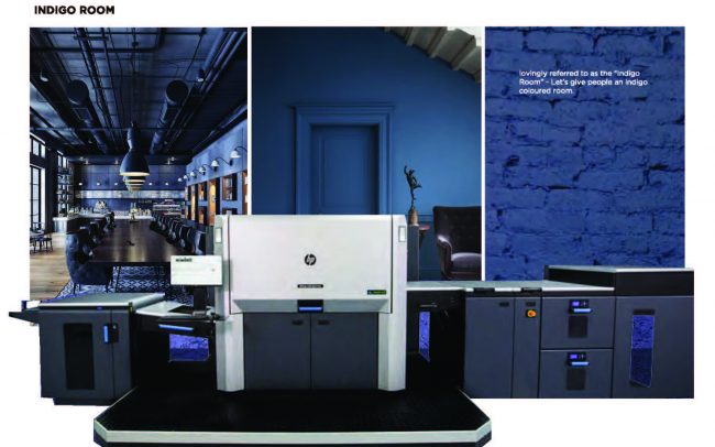
One of my last jobs whilst senior designer for resource was to re do the internal branding. This was to make the place feel more creative and increase client engagement whilst on site visits. Below is a presenter on how ideally I would have rebranded this agency into the creative practice it deserved to be.
Good Food, Not Fast Food
After developing the brand image for Mully’s Kitchen, they came to me to make them a website.
Tired of paying subscription fees for Just-eat, a place was required for a customer to place an order Online, pay and have food delivered.
A fully functional and on brand website was created which could be built upon and gave their social media presence. This is the start of that journey.
MullysKitchen.com
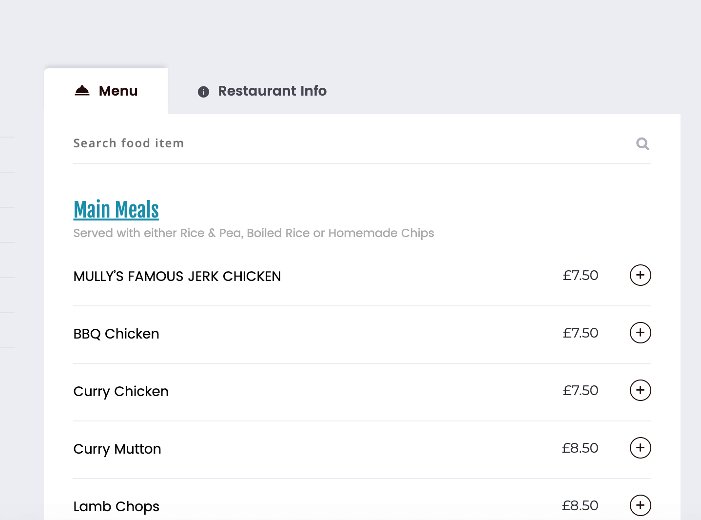
ONLINE MENU
An online menu was created, fully customisable by mullys kitchen, the price is editable bu the User and they can also add extras to make a meal complete.
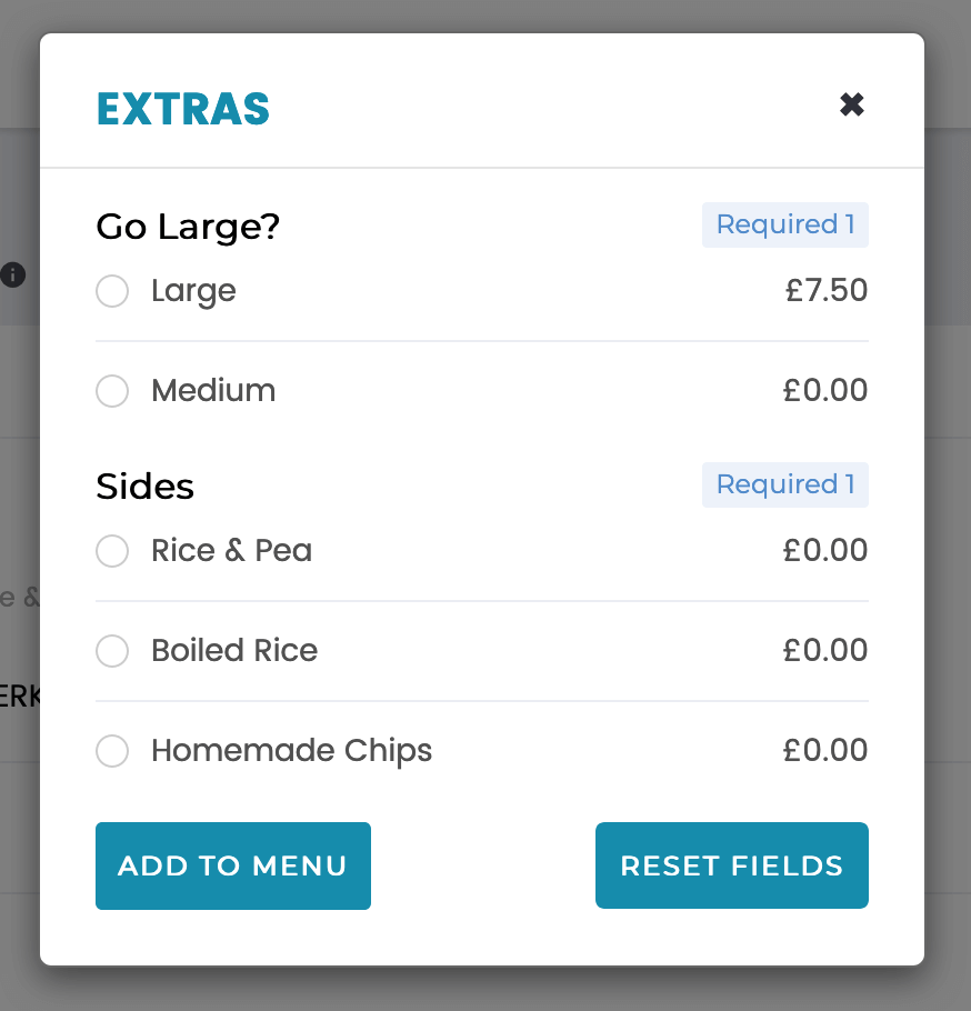
Social Media
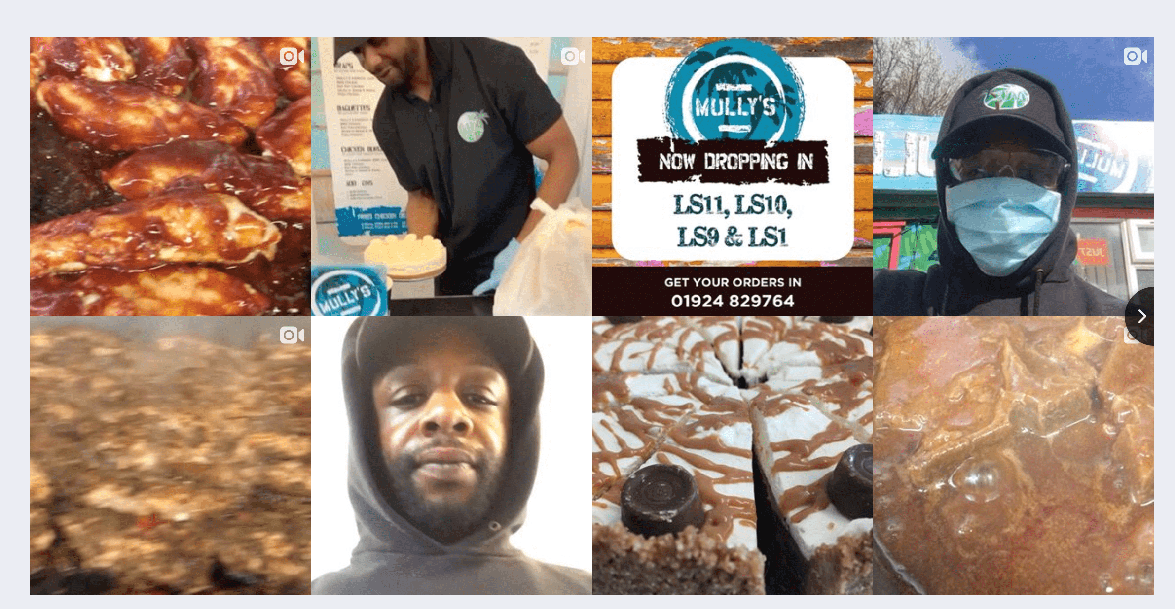
Mullys kitchen is extremely active on Instagram and also needed social media to be a prominent feature on their webpage. This was integrated with realtime updates so any changes on instagram showed instantly on the website.
User Sign Up
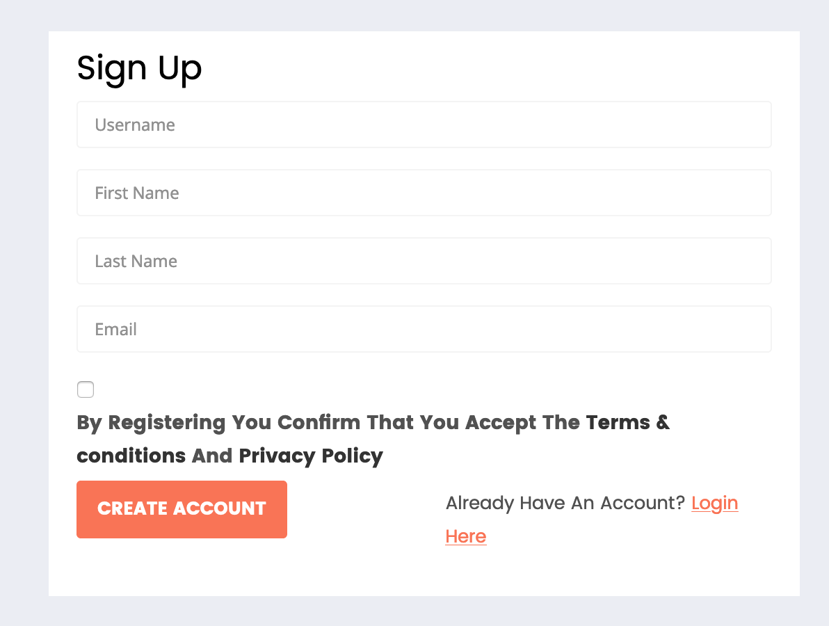
An inbuilt form where a user needed to sign up before they ordered was added. This captured details in a database such as email address to allow future contact and also created an account so the user did not have to enter their email address again in future.
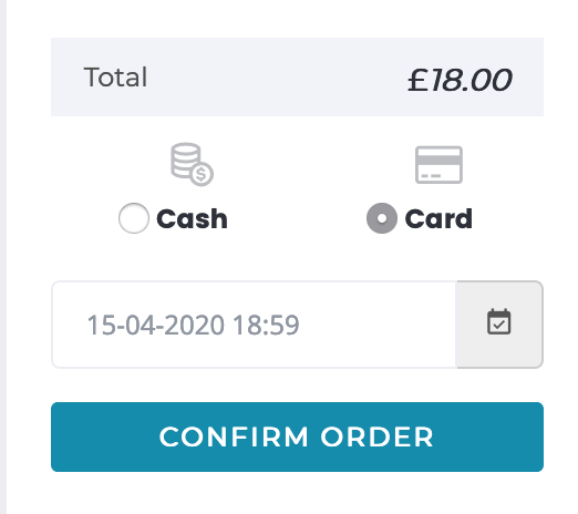
Card Payments
A method to pay by card was added to the system, this used strip as a payment gateway and accepted all current payment standards and included apple pay.
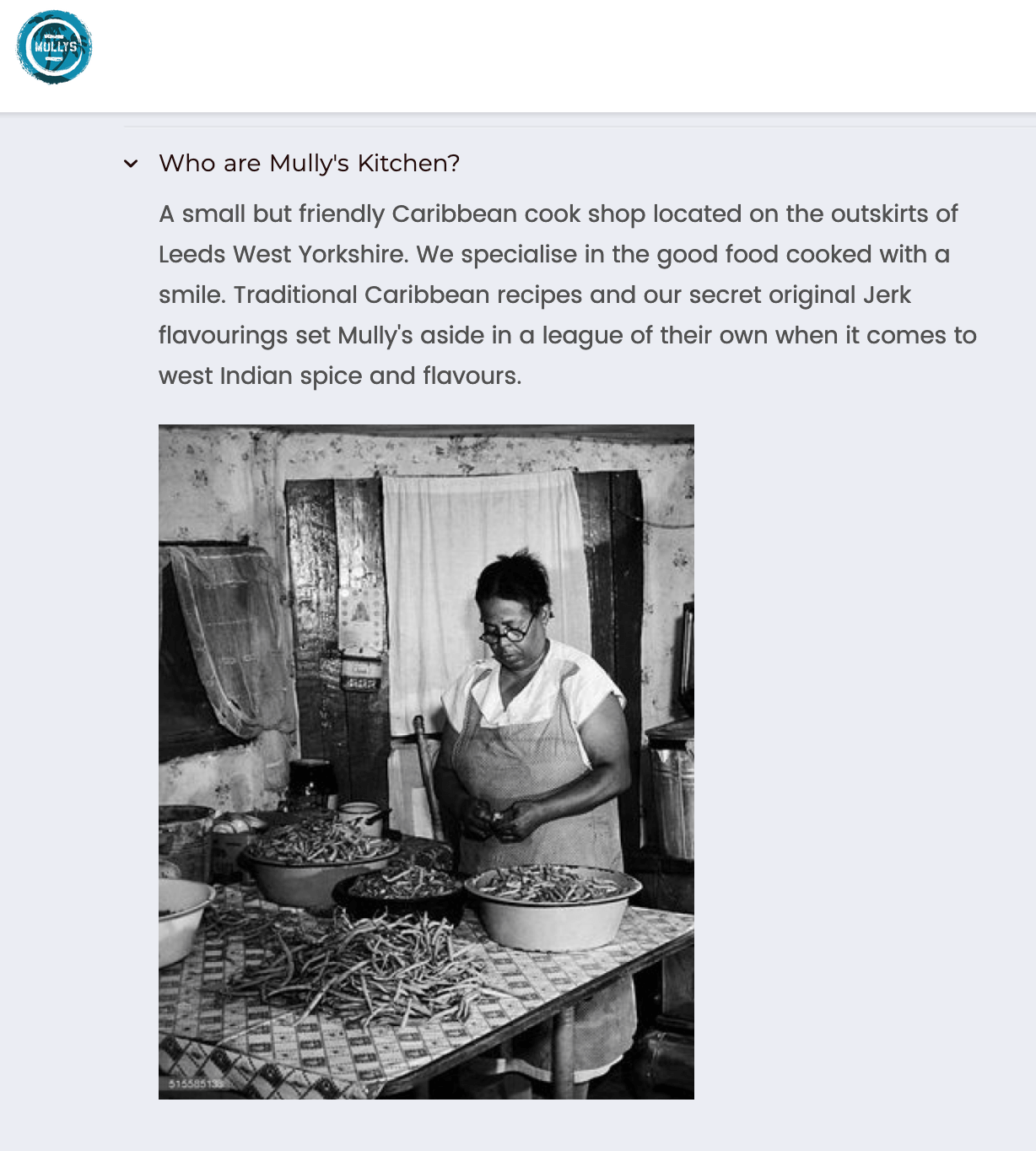
LEGACY
When I created the Mully brand – I needed a story of heritage. This is reflected ont he website with some olde time cook shop photos and a story about Mully’s Kitchen
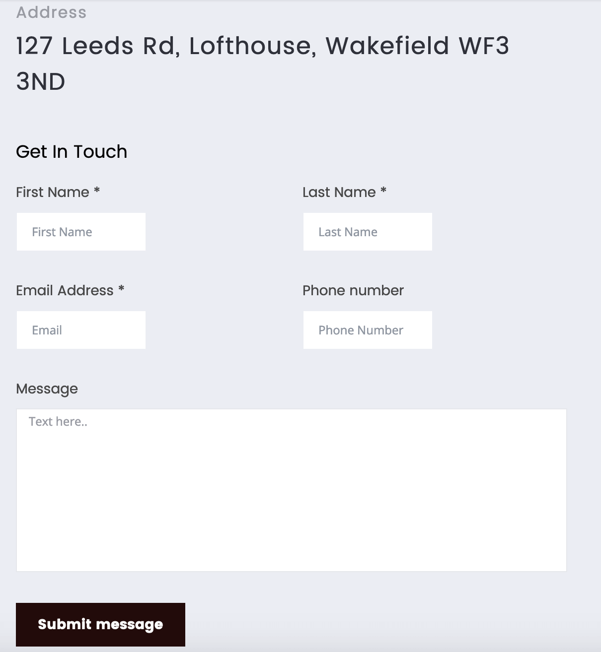
Contact form
A standard contact form was built in that emailed the restaurant.
LiveRnorth
This project was to complete a 12 minutes after effects animated instructional video for medical charity LiveRnorth. This i s a charity that is dedicated to liver disease and its symptoms and acts as a support network for those affected by this illness.
Competition
The brief for this project was a design competition, as it was for a charity this was not paid work. My design won the competition and subsequently the leaflet and video had been distributed to NHS patients.
Video
This 12 minutes animation was created using Adobe after effects. And although i’m much better versed at using all Adobe suite these days it was a vast learning curve for myself and was the first major project I had undertaken using this software.
Research
To complete this project it was necessary to research the effects of the disease to produce an affective design that would appeal to the end user. Some of those affected by Liver disease may experience visual effects, colour blindness Deuteronomy and may have medical anxiety. This meant that appropriate colours, typefaces and animation styles had to be designed to accompany the video and attached Leaflet.
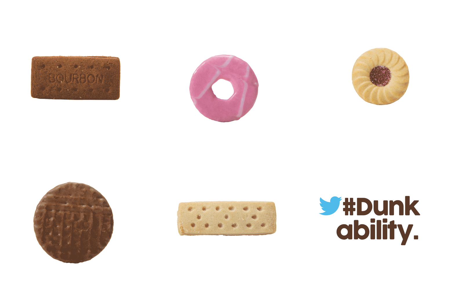
Dunkability
A multimedia marketing campaign for integrated print design agency resource
Marketing Calendar
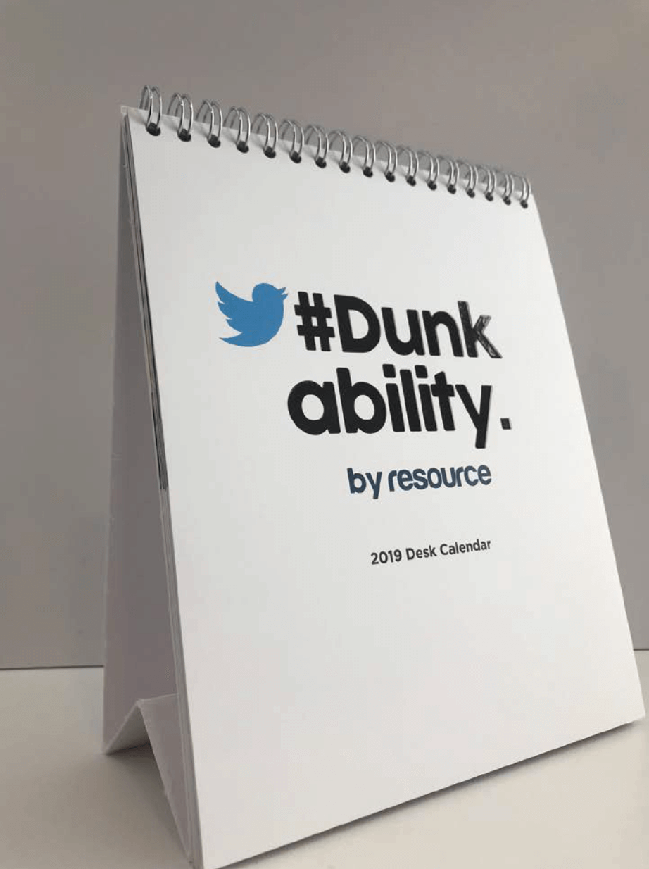
The Marketing calendar for resource, starts in the new year, and it starts logically with a calendar. Resource has been churning out its annual calendar for the past 5+ years and its deligates expect this now.
This year was my turn, I was now the senior designer for resource and had to come up with a mailable, campaign-able idea that appealed to the target audience of desk bound housing association comms types.
Introducing the desk calendar
The desk calendar is an obvious format that is kept on a delegates desk all year round, bringing the organisation to the front of mind every-time they glance at it.
The challenge comes when trying to keep them interested and not having boring content each month but engaging them with new refreshing and exciting ideas with every page turn.


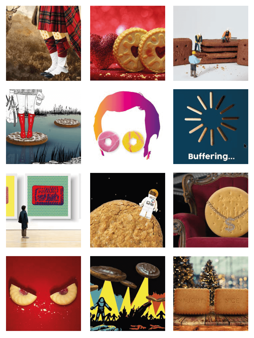
12 pages of creativity
Within the calendar inspiration was taken from 12 key dates throughout the year as to their design.
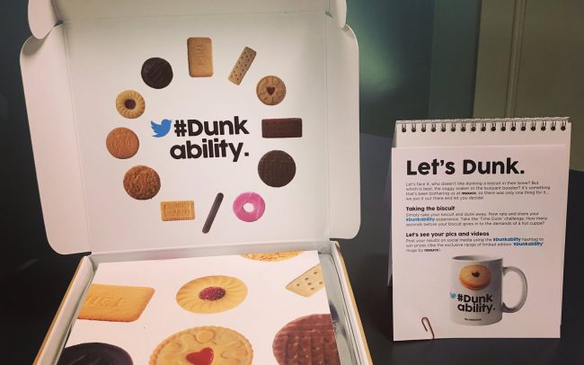
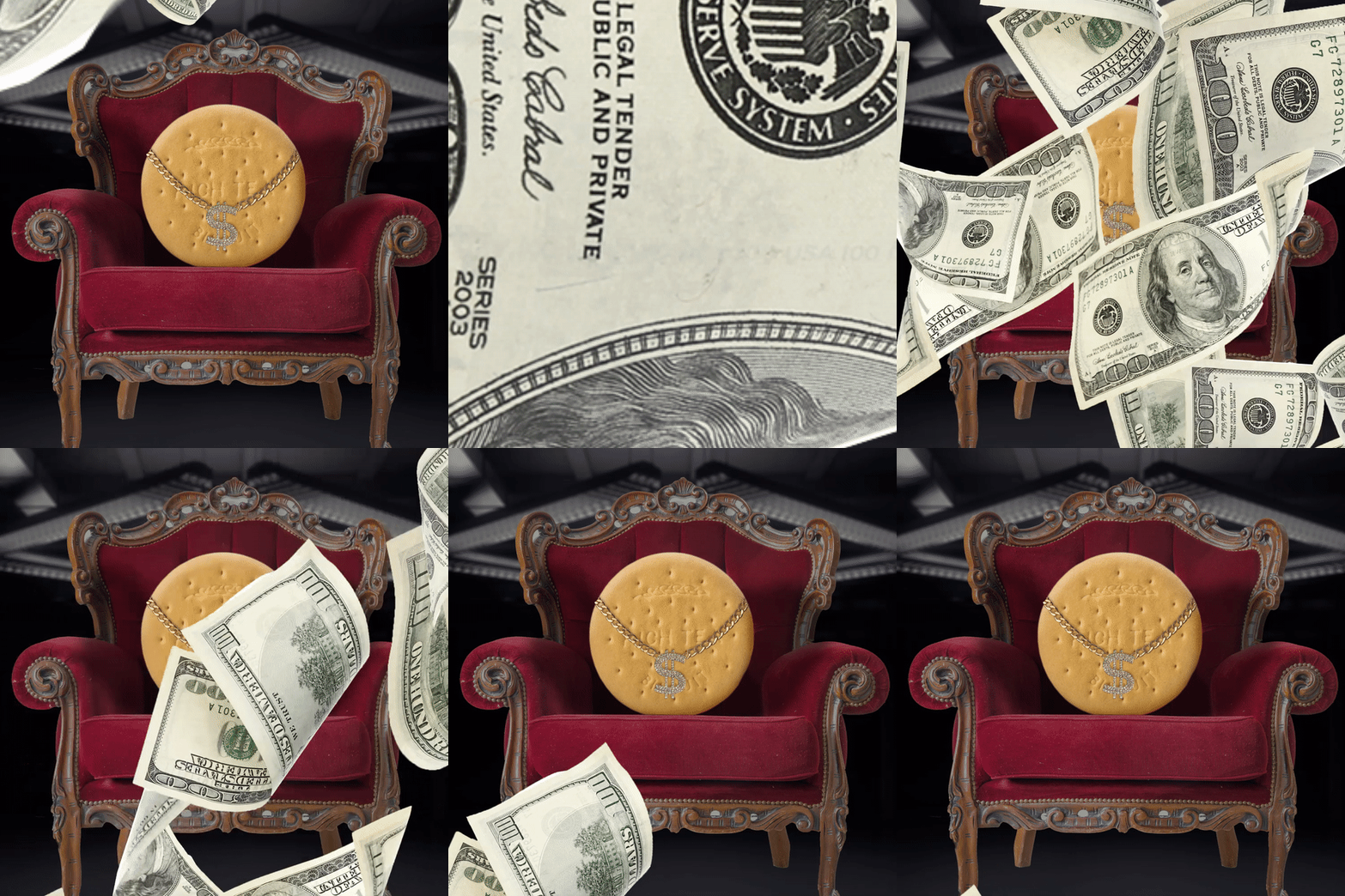
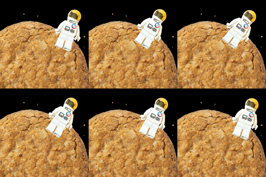
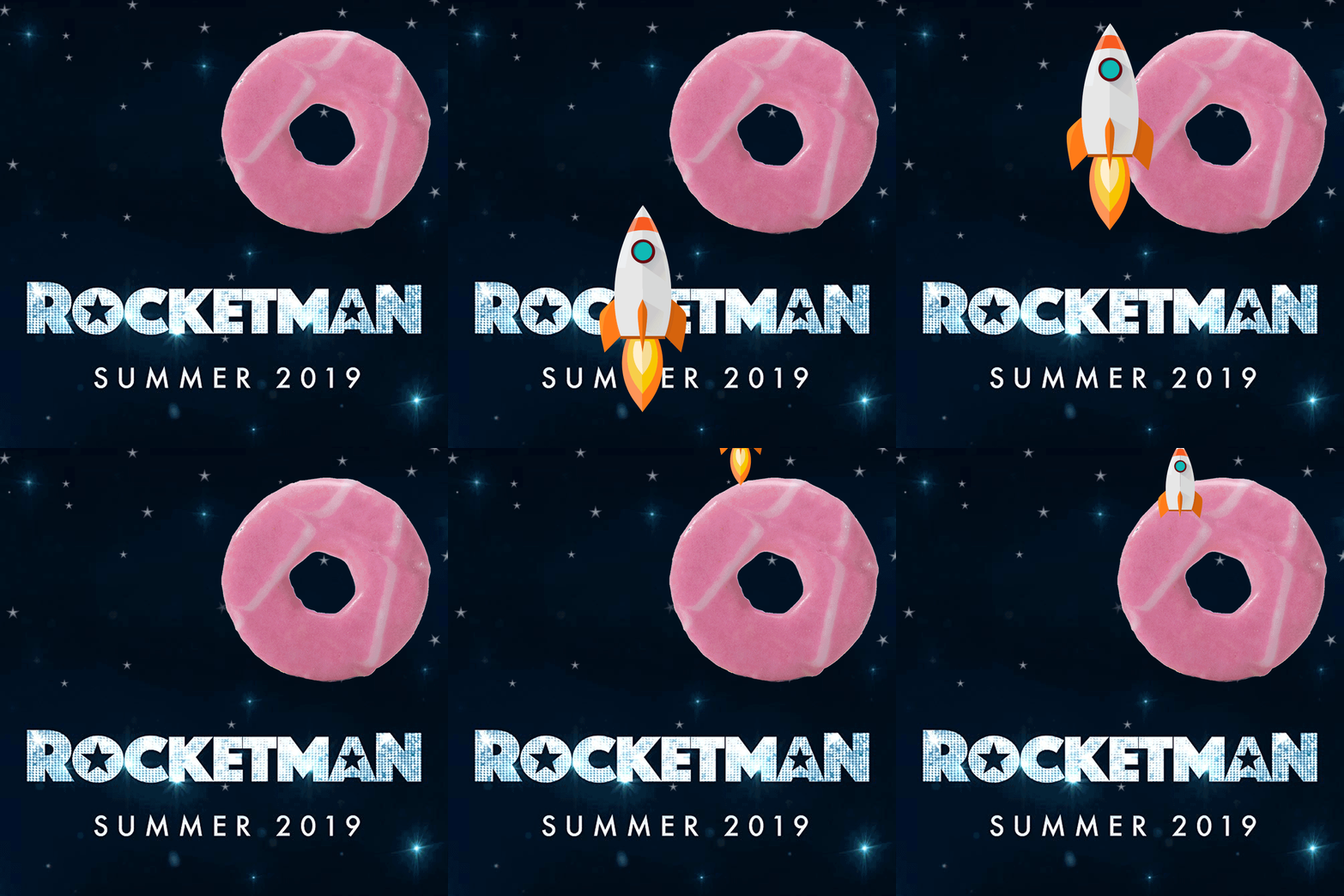
Burns night, valentines, movie releases, event anniversaries and other ideas were used to incorporate the overall theme of biscuits within the calendar, whilst showcasing print finishes offered by the print company on each page.
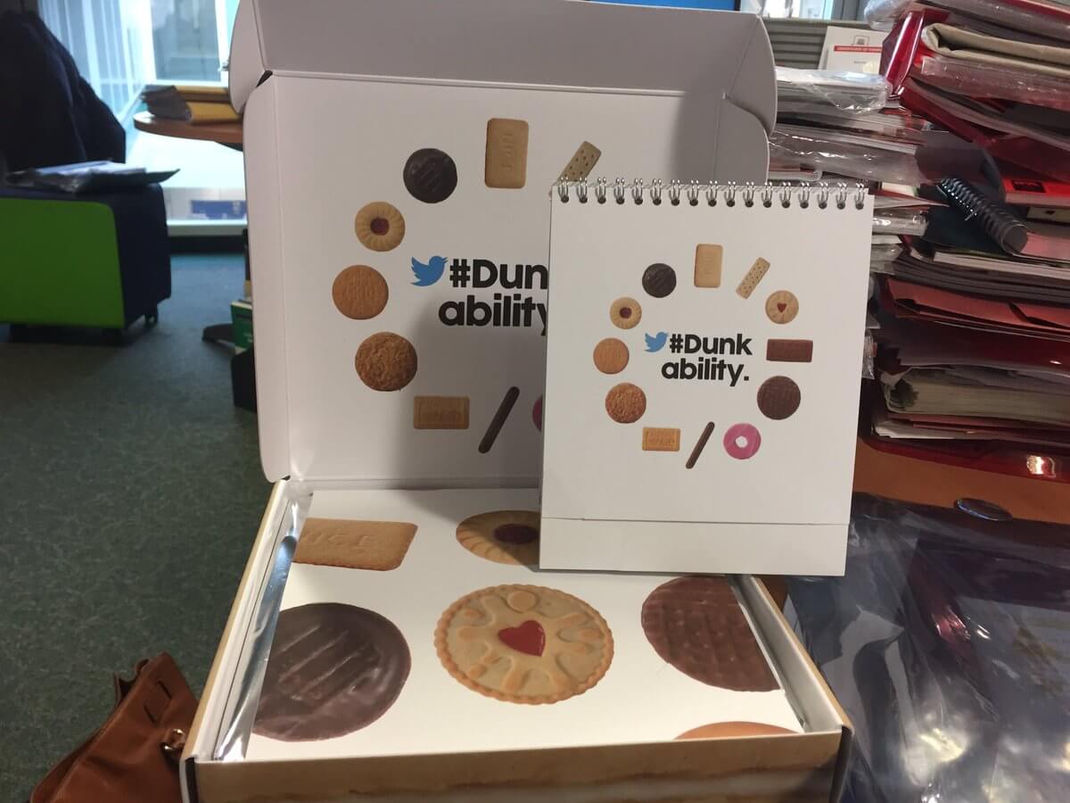
Social Media Engagement
The dunkability pack was sent to delegates at the start of 2019 after being delivered it encouraged social media engagement with a prominent hashtag at the centre of its branding.
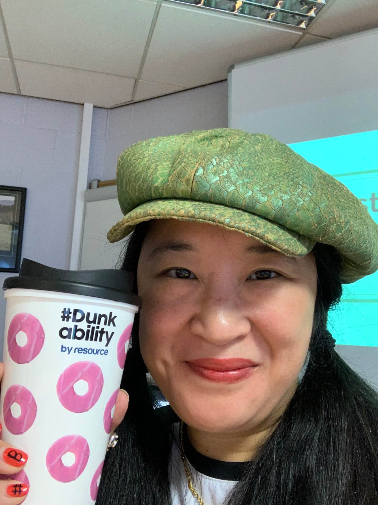
To coincide with each months unique biscuit inspired pages, an interactive gif was created that spurred a conversation for the page turn that month.
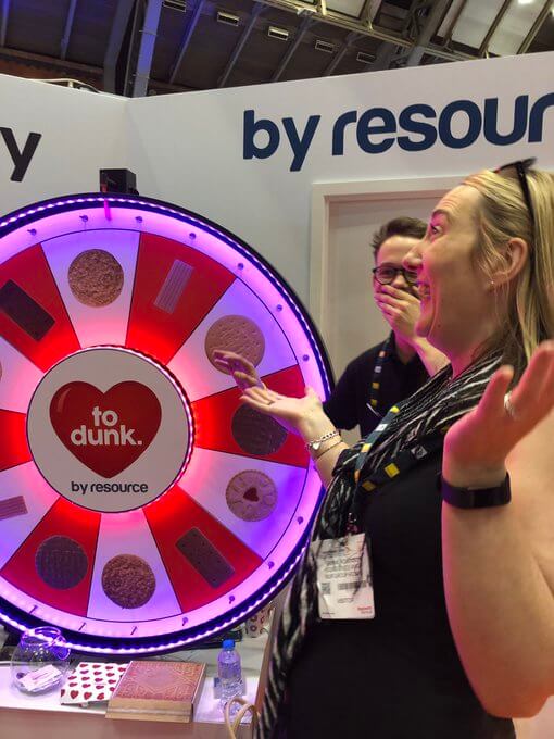
A physical wheel
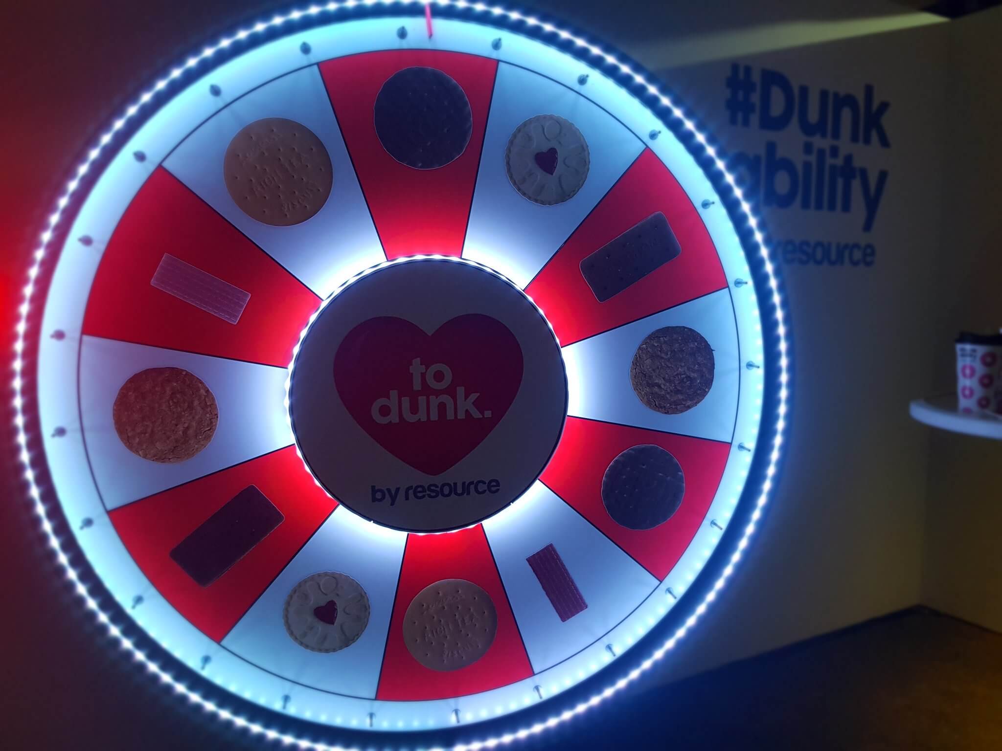
A wheel of Dunkability was devised, standing 6ft and illuminating with LED’s it was used in various conferences to encourage engagement and participation into the head to head dunk off. Used as a selling tool, the marketing team had a window of opportunity to engage those competing in the dunk off in conversation as a captive audience.
Hand Dryer Review
The hand dryer review project was first conceived with a close friend of mine photographer John Cade – I saw the potential and launched an instagram page which was an instant hit of satirical dry humour which was perfect for a viral audience.
Initially the idea was met with astounding success and everyone who visits it seemingly has an opinion.
I used this project as an outlet to showcase my social media skills.
Mullys Kitchen
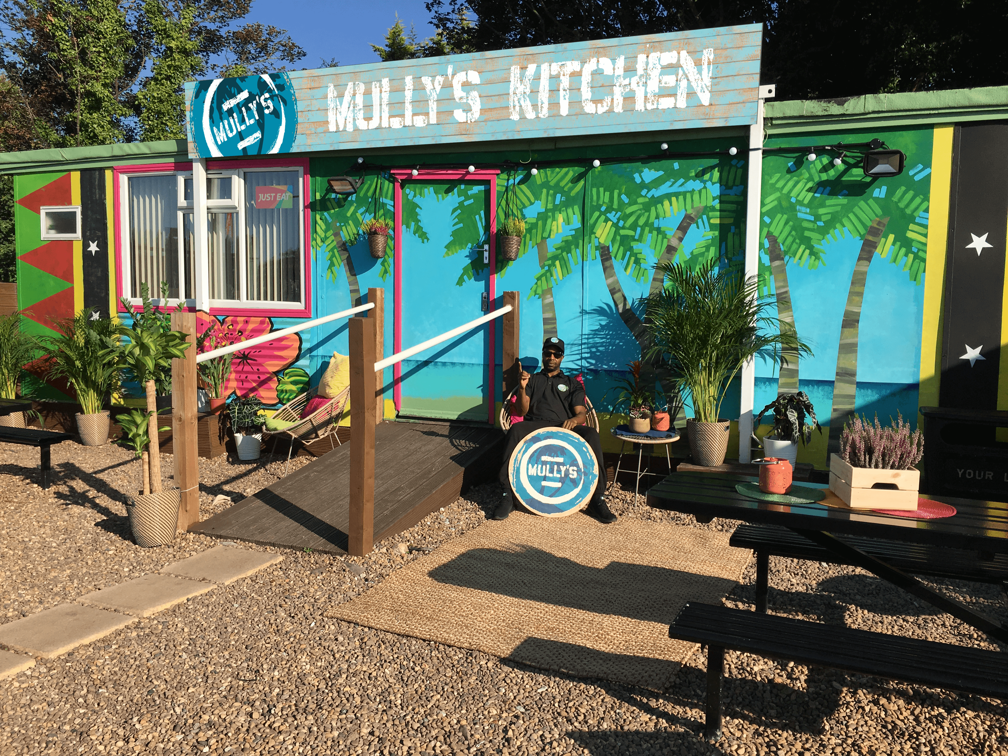
Mully’s kitchen Caribbean takeaway needed some flavour in their branding. A complete persona including typeface, distressed look and colour scheme were created.
A streetfood stall was assembled for Trinity kitchens Leeds among other collateral including stationary, menu, website and storefront.


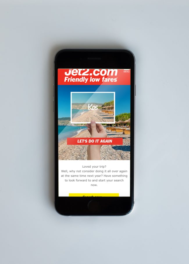
JET2.COM
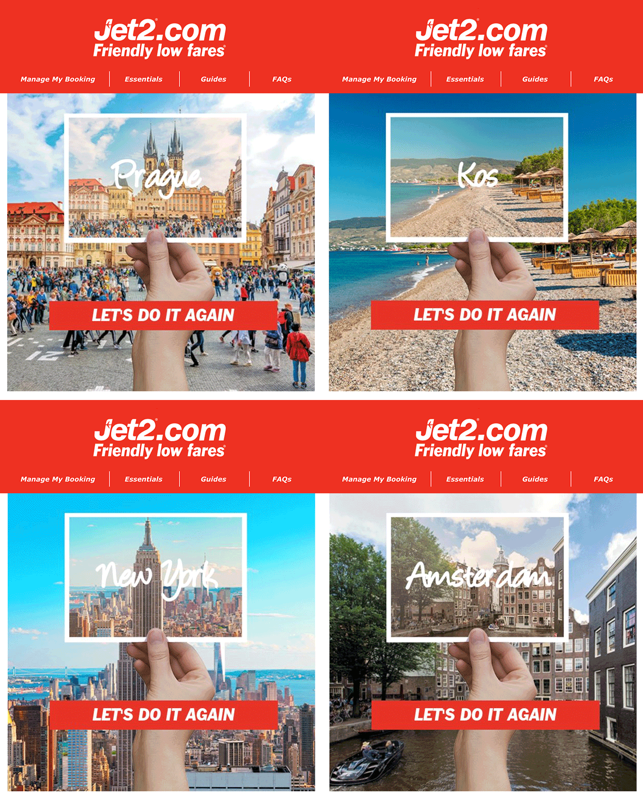
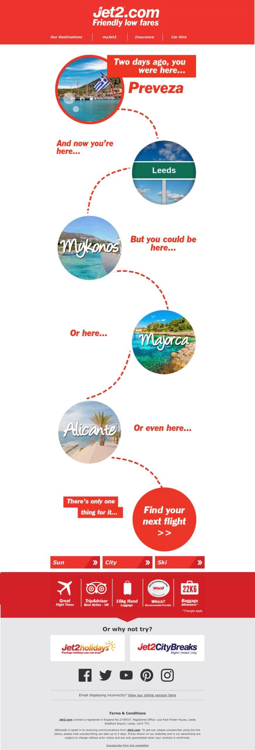
Whilst working with Jet2.com I worked on their automated email programme. This tailored a programme of emails to their customers depending on variable amounts of data.
Each email had as many as 86 variable destinations and focused on getting a customer to book again, Book in-flight meals or go to a similar destination defined by their buying habits.
These emails were coded using HTML, CSS and using their ESP Movable ink to turn CSV data into multiple variations of artwork.
BRANDING
I have always been interested in developing brands, positioning and personas as a means to sell a product or service. A brand isn’t just a logo or a mission statement, it’s a tool to tell the end user or customer exactly how an organisation operates. By thinking about the typeface, colour schemes, look and feel of a company we convey very important messages to the end user and how they interact with a product, branding is how we do this.
The Room
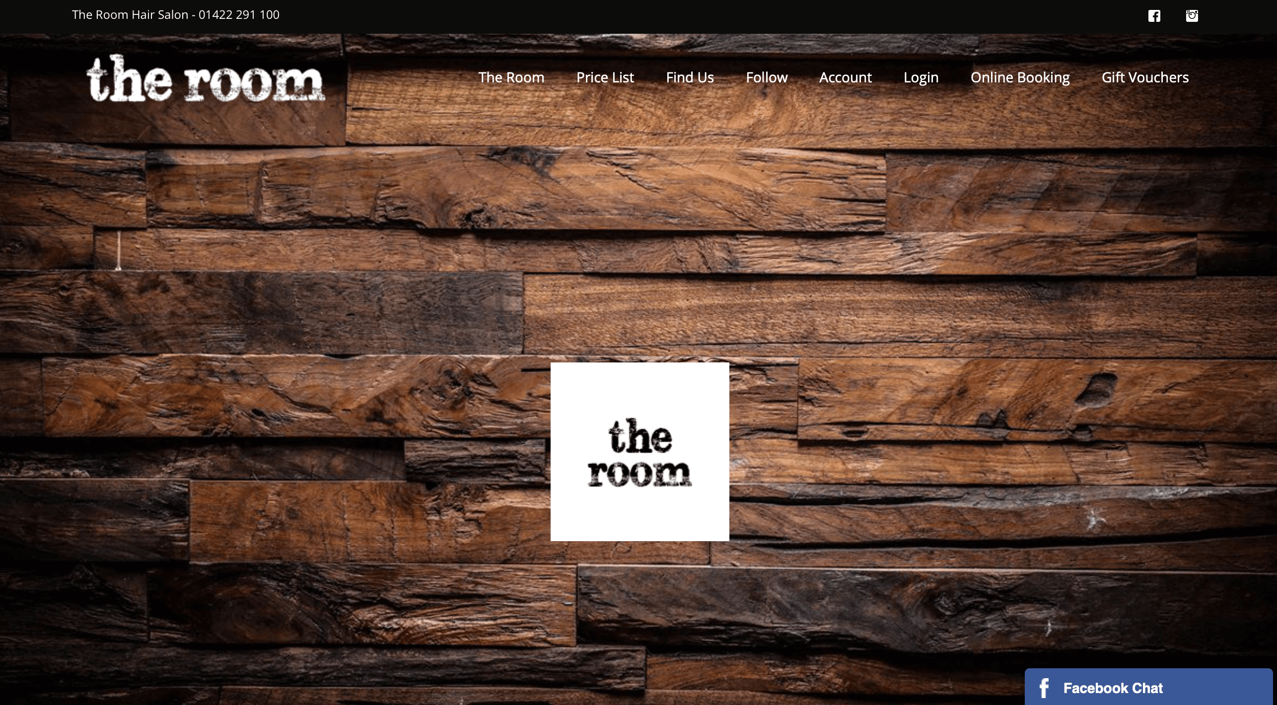
This quaint little salon started out in a small shop and blossomed into a busy hair study employing 7+ stylists with a full booking calendar and the number 1 salon on google for Hairdressers Halifax.
Online Booking
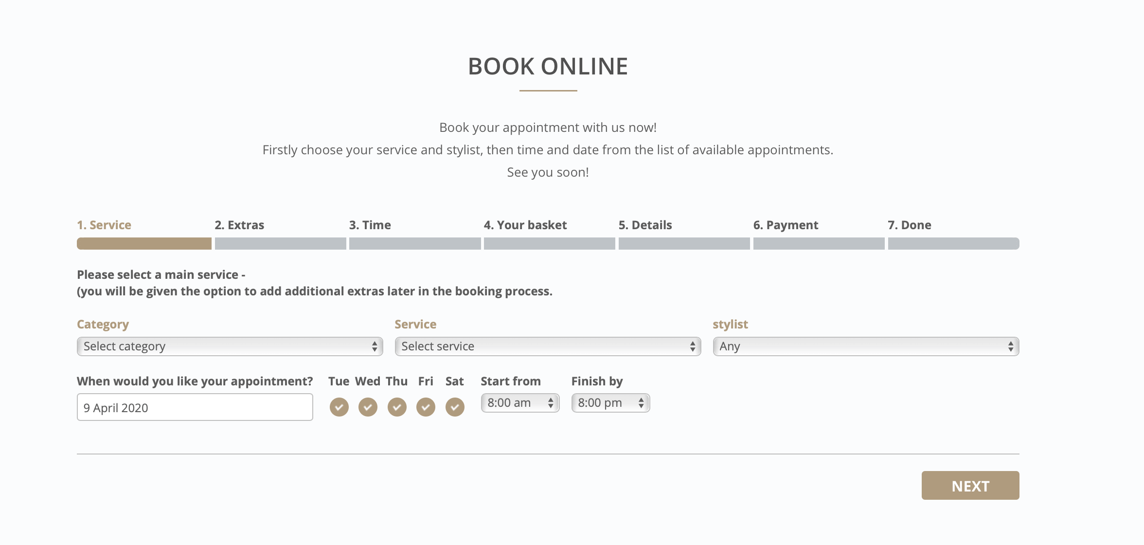
When designing the rooms website over 6 years ago, i realised something that was lacking in the market.
This was Online booking for hair salons. None of the competitors had this functionality and installing this had a significant impact on how successful the salon became.
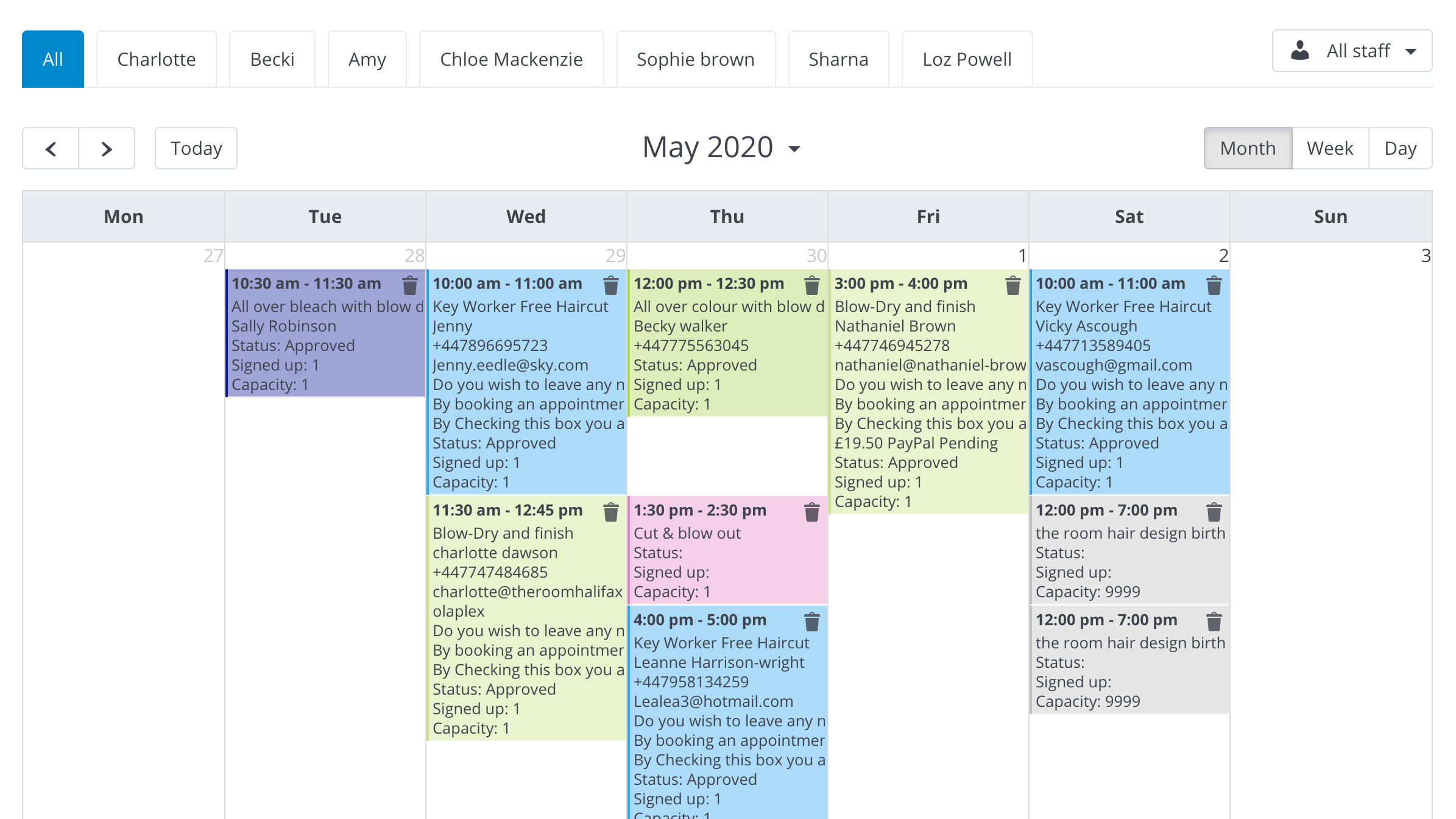
Organising Stylists
Because there are so many stylists operating from one salon, the booking system needed some calendar functionality to keep the stylists organised. An easy to use colour coded calendar view which is filterable for each stylist was used to keep order in the Salon.
LIVE CHAT
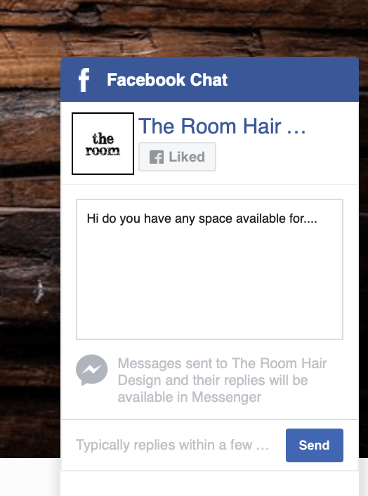
To give the room that 1 to 1 feeling, Live chat powered by facebook was implemented to allow customers to communicate with the salon this way.
SEO
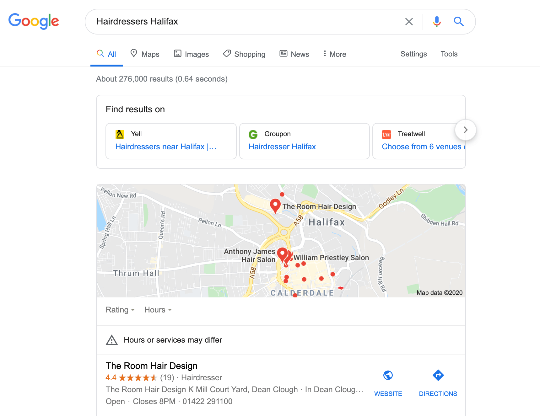
Key word search engine optimisation was used to target words and phrases that customers were actually searching for. Full google integration was used which made use of google displaying telephone number and location settings and before LOng the room hit number one google for the top 5 most popular search terms in the area.
Branding
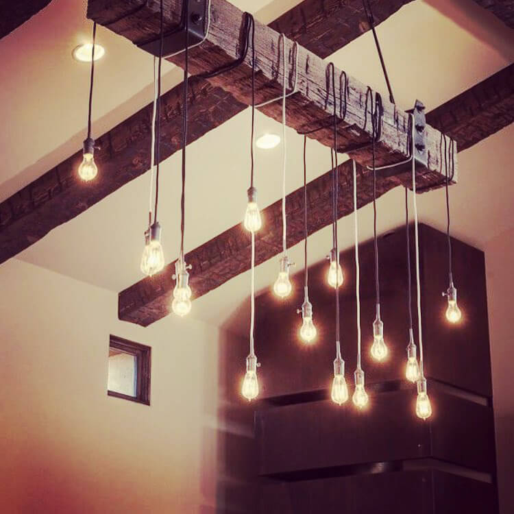
Code name rustic – Situated in the historic deanclough mills Halifax, the entire theme of the room was to feature rustic industrial styling with homely decor, website and stationary to match.
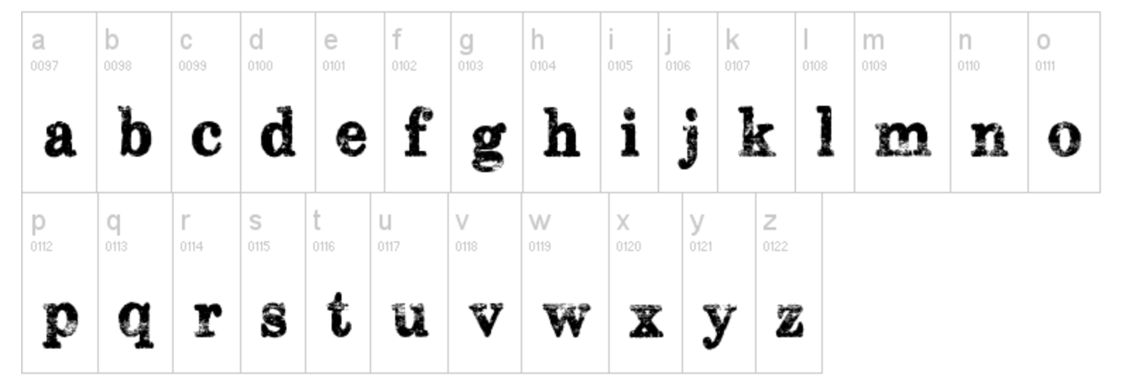
The typeface subway novella was used in lowercase only to give a rustic personable feeling to the brand.
ETN MAGAZINE
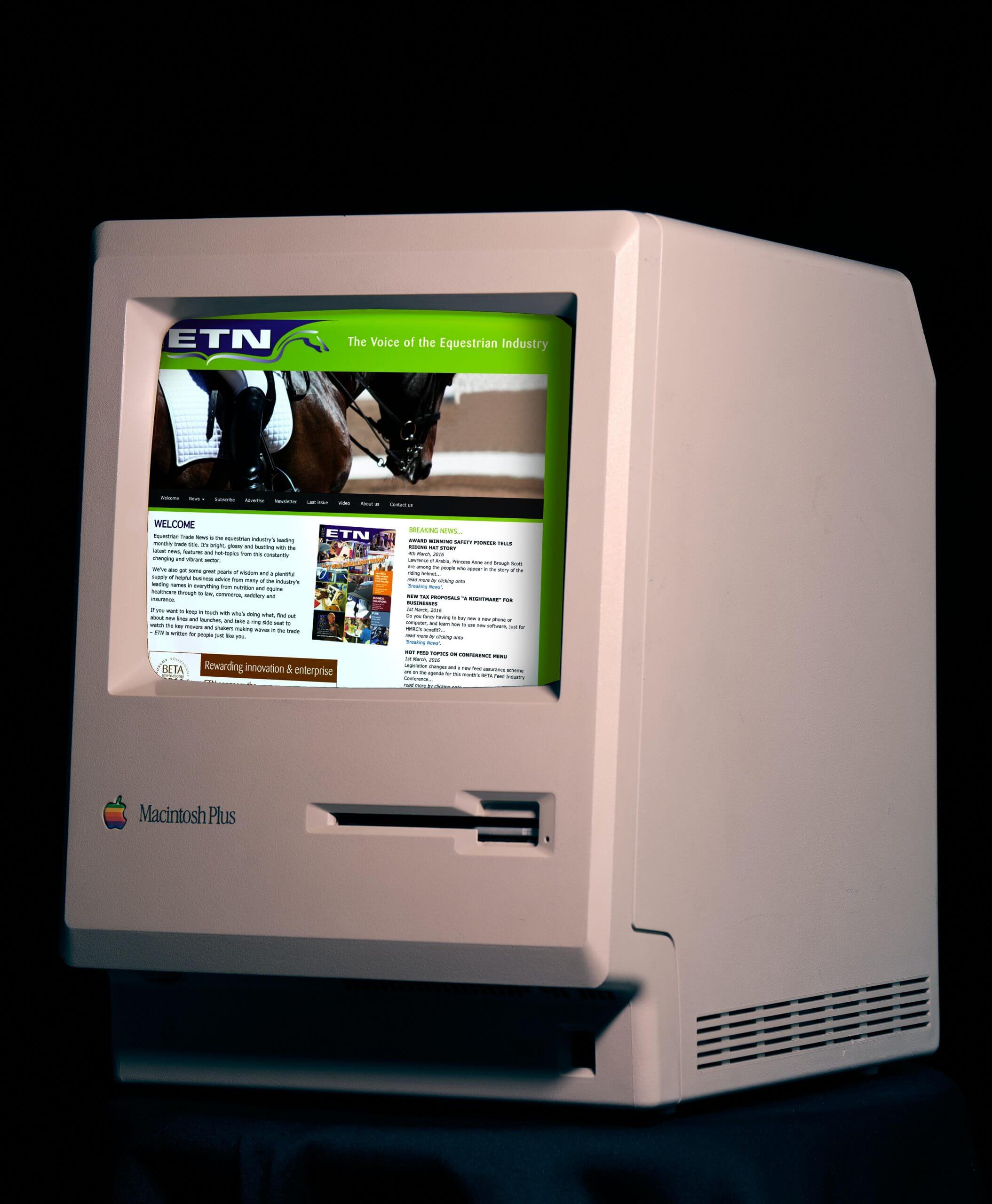
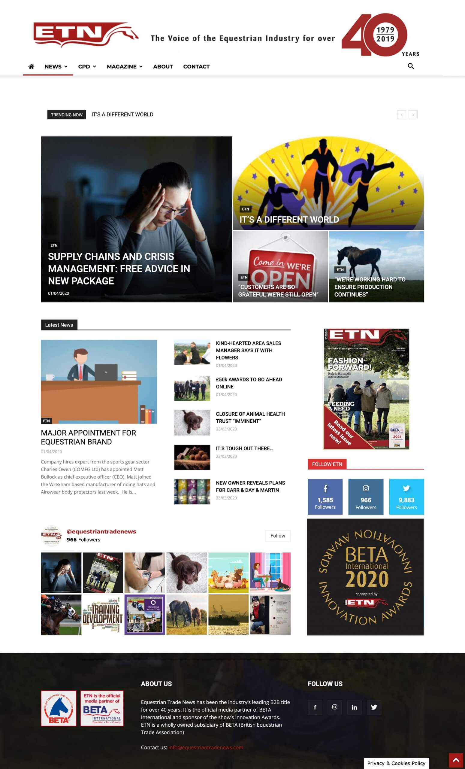
Like something out of the 90’s, ETN’s website was so outdated, it was updated manually using dreamweaver and re-writing HTML every-time an article was written.
An opportunity to bring it into this decade was seized and ETN has never looked younger more agile and sleeker. Built on the wordpress platform and featring a comprehensive, searchable news directory, the new ETN webside has brought them inline with their competition to offer an all singing all dancing horsey news experience.
Multimedia
Design undertakes the same process no matter the media. Personally I don’t like to pigeon hole myself into a graphic, digital or print designer. I look at design as a way to solve a problem, and a solution can take many paths that all undertake the same process. To be a good designer you need to adapt a product to the user, involving all stakeholders in the development of that groundbreaking idea.
Print has always been a media that has interested me. I have been lucky enough have experience working within a print design agency as senior designer which had allowed me to experience first hand print production and understand a variety of techniques used in print design.
I bring all these techniques together into my works as I try produce new designs with the latest variety of print finishes.
Digital
Years of experience in digital design from web design, email and animation. Nathaniel specialises in WordPress, HTML, CSS, Javascript and apps across the Adobe creative suite to reach digital solutions that make anything you can imagine possible.
#DUNKABILITY
An award winning multi-channel marketing campaign
Nathaniel Brown
Welcome to the portfolio page of UK based Multimedia designer, Nathaniel Brown. This collection features a wide variety of works (Not everything) displayed with the aim of showcasing the broad range of design diversity produced by this creative hand and mind.
Nathaniel Brown
Welcome to the portfolio page of UK based Multimedia designer, Nathaniel Brown. This collection features a wide variety of works (Not everything) displayed with the aim of showcasing the broad range of design diversity produced by this creative hand and mind.
#DUNKABILITY
An award winning multi-channel marketing campaign
Digital
Years of experience in digital design from web design, email and animation. Nathaniel specialises in WordPress, HTML, CSS, Javascript and apps across the Adobe creative suite to reach digital solutions that make anything you can imagine possible.
Print has always been a media that has interested me. I have been lucky enough have experience working within a print design agency as senior designer which had allowed me to experience first hand print production and understand a variety of techniques used in print design.
I bring all these techniques together into my works as I try produce new designs with the latest variety of print finishes.
Multimedia
Design undertakes the same process no matter the media. Personally I don’t like to pigeon hole myself into a graphic, digital or print designer. I look at design as a way to solve a problem, and a solution can take many paths that all undertake the same process. To be a good designer you need to adapt a product to the user, involving all stakeholders in the development of that groundbreaking idea.
ETN MAGAZINE
Like something out of the 90’s, ETN’s website was so outdated, it was updated manually using dreamweaver and re-writing HTML every-time an article was written.
An opportunity to bring it into this decade was seized and ETN has never looked younger more agile and sleeker. Built on the wordpress platform and featring a comprehensive, searchable news directory, the new ETN webside has brought them inline with their competition to offer an all singing all dancing horsey news experience.


The Room
This quaint little salon started out in a small shop and blossomed into a busy hair study employing 7+ stylists with a full booking calendar and the number 1 salon on google for Hairdressers Halifax.


Online Booking
When designing the rooms website over 6 years ago, i realised something that was lacking in the market.
This was Online booking for hair salons. None of the competitors had this functionality and installing this had a significant impact on how successful the salon became.
Organising Stylists
Because there are so many stylists operating from one salon, the booking system needed some calendar functionality to keep the stylists organised. An easy to use colour coded calendar view which is filterable for each stylist was used to keep order in the Salon.

LIVE CHAT
To give the room that 1 to 1 feeling, Live chat powered by facebook was implemented to allow customers to communicate with the salon this way.

SEO
Key word search engine optimisation was used to target words and phrases that customers were actually searching for. Full google integration was used which made use of google displaying telephone number and location settings and before LOng the room hit number one google for the top 5 most popular search terms in the area.


Branding
Code name rustic – Situated in the historic deanclough mills Halifax, the entire theme of the room was to feature rustic industrial styling with homely decor, website and stationary to match.

The typeface subway novella was used in lowercase only to give a rustic personable feeling to the brand.
BRANDING
I have always been interested in developing brands, positioning and personas as a means to sell a product or service. A brand isn’t just a logo or a mission statement, it’s a tool to tell the end user or customer exactly how an organisation operates. By thinking about the typeface, colour schemes, look and feel of a company we convey very important messages to the end user and how they interact with a product, branding is how we do this.
JET2.COM
Whilst working with Jet2.com I worked on their automated email programme. This tailored a programme of emails to their customers depending on variable amounts of data.
Each email had as many as 86 variable destinations and focused on getting a customer to book again, Book in-flight meals or go to a similar destination defined by their buying habits.
These emails were coded using HTML, CSS and using their ESP Movable ink to turn CSV data into multiple variations of artwork.


Mullys Kitchen
Mully’s kitchen Caribbean takeaway needed some flavour in their branding. A complete persona including typeface, distressed look and colour scheme were created.
A streetfood stall was assembled for Trinity kitchens Leeds among other collateral including stationary, menu, website and storefront.


Hand Dryer Review
The hand dryer review project was first conceived with a close friend of mine photographer John Cade – I saw the potential and launched an instagram page which was an instant hit of satirical dry humour which was perfect for a viral audience.
Initially the idea was met with astounding success and everyone who visits it seemingly has an opinion.
I used this project as an outlet to showcase my social media skills.
Dunkability
A multimedia marketing campaign for integrated print design agency resource
Marketing Calendar
The Marketing calendar for resource, starts in the new year, and it starts logically with a calendar. Resource has been churning out its annual calendar for the past 5+ years and its deligates expect this now.
This year was my turn, I was now the senior designer for resource and had to come up with a mailable, campaign-able idea that appealed to the target audience of desk bound housing association comms types.
Introducing the desk calendar
The desk calendar is an obvious format that is kept on a delegates desk all year round, bringing the organisation to the front of mind every-time they glance at it.
The challenge comes when trying to keep them interested and not having boring content each month but engaging them with new refreshing and exciting ideas with every page turn.


12 pages of creativity
Within the calendar inspiration was taken from 12 key dates throughout the year as to their design.
Burns night, valentines, movie releases, event anniversaries and other ideas were used to incorporate the overall theme of biscuits within the calendar, whilst showcasing print finishes offered by the print company on each page.

Social Media Engagement
The dunkability pack was sent to delegates at the start of 2019 after being delivered it encouraged social media engagement with a prominent hashtag at the centre of its branding.

To coincide with each months unique biscuit inspired pages, an interactive gif was created that spurred a conversation for the page turn that month.
A physical wheel
A wheel of Dunkability was devised, standing 6ft and illuminating with LED’s it was used in various conferences to encourage engagement and participation into the head to head dunk off. Used as a selling tool, the marketing team had a window of opportunity to engage those competing in the dunk off in conversation as a captive audience.


LiveRnorth
This project was to complete a 12 minutes after effects animated instructional video for medical charity LiveRnorth. This i s a charity that is dedicated to liver disease and its symptoms and acts as a support network for those affected by this illness.
Competition
The brief for this project was a design competition, as it was for a charity this was not paid work. My design won the competition and subsequently the leaflet and video had been distributed to NHS patients.
Video
This 12 minutes animation was created using Adobe after effects. And although i’m much better versed at using all Adobe suite these days it was a vast learning curve for myself and was the first major project I had undertaken using this software.
Research
To complete this project it was necessary to research the effects of the disease to produce an affective design that would appeal to the end user. Some of those affected by Liver disease may experience visual effects, colour blindness Deuteronomy and may have medical anxiety. This meant that appropriate colours, typefaces and animation styles had to be designed to accompany the video and attached Leaflet.

Good Food, Not Fast Food
After developing the brand image for Mully’s Kitchen, they came to me to make them a website.
Tired of paying subscription fees for Just-eat, a place was required for a customer to place an order Online, pay and have food delivered.
A fully functional and on brand website was created which could be built upon and gave their social media presence. This is the start of that journey.
MullysKitchen.com

ONLINE MENU
An online menu was created, fully customisable by mullys kitchen, the price is editable bu the User and they can also add extras to make a meal complete.

Social Media

Mullys kitchen is extremely active on Instagram and also needed social media to be a prominent feature on their webpage. This was integrated with realtime updates so any changes on instagram showed instantly on the website.
User Sign Up
An inbuilt form where a user needed to sign up before they ordered was added. This captured details in a database such as email address to allow future contact and also created an account so the user did not have to enter their email address again in future.

Card Payments
A method to pay by card was added to the system, this used strip as a payment gateway and accepted all current payment standards and included apple pay.


LEGACY
When I created the Mully brand – I needed a story of heritage. This is reflected ont he website with some olde time cook shop photos and a story about Mully’s Kitchen
Contact form
A standard contact form was built in that emailed the restaurant.

INTERNAL BRANDING FOR A CREATIVE AGENCY
One of my last jobs whilst senior designer for resource was to re do the internal branding. This was to make the place feel more creative and increase client engagement whilst on site visits. Below is a presenter on how ideally I would have rebranded this agency into the creative practice it deserved to be.
DANIEL FOOTWEAR LOOKBOOK
Having an interest in brutalist web design I wanted to create something new and functional whilst still being clean and usable.
For the Daniel footwear lookbook, the aim was to show off the seasons range in a visual way which was easy for the user to navigate whilst still being minimal, barebones and self explanatory.

Creative Print
I do a lot of invitations, wedding stationary and other event printing. I specialise in high quality print techniques and finishes whilst bringing unique ideas using unconventional print techniques. This allows me to explore capabilities within print and gives me a good understanding of technical terms.
Please find below a small selection of these works.
WE’RE MUIR
Muir are a UK housing association that although have brand guidelines, they aren’t using this properly. This branding presenter was made to illustrate what they are currently doing incorrectly and where they could take their branding for a brand refresh.
Graffiti Art
I started my graphics career around the age of 11 or 12 drawing on walls. It was a pure form of graphics and sparked my love of typography and colour. I don’t often pursue this media anymore, maybe once or twice a year if I’m lucky. But something about it still rings true.
The Hairfarm
An interesting future prediction brief, this was a student project from when I was studying my MA Design circa 2016. Set by world renowned branding agency Elmwood, the task was to design and develop the concept for a barbershop in the year 2026. Complete with UX app development using Proto.IO and concepts for a future proof idea. A service where hair was recycled to produce food by processing Dermestadae beetles into beef flavoured patties (I know crazy right.) and an online booking for a barbershop concept was conceived (Booksy wasn’t even on the radar yet.) the hairfarm earnt the user credit every time they got their barnet refreshed.

Project N
A repeat client, Project N is a barber who started working at another salon and eventually opened his own.
I had developed a traditional barber logo for him previously which he loved and returned wanting something more modern for his new salon.
The client also required print work and commissioned some luxury quality business cards and flyers.


Micro transactions per minute
This UX/UI Design project was to develop a promotional micro site for online casino based client. It was developed as a social media share to encourage users to play their online games by demonstrating the profitability of online gaming.
By using a visual display of top gossing games and a salary comparison generator that showed how much an e-sports player could earn the micro site would encourage gamers to spend via the online casino.
Adobe XD
Micro transactions per minute was designed using Adobe XD.
The link was shared with developers to collaborate on the project so they could get a better feeling of how the page was formed and how interactions should happen.
Logo Development
A logo was developed for the campaign which was stylised similar to the main branding for the client.

Navigation Design
familiar user friendly controls were developed for the project which used UI controls that the user would instantly recognise making the site controls easy to navigate.


ONLINE RSVP
This annual conference event held by Ongo Housing had an online registration form which was emailed to delegates with the relevant fields to fill out. It had follow up emails and gathered important data for the live event.
Ongo had stringent brand guidelines that had to be adhered to at all times, when creating this RSVP portal these had to be added using custom fonts, colours and HTML, CSS.


The Creative Spirit of John Curry
This project was a print design project do design and layout a creative journey of dance and ice for Balbir Singh Dance Company. The purpose of the document was to present in a diary format a curation between dance and ice, a pastiche of the ice skating legend, John Curry.
Danielfootwear.com
One of my main clients, I have designed pretty much everything for Daniel, from shop POS, Packaging to their website and even their App. I was their senior designer for 5 years. When designing for Daniel, i tried to use good clean eCommerce design principals that showcased the products effectively and gave a high end look to their web stores and shops. High quality materials were used in print work and creating a sense of luxury was achieved throughout.

Design Everything
At Daniel I was the senior designer. In fact, honestly, I was the only real designer and thus did pretty much everything to do with design. I had to update the website on a regular basis whilst keeping consistency across the brand and delivering fresh content and promoting new stock daily.

POS Design
New designs for POS had to synchronise with the marketing calendar. Sale in retail is frequent, and it was a requirement to keep up with new, fresh, creative concepts .


Email Design
A minimum of 5 emails a week were designed by myself for Daniel footwear, these would promote the new stock using fresh product photography and studio shots which were sometimes directed by myself.

Shop Signage


CARICARTON
An academic design project
After working as a designer for about 10 years, I finally decided to go back to school. I enrolled onto the MA design course at the University of Leeds.
Caricarton is the final project for this 2 year MA that earned me a distinction at one of the top 100 Universities in the world.
A crescendo of creative research into a subject that i knew nothing about. A project to tackle the problem of packaging in an eCommerce environment.
This project exercised several usability research oportunities focussing on user centred design and finished with a 20,000 word thesis on carrying out this design research and final summarised portfolio.
It’s long, It’s in depth,
Enjoy.

The Project
Abstract
In recent years internet shopping has rapidly grown to become the preferred method of commerce, it is estimated that 77% of internet users now shop online (Twenga 2016). Offering the widest variety of goods, internet shopping brings accessibility to almost every product in the market without ever requiring the shopper to leave the comfort of their armchair. This does not mean shopping has eliminated problems for the customer, with unpredictable delivery times requiring the shopper to be present, a more convenient way of shopping has been born. Many brands have turned to click & collect shopping, cutting down the queues at the store by completing transactions online and allowing customers to pick up goods safely and securely at a time that is convenient to them. Pioneered by brands such as Amazon and Argos in the UK, the time to adapt to a click and collect marketplace is now, with numbers currently suggesting almost a quarter of online purchase are now using click and collect as a method of receiving goods (IMRG 2016) Convenience is becoming the key motivator for shoppers to collect their online purchases (Chaliel 2016).
Cut out the need to wait at home all day for that obscure purchase to be delivered, instead have it waiting for you when you pick up your shopping or get off the train after your commute home. Click & collect shopping opens doors to what items you can buy from your local convenience store making the fulfilment possibilities endless and offering the broadest product range possible for supermarkets, without requiring them to physically stock the goods. (Chaleil 2016)
The only problem now is helping the shopper carry their goods from the click & collect point to their home.
In this ever changing market place, can we develop a packaging that will benefit shoppers in the year 2018? Even as of conducting this research innovations have been made in this new and emerging field re-defining the way we shop. New shopping concepts such as Amazon pantry pave the way for the needs of this new type of packaging system, aiding the consumer in safely ferrying their purchases to their home.

Overview
Aim
The project aim is to design and develop a new and unique type of packaging to benefit the current trend in e-commerce online shopping of click & collect.
Research focus
Research will focus on user centred design to develop a product that meets the varied needs of stakeholders within e-commerce. Design research will be lead by needs of the user but will also incorporate all needs of the industry, from multi-channel retailer to warehouse packer. The researcher hopes to identify any stimuli that would need to be incorporated into a successful packaging design for use within the online shopping market place. Research will outline what has already been accomplished in the industry, but also what is missing from and identify any problems associated with current packaging. Solutions will be developed taking into account any found user problems, any existing industry standards will also be taken into consideration.
Contribution to the field
Research will be conducted into online shopping trends. This research will identify not only how many people shop online and receive their items by click and collect shopping methods, but also find the users preference in how they receive their delivery, what their packaging preference looks like and how to achieve user satisfaction through e-commerce packaging.
Research will be conducted into the best materials, techniques and user understandings of instructions used in this type of packaging.
Originality
Although there has already been research conducted into the desirability of packaging and what stimuli satisfy a consumer in regards to packaging design, this is usually carried out on product packaging and little in the field of actual delivery packaging. E-commerce and internet shopping is an emerging field and new marketplace, little research has been conducted on user preferences for such a packaging type.
Objectives
- Research Packaging design techniques and user preference
- Research Packaging material types and user preference
- Analyse e-commerce delivery process from clicking buy to customer receiving order
- Understand what instructions are needed by the user to promote ease of packaging use
- Understand what aspects of packaging are important to the user
- Develop an easy to use packaging system to transport multiple purchases easily & securely
Research Structure
Literature Review
- Online shopping preferences
- Design research
- Trend Forecasting
- Packaging design
- Usability testing methods
- Environmental impact
- Branding Design
Primary Research
- Online Questionnaire 1
- Visual research
- Sample collection
- Low-fi Prototyping
- Location observations
- Interviews
- Online Questionnaire 2
- Usability testing 1
- Usability testing 1
Analysis & Findings
- Online shopping process
- Online shopping problems
- Order & collection process
- Locker size / box size
- Target audience observations
- Preference of materials
- Quick erection box types
- Structural strength
- Box locking techniques
- Preference of branding
- Order & collection process
- Instructional understanding
- Usage preference
- Desirability factors
Prototype / Outcome
- Initial lowfi prototypes Selected
- prototype scalable size Crash
- lock opening Cardboard types
- Fold flat easy construction
- Design Locking handle
- Stackable design
- Branding opportunities
- Logo design / Bran design
- Instructional design Easily
- Loadable
- Separate lid
Research Methods
Literature review
Research from reading literature found in books, journals, online and other sources was conducted to fulfil this project. The main fields of study are Online shopping, Brand design, Instructional design, Design research, and Packaging design.
Online Questionnaires
2 x online questionnaires are carried out by the researcher each with 100 participants. The results are used to determine user preferences to gain a greater understanding of the users need when developing a packaging type.
Interviews of industry professionals
Semi structured interviews of industry professionals were carried out on professionals in the delivery sector (royal mail employee) & the packaging industry.
Lowfi prototypes
Multiple iterations of lowfi prototypes are created to develop the best approach to a packaging system that satisfied all requirements of the project outcome.
Location Observations
Observations are conducted at multiple points of interest including Royal mail collection offices, Click & Collect points & lockers and an Amazon fulfilment centre to ascertain the entire process of e-commerce shopping and observe the Subjects that may use Amazon click and collect lockers to develop a profile of our target audience.
Market Research
Market research of existing packaging and materials is carried out to determine positive aspects and failures currently existing so improvements on current systems can be developed.
Usability Testing
2 Rounds of usability testing are carried out on prototypes. Firstly to determine the ease of use of proposed packaging types to identify any initial failings and undesirable traits. After refinement the second round of usability testing is carried out on proposed target audience to identify ease of use and general desirability of finished prototype.
Questionnaire 1
The first questionnaire survey determined how popular the proposed method of shopping (Click & collect) was and to forecast on how popular it may become. It measured the e-commerce shopping climate and identified any problems shoppers currently experienced with online shopping.

This question in particular was interesting as we compared it to 2014 questionnaire results (Guruswami 2014) we found that preferences have been reversed and Amazon has taken over as the most popular place to buy online.

This question shows the rising popularity of Amazon’s own courier service. Amazon now rival Britain’s national postal service Royal mail for frequency of parcel deliveries.

This question shows the potential interest to the consumer in collecting their on line shopping from a click & collect locker.

Recently it was found in primary research by collecting packaging samples that most are easy open packaging. The importance to consumers of easy open packaging was analysed and found not to be entirely important to everyone. A mixed review across the board as to the importance of the matter, with as many as 5 participants even claiming that it showed no importance to them at all. The results of this question left the researcher undecided whether to include this feature in further usability tests or even in the final design.

Participants showed that they do not like heavily branded boxes and much preferred plain and lightly branded packaging design to receive their on line purchases. Through literature review it was suggested that people prefer this for 2 reasons, firstly the current trend in sustainable packaging suggests that consumers are becoming more environmentally aware. (Arora 2013 pp 116) A heavily printed package suggests to the user that the packaging has greater environmental consequences and should be avoided. Another reason consumers would prefer an unbranded packaging is for security and anonymity reasons. A package with no indication of the sender can hide the value or nature of its contents, preventing theft (Fryer, J. and Medina, D. 2015) and or embarrassment.
The majority of participants showed that returning a product easily was important, with 60% of those placing this with the most importance on a semantic scale of options. When shopping on line it is important for the consumer to return something as it isn’t possible to view or try on the actual product at point of sale. Within E.U legislation is a requirement that a product can be returned for a full refund without any reason within 14 days if bought online. (Europa.eu 2017, Which 2017)
It is concluded from this that designing a product that can be used multiple times, being resealed and returned would aid the user in returning an unwanted product.
This would also have the added plus of being more ethically viable than simply throwing away the box or sending for recycle.


This question was asked to participants to determine the importance of frustration free easy open packaging and the trend for using cardboard zips on e-commerce packaging found when the researcher collected samples. The response was highly varied and not very conclusive with mixed preference cross the board, in fact only 5% of participants considered this a very important factor. Aesthetically on the other hand it can be used to instruct the user how to safely open the packaging preventing damage to products inside. It was concluded that Including a cardboard zip will not harm the overall design of the packaging.

Interviews
Interview 1 was with a long term employee of Royal Mail who has worked with for the UK’s National mail company for over 9 Years.
The interview used to develop an insight in to desirable traits for a user who handles packaging on a daily basis.

This is a semi-structured interview with a royal mail employee conducted for a MA Design Module for the School of design, University of Leeds.
By participating in this interview the subject is agreeing to data being used for research purposes of aforementioned module. Your research will be used to potentially design an improved online shopping experience.
Your help is greatly appreciated.
- How long have you worked for royal mail and what jobs have you done there?
- What do you like best about working at Royal mail?
- How many parcels would you say that you personally handle in one day?
- Are packages sometimes difficult to lift or carry? And why is this?
- How many parcels are returned to the depot after they have gone out for delivery each day?
- At the collection office, what is the busiest period?
- After a failed delivery, how long do people usually wait to collect from the depot?
- What type of person usually collects from the depot?
- What problems do you see with packaging?
- At the collection office, what time is busiest period?
- Has the collection depot got busier in recent years? If so, why do you think this is.
Thank you for completing this short interview.
Ok so I’ve typed up some answers .they might not make sense and be perfect grammar coz I’m really tired also if the answers are too short or if you want something going into further detail or explaining just say ..
I have worked for Royal Mail for 9 years and 9 months . In that time I have mainly been in delivery with some over the counter service. I also do evening collections and sorting on overtime. The thing I enjoy most about work is talking to & meeting new people every day on my deliveries . I also enjoy being outside all day. The amount of parcels I handle per day depends on the day. Tuesday’s tend to be fairly quiet days with less mail , Thursday’s are usually the busiest days with double the amount of Tuesday’s work load . On a busy day I will have about 40 packets and parcels however on a Tuesday it might be as little as 15 . This isn’t a true across the board reflection as my current duties are rural deliveries (mostly farms , so I have less delivery points because it takes longer to get to each delivery point ) . An ‘urban’ walk can easily get 60+ parcels on any given day . Parcels are difficult to carry when they’re packaged in large/ heavy boxes that are too wide to be able to get your arms around . Amazon packages are difficult to carry as they’re not sealed up and tend to fall apart in your bag . The busiest period in the collections office is lunch times and roughly 4pm to closing time. Opening up the office at 7am there is often a queue outside waiting for the office to open presumably collecting parcels before work . Currently with my rural duties I don’t bring any parcels back , as it’s mostly farms and nice areas customers are happy for parcels to be left in a safe place or with neighbours . On a normal ‘urban’ delivery around 50% of parcels are brought back . As it is officially ‘not Royal Mail policy’ to leave parcels , we are not protected if we were to decide to leave a parcel in a safe place or with a neighbour that unbeknown to us the customer didn’t get along with and the customer complained . Most people decide the risk is not worth their jobs . I think customers lying about not receiving items puts a dampener on things . Unfortunately time restrictions and increased workloads mean most of the time we just phsyically do not have time to try with different neighbours. People usually collect their parcels as soon as possible . Usually the next day. The people that collect parcels from the depot are usually in some form of work uniform . Smartly dressed. There are many different problems with packaging – all resulting in complaints towards our delivery staff even though clearly not our fault . Biggest issue is rain. Most Packages & letters aren’t designed to be waterproof . I guess people think it doesn’t rain on a postie ! Jiffy bags pretty much disintegrate and you have to try and hold it all together with elastic bands and an embarrassing apology . Also wet things don’t go through letterboxes very well , so even if they have made it to the door in almost one piece , trying to put it through a letterbox is a different story. Amazon don’t seal their packages so those packages fall apart even without the rain. Usually seems to be when sending books , they just have a little folding flap that isn’t fit for purpose . Often on an evening when we’re sorting the mail we have to put some packets In our own bags because companies have posted heavy items like keys/ padlocks in a flimsy envelope that is already breaking after the journey from collection to office . A lot of complaints off people are “well it’s only a cd why have I got to sign for it !!!” (Or an other item of equal value) , we haven’t sent it signed for so don’t complain at us , we are just doing our job , take it up the sender . Another is small things in big packages . A dvd that’s been put in a big a4 cardboard package that isn’t flexible enough to go through a smaller letterbox . The customer is expecting it to be dvd sized and to go through the door, and thinks it’s unacceptable to have to pick it up and that is obviously our fault again. yes the Collections office has got busier . I think this is down to job insecurity and increased workloads . It is a sackable offence to leave a parcel somewhere (shed , garden box , behind a bush etc) and with today’s complaint culture it isn’t worth the risk. Also the fact that our deliveries are getting bigger and parcels numbers are growing we literally don’t have time in our duties to knock and wait , then knock and wait again at the customers door , realise they’re not in, go next door , knock and wait , realise that neighbour isn’t in, go to the other next door . And then go back to original customer and leave the note saying where it is . It’s just not realistic .
Also I know I contradict myself when I say it’s a sackable offence to leave parcels in a safe place, but then I say I leave mine in safe places . It’s only coz the houses I deliver to aren’t exactly on the road side, and i 100% know the customers aren’t gonna try and pull a fast one by saying they haven’t got it
This was an electronic Interview with a Professional within the packaging industry. The interview was used for information into materials and production limitations for the final product. The researcher also drew conclusions on trend forecasting within the packaging industry.

This is a semi structured interview conducted on a professional who works within the packaging industry specialising in corrugated cardboard. The answers to this interview will be used for research into packaging design for a MA Design module at the university of Leeds School of Design. By continuing to answer this short interview, you are agreeing for this data to be used in this module.
Thank you for your help, it is much appreciated.
- How long have you worked in packaging? And what is your current position?
14 years. Sales – Business Account Manager
- What type of cardboard would you say is the strongest and best suited to ecommerce packaging?
Its not that simple. It depends on the product, is the product going to support any of the weight if stacked, is it getting exported, value of product, does it need to be reusable for returns. There isn’t a one style or board grade that fits all.
- How many boxes are produced by your company every day?
Approx. 50 million
- Please explain briefly how cardboard is manufactured.
Either 3 or 5 liners of paper are stuck together using steam and starch through a machine called a corrugator.
- What is the largest size a single sheet of corrugated board that can be produced by your company?
1625 x 3200mm – single wall
1620 x 3200mm – double wall
- What is the most elaborate packaging you have seen made?
I saw a truck at coke a cola HQ. I’ve also seen a F1 car at an exhibition
- What is the most common type of packaging requested by your customers?
0201 style boxes – flaps meet in the middle.
- For the boxes you manufactured for Daniel footwear, what sort of cardboard is used?
It is B flute – 125gsm White kraft (virgin paper) / 150 waste based fluting/ 150gsm Kraft liner
- What kind of problems do you see with packaging today?
Packaging technology is moving very quickly and customers are demanding it to do more and more. I think the biggest problem with packaging in general is waste and recycling. Cardboard is very good in this respect as it is a very “green” product, whereas plastics are very poor. I am constantly seeing the damage plastic packaging is having on the environment, particularly the seas and oceans.
- Can you give me any examples of where you see the future of packaging is heading?
I think packaging will eventually be 100% recyclable and the recycling will be the norm. Print will continue to improve and the applications of corrugated and/or paper based packaging will be more wide spread.
Thank you for completing this short interview
LOW-FI PROTOTYPES
The researcher designed a plethora of Lowfi prototype models before settling on the model that fulfilled most desired criteria. Initially it was thought the most important factor was to make an adaptable packaging type that adapted to the contents size. Later it was decided that the packaging size was actually determined by the maximum dimensions of the click & collect locker. One of the most important factors discovered was the placement of a handle to aid carrying of the parcel.
Brand Development
Branding was developed for the product and the name Caricarton was chosen. The name represents and easy carry package, developed on alliteration for a strong sounding easy to remember name.

Typeface
A stencil typeface ‘Stardos Stencil’ was chosen. Similar to stencil type found on shipping crates but with a softer edge, it gives the feel of strength and stability associated with shipping, whilst still maintaining a softer friendlier feel.

Logo design
to accompany the typeface chosen a brand logo was developed.
This was taken from the look of someone holding a box with one handand simplifying the form to a simple shape. It also emerged from the first 2 letters of the brand name and is a partial C and an A from the stencil typeface used.
Observations
Observations are conducted at key locations that would aid research in all stakeholders to the project, this includes warehouse pickers, packers and eventually the public themselves. It was important to observe the shopping journey, from the moment a purchase is made right up to receiving the product.
Amazon distribution centre.
Amazon, true to its brand values of being a “customer focused friendly company” (A Wheeler 2013 pp. 220) Invites members of the public to come and observe the process of how an item arrives at destination.
The 45 minute tour around the huge warehouse, 3 times the size of Wembley stadium with activity spread over 3 floors of processing power, promised to show anyone interested in the subject their machine like accuracy and automation in their picking and packing process.
Amazon’s fulfilment centre drew conclusions that the overall design should contain elements of quick construction as workers struggle to erect packages at busy times of year to meet the high demand of peak trading season. structural stability and stack-ability of the design are also requirements observed through visiting this site. The sheer diversity of product time suggested that packages dimensions should not be defined by the product that can fit inside it. It was found that Amazon holds over 14 different box types at each packaging station.
Amazon ‘PRIME’ deliveries receive priority treatment in both picking and packing areas. It was found that services such as ‘PRIME NOW’ have their own distribution centres which explains their limited range of product. It was also found that ‘PRIME NOW’ product is packaged much earlier in the picking process.


Royal Mail Collection
The researcher visited multiple Royal Mail collection offices and observed a high volume of footfall at each location. There was always a constant stream of people collecting missed deliveries.
The researcher observed a good mix of people from all different demographics in the queues at the collection offices. Not all people were alone and had a friend present which contributed to the queue lengths. The researcher observed the average weight time to be around 15 minutes per person that joined the queue.

Technology integration
The researcher observed that Royal mail had adopted computer technology in a few locations. This machine was to pay customs charges, but looked easy to use and self explanatory.
The researcher found it somewhat strange that the rest of the collection process was manual and took a person to read a collection card then collect the package from presumably a warehouse type storage area in the back. The process could be improved by adopting a more technological lead approach to collecting packages.
Collection lockers
The researcher observed the presence of collection lockers, these were numbered and presumably belonged to individuals that frequently had to collect from the Royal mail depot. The researcher did not observe anyone using these while attending the location.
This seemed like a waste of space which could be easily replaced with a similar service to click and collect lockers and could reduce queueing time experienced at busy periods.

Click & Collect lockers
The researcher visited and observed click & collect lockers of various varieties. It was found that fundamentally these lockers are of the same design and the same modular dimensions across various brands. Click & collect lockers are often found in supermarkets, petrol stations, tube station and convenience shopping locations where the user would normally visit for other purposes.


Locker Sizes
The researcher took measurements of the largest locker and designed packaging that fit this compartment exactly. 430mm(H) x 380mm(W) x 580mm(D) The researcher found that Amazons prescribed locker dimensions are not the maximum that could potentially fit this space. Amazon (2017)
Multiple Purchases
The researcher observed that when buying multiple products online and opting for delivery to one of these lockers, their purchases are delivered to multiple small lockers at the same time. This means the customer has to take time opening several lockers to collect their purchases, which increases the time taken to collect and is also difficult if carrying multiple items.
The researcher collected 3 small items, each from different lockers compartments, this would have been far less time consuming if it was already all in one locker.
Small visitor count
The number of people using the lockers at any given time was very low compared to those observed using Royal mail collection points, presumably this could be down to the times each location was visited. The speed and ease of using the lockers could also account for this as a queue would be less likely to build up with a more efficient service than that experienced at a Royal Mail collection office.
Amazons Recent investment in locker technology shows an increased need for lockers. With systems such as Amazon hub, Lunden, I. (2017) to bringing the lockers closer to the user.

How well did the participant construct the box from flat?
Participants were asked to erect Version 6 from flat to full construction, Version 6 contained simple arrows to guide participants where to push for easiest construction method. The results showed 40% of participants found it really easy to assemble the box, with a further 50% and 10% finding it easy and simple respectively. None of the participants were found to have trouble constructing the package.
These results showed that a suitable box construction design was chosen, This featured a crash locking system that features a 1 motion erection type. found in many types of packaging the crash lock enables users to construct the box trouble free, it is even possible to with a single hand.
Observations to participants reactions were recorded and 90% of participants were found to show delight at the ease of constructing the package. Comments such as’ That was easy.’ being recorded from at least 2 of the participants.


How did the participant use the lid?
It was found that without instruction participants struggled to realise that the lid potentially had 2 separate uses (To constrain package on shield contents from outside) Naturally, the majority of participants used the lid for the box externally, it is to be assumed this is the preferred position of the lid.
Participants seemed to have some trouble with the lid, this was found to be a weak designed aspect of version 6, Specifically it was found that participants had problems with flaps on the lid. the flaps aided in confusion and created a confusing experience. Because of this the question was raised whether to include the flaps in the next iteration at all. The flaps on the lid were initially included to hide a hole in the side of the package, another design solution needed to be found because of this problem.


Observation of Participant using adhesive tape
Participants were observed as to whether they easily discovered an adhesive strip on the underside of the packaging lid. Participants were fed no instructions as to the location of the strip.
Although 80% did find the adhesive strip this was observed to be to a dis-satisfactory level of ease, 100% participants that were observed to find it showed an emotion of surprise showing that they did not expect it to be there. 20% of participants did not find the strip at all until shown its location.
If an adhesive strip was to be used in the final design it needed to be more obvious. When the adhesive strip was found by participants, 100% instantly knew how to use it, double sided adhesive strips have become so common place all participants can use them easily.

Observation of participants using the handle
After sealing the package, participants were asked to use
the handle, lift the box and were observed to carry the central handle.
Participants are asked their general opinion of the handle,
most appeared fine and didn’t have any suggestions for improvement. The cardboard felt thick and comfortable to use was the overall opinion of those surveyed.


Questionnaire 2
Questionnaire 2 was used to outline certain uses for the packaging to be created, it determined how it would be used and outlined any common problems users might experience with current packaging available. It was also used to help develop aspects of the branding for the packaging and determine graphical elements that could be used in the final design.

This question showed that when a customers made a purchase online 81% said they would buy more than one product from the same place. This showed the need in the market for a packaging to hold multiple different items to be received at a singular destination.

This question showed that it is a viable option to develop a packaging that would contain multiple items that arrive at the same time. This was proven at a later point in the study with Amazon developments in ‘Amazon pantry’ offering a standard fee for delivery of a single box of a set size. (Amazon 2017)


When participants were asked what problems they may encounter when collecting their packages, convenient times and travelling to a depot are perceived as the most commonly experienced. while other problems such as carrying items, Long queues and arriving at the depot before your items are also experienced. Some of the problems such as collecting at a convenient time and long queues can be solved by the solution of a click and collect locker. A solution for carrying multiple items and tackling the problem of travel would need to be combated in the design of the proposed packaging.
A visual stimuli was used in this question to determine the preference of how the packaging was branded. similar to a question in the 1st questionnaire it reflected on how heavily branded the participant preferred their packaging.
An internally printed package was preferred overall perhaps because it still added discretion to the contents of the box, but immediately told the recipient who the package was from upon opening . This helped determine that the package should not be heavily printed externally, but an equal amount of print cold be provided internally to great effect.


Although the majority of participants suggested that the box with 2 handles looked easier to carry, this wasn’t by a overwhelming majority, and almost an equal split of both handle designs was preferred. After the question was asked as to why the participant thought this, many participant correctly identified the benefit of a singular handle in that it frees the other hand to perform tasks such as “Easier to carry it with one hand so I have my other hand free to push a pram or hold a child’s hand.” & “You can carry one handed so you are free to carry other shopping.”


This question showed that participants identified the second instruction from the top as the one that meant they had to push at the sides with 69% off all participants choosing this option. The second chosen option at 22% shows that participant didn’t know and are unsure. Perhaps their surety would be clarified when the instructions were found in situ. This basis would be used as instruction on how to construct the packaging.
Visual research and sample collection
A collection of delivery packaging was completed during the project, the researcher determined through this collection and questions asked at the Amazon delivery centre that there are over 14 standard boxes used in Amazon fulfilment centres.
A website was found which had catalogued Amazon packaging used and documented at least 83 different types, this shows that there was no standardisation of Amazon packaging until recently.( Inc, I. 2014) This was reinforced by the more recent BBC documentary War on waste on which it was highlighted that Amazons packaging use was nonsensical and ill packaged items among Amazon is rife (BBC 2016)


Materials
Literature review was used by the researcher to determine the best material to use for the designed packaging. It was found in interview with Daniel Graham (2017) that there is no specific material that could be recommended for any one type of packaging and each packaging was made from a materials which met the need of that specific packaging type. It was found using questionnaires what important factors we’re to the user and a material that best suited the need was found. Flute types The researcher found through literature review that cardboard was manufactured in different flute types which determined the thickness, strength and rigidity of the material. It was ascertained that the best material for the project would be an EE type fluted cardboard. EE Flute gave a thickness of 3mm and the strength needed to carry the recommended weight of 10kg.

Cardboard Coatings
The researcher found to add strength to cardboard it is possible to coat the cardboard which increases protection to contents and adds strength to the packaging. It was determined that an oil or wax coated cardboard would offer shower protection to the packaging and contents and increase the strength of the overall design.

Recycling Compatible Adhesives
It was found through literature review that an adhesive that is easily recycled was needed, these are known as Recycling compatible adhesives or RCA’s.
The idea behind RCA’s is that when recycling the cardboard to pulp, the adhesive clumps in a way that ensures its stays big enough to collect and separate from the cardboard. This ensures that our final product is easily and readily recyclable, which is a positive for environmentally friendly consumers. Hot melt glue is the best adhesive to use when recycling is concerned. (Bennet 2015)
Reinforced paper tapes
It was found through literature review and observation that the industry standard paper packaging tape with gum adhesive which is 100% recyclable and the best to use for design and branding purposes.

Instructional Design
The researcher developed instructional design for the project which was re-iterated alongside developments in the packaging. Literature review and collection of found examples was used to understand techniques for packaging instructions. The instructions are designed within brand guidelines using the approved typefaces and symbols which will reinforce desirability for the brand and product.
The researcher developed instructions for aspects which were found to be less than easy for the user during usability testing. This would aid the ease and fluidity of use for the product and help to improve understanding of how to construct the package for the user.


Usability Testing
Further usability testing was conducted on prototype V7.04. The results are used to see if any problems with the final design still occurred and whether instructions to be used helped the end user with aspects of the box. 10 participants of mixed ability carried out the tests.

Because this usability test had elements of testing the successfulness of instructions, participants were split into 2 equal groups. One group contained instructional elements to the packaging, the other group did not.

The above test was conducted with the 2 groups of participants, although both groups or participants constructed the package in a reasonable time, its clear from the results that those which benefited from the arrow instructions had a clear advantage over knowing exactly how to erect the package.


Participants are shown 4 sets of instructions and asked which size they can most easily read and find most appropriate for use, the pt size is relative to the instruction size so was used as a guideline to correspond with that which was chosen.
60% of participants picked 14pt as the best size of instructions to use.
Comments by participants regarding the instruction design.
- Simple instructive colours and design style, very easy to understand.
- Easy to follow design with nice colour scheme
- Nice colour scheme and easy to understand.
- Nice colours and easy to understand.
- Easy to understand, looks like the box.
- Easy to understand, relates to the package.
- Easy to follow and good colour scheme.
- Looks nice and clean, easy to follow.
- Nice design easy to understand
- Easy to understand and looks like the box.

Usability Testing 2
Participants are asked to load a package with 6 Amazon boxes. The researcher ensured that the boxes fit prior and observed participants loading the boxes into. The observer marked the participants on how easily they managed to get the boxes inside the package. The researcher found that all participants had some difficulty in loading the boxes into the package and marked them accordingly.
The researcher made notes on the progress of the participants and found that difficulties came about for 2 reasons. The high sides on the side of the box and the lid getting in the way of the person loading the package.


What do you like about this design?
Participants are asked what they like about the design. 60% of participants commented on the easy construction of the package, whilst 40% made comment on the strength of the design, both of which are desirable traits for this design.
- Construction is quick and easy.
- The construction of the package is very easy to work and is very simple to use.
- Easy construction, nice feeling handle and strong
- Strong and nice central handle.
- Simple design that erects easily.
- Sturdy and simple to construct, doesn’t take up much room when flat.
- Assembles easily
- looks recyclable and strong.
- Looks recyclable and holds a lot.
- Strong and assembles really easily.
What don’t you like about this design?
Participants are asked what they didn’t like about the design. 70% of participants said they disliked the lid of the box and 20% of participants said the sides are too high.
- The lid is a bit cumbersome and doesn’t appear strong enough.
- The high sides made the package hard to load.
- Hard to fit things into the box
- The lid is a bit inconvenient.
- Hard to find things like the tape on the underside of the lid.
- The lid gets in the way.
- lid gets in the way a little bit.
- A little confusing on how to use properly.
- The lid isn’t seamless and you can see inside the package
- The lid is a little flimsy
Participants are observed when asked to seal the package.
The 2 groups of participants, those with instructions (50%) and those without (50%) are asked to seal the package, they are then observed to see how easily they can locate the double sided sticky tape on the under side of the lid.

We can see that the participants who are provided with instructions found it easier to locate the double sided tape, they are observed to take less time and look in the right place than those who did not have instructions.
How easy was it for the participant to use double sided tape on the package?
After finding the position of the tape, the participant was observed to use the tape, it was found that none of the participant had trouble performing this task and that all participants tested knew exactly how to use the double sided tape.


Conclusion
The aim of the project was to design and develop a packaging for online shopping needs. The researcher developed a packaging for e-commerce in 2018. Branded the Caricarton, it is designed to meet the needs of a click & collect shopping service specifically for multiple purchase delivery. The Caricarton features the following elements which meet the criteria required of such delivery system.
Stackable design
The Caricarton can stack on top of each other, the protruding handle fits into the recess in the crash lock and makes it stable to stack when fully erected.
Keeps contents secure
The Caricarton is fully seal-able keeping the contents both secure and private. Once opened with the zip lock, the Caricarton is evident when tampered with adding hat final element of security which was a major factor of importance when asked in online questionnaire 2.
Discreet external design
The exterior of the packaging is discreet giving an element of privacy to the end user. users showed that they preferred either plain packaging to minimal branding for this reason. This both cuts down on packaging theft and can potentially save embarrassment with online shopping.
Folds flat
Both the lid and the body of the package fold flat for easy storage. it is possible to fit at least 10 of the boxes into the footprint of 1 constructed box taking up minimal space.
Quick Construction
The Caricarton is developed to be as easy to construct as possible for all users. This is achieved with easy to understand instructions and intuitive design. Improving time to construct aids ease of use and allows packing workers in e-commerce fulfil their job role a lot faster and more efficiently.
Fits Click & Collect Locker
The primary usage are for the Caricarton is Click & Collect lockers, an ever growing popular way of shopping. The Caricarton fits these lockers exactly allowing the maximum purchases possible to be delivered and collected from these locations.
Self seal-able
Caricarton comes equipped with self seal tape that is already applied and strong enough to keep the package secure. The self seal tape is understood by all users tested and doesn’t require further instruction on how to use.
EE Flute Cardboard
EE Flute cardboard was chosen to feature in the final design, this wasn’t achievable in the prototype due to manufacturing limitations.
EE Flute cardboard provides Caricarton with the strength required whilst still being thin enough to not feel so robust to the user.
Easy to understand instructions
The caricarton’s instructions are designed to be as simple as possible, designed using usability testing and questionnaire techniques, they are both on brand and easy to follow.
Single handed carry design
The Caricarton features a single central handle. This is to aid the user in carrying other items, opening doors or completing other tasks with their free hand. This was a positive for the target audience as the location of click and collect lockers are usually supermarkets where the user is more than likely to be carrying other items already.
Strong
The design of the Caricarton has been made as strong as possible with the material, this is to protect the users purchases and increase longevity of the package cutting down on waste and helping the user reuse as much as possible.
Reusable
adding to the trend of reducing environmental impact, the Caricarton features a reusable design that can be folded flat when the user gets home and re-used, either to return an unwanted product or for any other purpose you see fit.
Recyclable design
The Caricarton is widely recyclable. Using kraft cardboard that can be made from already recycled material and recycling compatible adhesives it has a very good environmental impact as opposed to using plastic bags to carry your purchase.
Branded internally
Questionnaire results showed that participants didn’t like advertising or branding on the outside of the packaging. An internally branded package was preferred just as much as a plain package, but significantly more than an external branded design.
Easy Open
An easy open design was used for the Caricarton. Although questionnaire results suggested this was not a necessary requirement, it only aided the final design in elements of security and ease of use.
Holds 10kg
Caricarton was tested with weight of 10kg and carried over 1 mile in distance. Although an Amazon pantry box is twice this weight, it was deemed impossible for the user to lift at this weight and suggested that 10kg alone was already a heavy weight for the average user.
Separate lid design
After extensive usability testing, it was finally decided that the initially designed caricarton made from a single piece of cardboard made loading too hard for the user and didn’t look as good aesthetically. A separate lid design was chosen.
Net design
The net for both the Lid and the base fit on a single sheet of cardboard 1.2m X 2m in size. This is a standard size, available from most board mills and creates minimal waste with most of the board being used and the rest being recycled at point of manufacture.

Caricarton is a project that created an e-commerce packaging for shopping habbits in 2018. The project develops a packaging type beneficial to all stakeholders involved with e-commerce shopping. From the warehouse packers and private shoppers in a supermarket to the end user that actually collects their shopping from the locker itself. Every users journey has been considered in an effort to develop the most suitable packaging to this type of shopping.
Caricarton is developed formostly for multiple item shopping online. Research has shown that this is a viable near future concept with implementation just around the corner.
The design has taken into account ease of usability, environmental impact and aesthetical priorities. The researcher feels that a viable product has been concluded, that is easy to understand and operate, whilst giving environmentally ethical impressions to the user. The researcher believes the design of a product shouldn’t make the user think, but become second nature. This is why Caricarton has been created to be as intuitive as possible, easy to use for each and every person. Iterations have been design and improved at every stage taking every users feedback into consideration. Every change made has directly been influenced by the user and made to their preference.

Arora, D.N. 2013. THE BUZZ OF THE WORD GREEN IN HACKING COMPETITION. international journal of marketing, financial services & management research . 2 (1), article no: 2277-3622, p.121. [Accessed 13 January 2017]. Available from:
http://www.indianresearchjournals.com/pdf /IJ M FSM R/2013/ January /13.pdf . Amazon.co.uk. (2017). About Amazon Pantry. [online] Available at: https://www.amazon.co.uk/gp/pantry/info/ref=pntry_wayfind_7 _1 [Accessed 20 Nov. 2017] Amazon.co.uk. (2017). Amazon Locker – a self-service kiosk to collect your parcels. [online] Available at: https://www.amazon.co.uk/Click-and-Collect-with-Amazon-Lockers/b?ie=UTF8&node=2594544031 [Accessed 14 oct. 2017]. BBC. 2016. Hugh’s war on waste . [Accessed 14 January 2017]. Available from:
https://store.bbc.com/hughs-war-on-waste/hughs-war-on-waste . Bennett, S. (2015). How to Recycle Glue and Adhesives . [online] RecycleNation. Available at: https://recyclenation.com/2015/09 /how-to-recycle-glue-and-adhesives/ [Accessed 14 nov. 2017]. Chaleil, J. 2016. The Strategy behind Click and Collect by lockers! I Techingrocery.
[Accessed 12 February 2017]. Available from:
https://www.techingrocery.com/i nd ustry /click-and-collect/ . Guruswamy, M. 2014. Online Shopping Habits and Consumer Behaviour: A Study on Consumer Behaviour … – Murali Guruswamy – Google Books . [GRIN Verlag. [Accessed 12 February 2017]. Available from:
https://books.google.co.uk/books/about/Online_Shopping_Habits_and_Consumer _Beha. html?id=ey _iAgAAQBAJ&redir _esc=y&hl=en IMRG. 2016. Click & collect update (april 2016) . [Accessed 16 January 2017]. Available from:
https://www.imrg.org/imrg-insight/click-collect-update-april-2016/ . lncompetech.com. (2018). Amazon Boxes. [online] Available at: https://incompetech.com/gallimaufry/amazonboxes.html [Accessed 14 feb. 2017]. Lunden, I. (2013). EBay debuts its answer to Amazon lockers: Click & collect at retail stores, while eBay now goes abroad . [online] Available at:
https ://techcru nch .com/ 2013 I 09 I 2 4 I ebay-bridges-on Ii ne-a nd-h i gh-street-wi th-c Ii c ka ndcollect-servi ce-i n-the-u k-a rgos-fi rst-pa rtner / [Accessed 16 Feb. 2017]. twenga solutions (2016). E-commerce in the United Kingdom: Facts & figures 2016.
[online] Available at: https://www.twenga-solutions.com/en/insights/ecommerce-unitedkingdom-
facts-figures-2016/ [Accessed 8 Jan. 2017]. Wheeler, A. (2012). Designing brand identity: An essential guide for the whole branding team . 4th ed. United States: John Wiley & Sons Canada.
WHAT’S TODAY’S COLOUR?
A colour a day is a social media project to showcase a new colour choice everyday along with its relevant colour codes.
INFOGRAPHICS
Why are they important?
Graphical tables and information design is essential to convey facts and figures, they aide information retention and give interesting focal points to a body of text that captivates your audience and encourages them to read.
These could be designed in numerous different ways, Graphs, charts tables or simply icons and instructional pieces that instruct or inform the reader.
Below are just a few examples of infographics produced by Nathaniel brown.


Data Visualisation


Future Sports Fans
Future sports fans was a recent health-related project based on visualising the apparent health impacts on sports spectators if they continued the lifestyle of the average fan on match days.
The campaign had phenomenal shares and was featured on many pages such as LADBIBLE and UNILAD


Reality Celebs
Reality Celebrity showdown was an interactive table project which displayed the total revenue that was made by each reality tv show through social media platforms such as Instagram and tiktok.


